Architectural design projects are the life and soul of architecture school. As a student, you are always working on one, and somehow it becomes what your life is revolving around.
You would give it every possible effort and believe you have done your best, but on jury day, when you see everyone else’s project you could lose a bit of your confidence, not because your project is any less, but because your presentation is lacking.
The architecture project presentation might not be the core of the project, but it surely influences the viewer. It can also be considered an indicator of your artistic skills and sense as a designer.

[irp posts=’151929′]
While you shouldn’t be completely dependable on positive results from a merely eye-catching architecture project presentation, you still need to give an adequate amount of time to properly plan it in a way that communicates your idea best. Your architecture professor might credit you for a creative design regardless of the presentation, but your future client might only see the presentation, so make it a habit, to involve your design skills in all aspects of your project, starting now.
Besides the essential tips and tutorials for photoshop architectural rendering that will definitely improve your board, here, we will give you some basic tips on how to create a Stunning Architecture Project Presentation. So, let’s get started.
Architecture Project Presentation Board Tips
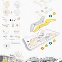
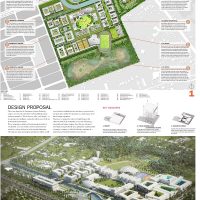
1) Size and Orientation

Most of the time your professors restrict you to specific board sizes and the number of boards. If that is the case then you need to confirm if your boards should be presented in Landscape or Portrait orientation. You, also, need to decide if you will be presenting your board side by side as one big board, one poster of equivalent size, or as separate boards that come in sequence.
2) Layout

Now, that you have a base to work on you need to start planning the layout of your boards or poster:
- If you are presenting hand drawings then you can do prior planning on one or more A4 paper sheets for example. Try to make an accurate estimation of the space needed per each drawing and the buffering space you would like to leave around each.

- If you will be presenting CAD drawings, then this might be easier. You can experiment with the actual drawings on CAD Layout or Photoshop if you will be rendering your project digitally.
- You can use a grid system to organize your drawings. Decide on a unit width, for example, 6cm, then use its multiples to create unit areas to contain your drawings, like for instance, 12cm for outer frame buffering, 36cm for main drawings and so.
Do This Or that! Here is an example!
3) Placement and Zoning

Think of the way you would like the viewers to circulate through your presentation, what you would like them to see first, how they would best understand your project. For example, you may start by brief site analysis, then move to the concept statement and its illustrative sketches if needed.
- If your concept is form-based you may need to show the form first, before the plan, then move to the plan to reveal how the form has functionally worked out.
- If your concept is in the plan itself, then you may move directly to the plan and conclude with the rendered exterior form as usual.
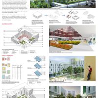
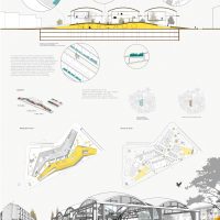
Drawing and Rendering Tips
4) Background

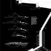
Dark Background
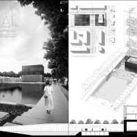
It is called “background” for a reason. It should be a platform to feature your drawings as the main focus, clear of any distractions. Some students use faded renderings of their own projects as background, but this can be seriously diverting. White backgrounds are best, as they show the true colors of your project.
Some opt to use a black background to stand out, however, that doesn’t usually turn out so well. It may cause halation and strain for sensitive eyes.
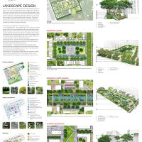
5) Colors

Black and white presentation
There are many ways you can render your projects, choose the one you excel at and shows your project best.
- There is the Black & White or Greyscale presentation where you only show lines with various thicknesses, in addition to shade and shadow.
- There is the greyscale presentation with an element of color where you would choose one bright color, for example, green for landscape and greenery, to contrast with the, generally, achromatic drawings.
- One color might become two colors revealing different materials like wood or bricks and glass for example.

Presentation with a Color Scheme on Greyscale
All, these previous techniques would work out fine if colors are not the main focus in your project, however, if there is an idea behind your color scheme or the used materials, or there are many details that will go lost in greyscale, then there is no way out.
You need to fully color or at least broaden the color palette for your presentation.

Colored Presentation
The manual achromatic presentation can be via graphic pencils and ink, and the colored elements can be executed using watercolor, markers, brush pens, or pastels. For digital presentations, you can use Adobe Photoshop as the most commonly used tool. You can even mimic the aesthetic of the manual presentation in Photoshop using downloadable brushes and a mix of effects.
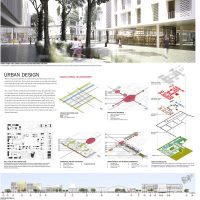
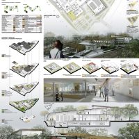
6) Visual Hierarchy

Black and White Contrast Color
What is your strongest point, the highlight of your project? Grab the attention from far away with that. There are many ways to grab the attention of a specific drawing, using color or size. For example, if the main idea is in your cross-section, you can present it on large scale with full-hue colors, against black and white plan drawings. That is mixing between two of the color presentation techniques mentioned in the previous point to get emphasis by contrast.
General Tips
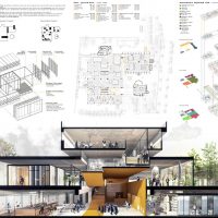
7) Minimize text on your presentation board. Write a short and concise concept statement and add a very brief explanation, if needed. Don’t waste your time composing elongated descriptive text because no one will read it.
8) Replace words, whenever possible, with simple illustrative sketches and figures. After all, a picture is worth a thousand words. You may use colors and keys to further clarify your illustrations.

9) Use a suitable font for your title and text and, preferably, don’t use more than one font type per project. You can vary between the title, the concept statement, and the labeling by size. Sans Serif fonts like Century Gothic and Helvetica may be good for headlines; their slick minimalism befits modern high-tech designs.

10) Finally, don’t overdo it.
- Don’t pack your boards with drawings and text at every corner. Leave some breathing space but not too much, that it would look like a) you couldn’t finish your work, b) you didn’t well plan your boards or c) you haven’t worked hard enough.
- Don’t overuse colors to the extent that they would become a distraction but also don’t make your presentation too light and faded, or it might exhaust the eyes of the viewer and give an impression of weak effort.
Good luck!