
Graphics in R with ggplot2
- Introduction
- Data
- Basic principles of
{ggplot2} - Create plots with
{ggplot2}- Scatter plot
- Line plot
- Combination of line and points
- Histogram
- Density plot
- Combination of histogram and densities
- Dotplot
- Boxplot
- Barplot
- Raincloud plot
- Further personalization
- Title and axis labels
- Axis ticks
- Log transformations
- Limits
- Scales for better axis formats
- Legend
- Shape, color, size and transparency
- Text and labels
- Smooth and regression lines
- Facets
- Themes
- Interactive plot with
{plotly} - Combine plots with
{patchwork} - Flip coordinates
- Save plot
- Managing dates
- Highlight data with
{gghighlight}
- Tip
- To go further
- Conclusion

Note that this article is inspired from the lecture notes of Prof. Anouar El Ghouch and my personal notes as teaching assistant for his course entitled “Statistics and data sciences with R: Advanced programming” given at UCLouvain.
Introduction
R is known to be a really powerful programming language when it comes to graphics and visualizations (in addition to statistics and data science of course!).
To keep it short, graphics in R can be done in three ways, via the:
{graphics}package (the base graphics in R, loaded by default){lattice}package which adds more functionalities to the base package{ggplot2}package (which needs to be installed and loaded beforehand)
The {graphics} package comes with a large choice of plots (such as plot, hist, barplot, boxplot, pie, mosaicplot, etc.) and additional related features (e.g., abline, lines, legend, mtext, rect, etc.). It is often the preferred way to draw plots for most R users, and in particular for beginners to intermediate users.
Since its creation in 2005 by Hadley Wickham, {ggplot2} has grown in use to become one of the most popular R packages and the most popular package for graphics and data visualizations. The {ggplot2} package is a much more modern approach to creating professional-quality graphics. More information about the package can be found at ggplot2.tidyverse.org.
In this article, we will see how to create common plots such as scatter plots, line plots, histograms, boxplots, barplots, density plots in R with this package. If you are unfamiliar with any of these types of graph, you will find more information about each one (when to use it, its purpose, what does it show, etc.) in my article about descriptive statistics in R.
Data
To illustrate plots with the {ggplot2} package we will use the mpg dataset available in the package.
The dataset contains observations collected by the US Environmental Protection Agency on fuel economy from 1999 to 2008 for 38 popular models of cars (run ?mpg for more information about the data):
library(ggplot2)
dat <- ggplot2::mpg
Before going further, let’s transform the cyl, drv, fl, year and class variables in factor with the transform() function:
dat <- transform(dat,
  cyl = factor(cyl),
  drv = factor(drv),
  fl = factor(fl),
  year = factor(year),
  class = factor(class)
)
For the interested reader, see more data manipulation techniques in R.
Basic principles of {ggplot2}
The {ggplot2} package is based on the principles of “The Grammar of Graphics” (hence “gg” in the name of {ggplot2}), that is, a coherent system for describing and building graphs. The main idea is to design a graphic as a succession of layers.
The main layers are:
- The dataset that contains the variables that we want to represent. This is done with the
ggplot()function and comes first. - The variable(s) to represent on the x and/or y-axis, and the aesthetic elements (such as color, size, fill, shape and transparency) of the objects to be represented. This is done with the
aes()function (abbreviation of aesthetic). - The type of graphical representation (scatter plot, line plot, barplot, histogram, boxplot, etc.). This is done with the functions
geom_point(),geom_line(),geom_bar(),geom_histogram(),geom_boxplot(), etc. - If needed, additional layers (such as labels, annotations, scales, axis ticks, legends, themes, facets, etc.) can be added to personalize the plot.
To create a plot, we thus first need to specify the data in the ggplot() function and then add the required layers such as the variables, the aesthetic elements and the type of plot:
ggplot(data) +
  aes(x = var_x, y = var_y) +
geom_x()datainggplot()is the name of the data frame which contains the variablesvar_xandvar_y.- The
+symbol is used to indicate the different layers that will be added to the plot. Make sure to write the+symbol at the end of the line of code and not at the beginning of the line, otherwise R throws an error. - The layer
aes()indicates what variables will be used in the plot and more generally, the aesthetic elements of the plot. - Finally,
xingeom_x()represents the type of plot. - Other layers are usually not required unless we want to personalize the plot further.
Note that it is a good practice to write one line of code per layer to improve code readability.
Create plots with {ggplot2}
In the following sections we will show how to draw the following plots:
- scatter plot
- line plot
- histogram
- density plot
- dotplot
- boxplot
- barplot
- raincloud plot
In order to focus on the construction of the different plots and the use of {ggplot2}, we will restrict ourselves to drawing basic (yet beautiful) plots without unnecessary layers. For the sake of completeness, we will briefly discuss and illustrate different layers to further personalize a plot at the end of the article (see this section).
Note that if you still struggle to create plots with {ggplot2} after reading this tutorial, you may find the {esquisse} addin useful. This addin allows you to interactively (that is, by dragging and dropping variables) create plots with the {ggplot2} package. Give it a try!
Scatter plot
We start by creating a scatter plot using geom_point. Remember that a scatter plot is used to visualize the relation between two quantitative variables.
- We start by specifying the data:
ggplot(dat) # data
- Then we add the variables to be represented with the
aes()function:
ggplot(dat) + # data
  aes(x = displ, y = hwy) # variables
- Finally, we indicate the type of plot:
ggplot(dat) + # data
  aes(x = displ, y = hwy) + # variables
  geom_point() # type of plot
You will also sometimes see the aesthetic elements (aes() with the variables) inside the ggplot() function in addition to the dataset:
ggplot(mpg, aes(x = displ, y = hwy)) +
  geom_point()
This second method gives the exact same plot than the first method. I tend to prefer the first method over the second for better readability, but this is more a matter of taste so the choice is up to you.
Line plot
Line plots, particularly useful in time series or finance, can be created similarly but by using geom_line():
ggplot(dat) +
  aes(x = displ, y = hwy) +
  geom_line()
(Note that this might not be the most appropriate plot since there are multiple points for each value of displ, but this is just an example to show how to create a line plot.)
Combination of line and points
An advantage of {ggplot2} is the ability to combine several types of plots and its flexibility in designing it. For instance, we can add a line to a scatter plot by simply adding a layer to the initial scatter plot:
ggplot(dat) +
  aes(x = displ, y = hwy) +
  geom_point() +
  geom_line() # add line
Histogram
A histogram (useful to visualize distributions and detect potential outliers) can be plotted using geom_histogram():
ggplot(dat) +
  aes(x = hwy) +
  geom_histogram()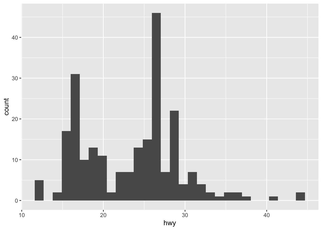
By default, the number of bins is equal to 30. You can change this value using the bins argument inside the geom_histogram() function:
ggplot(dat) +
  aes(x = hwy) +
  geom_histogram(bins = round(sqrt(nrow(dat))))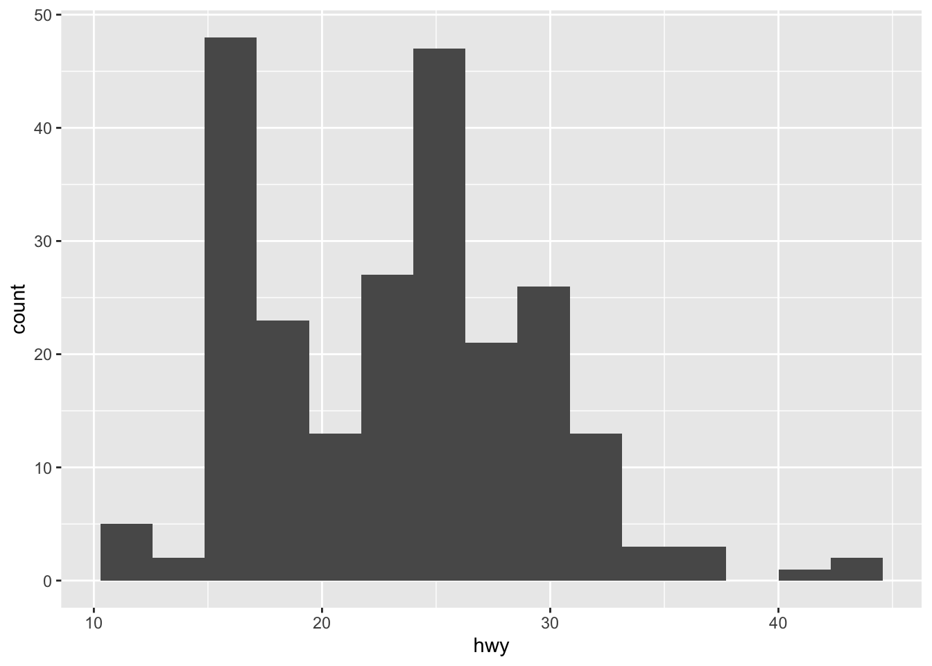
Here I specify the number of bins to be equal to the square root of the number of observations (following Sturge’s rule) but you can specify any integer number.
Density plot
Density plots can be created using geom_density():
ggplot(dat) +
  aes(x = hwy) +
  geom_density()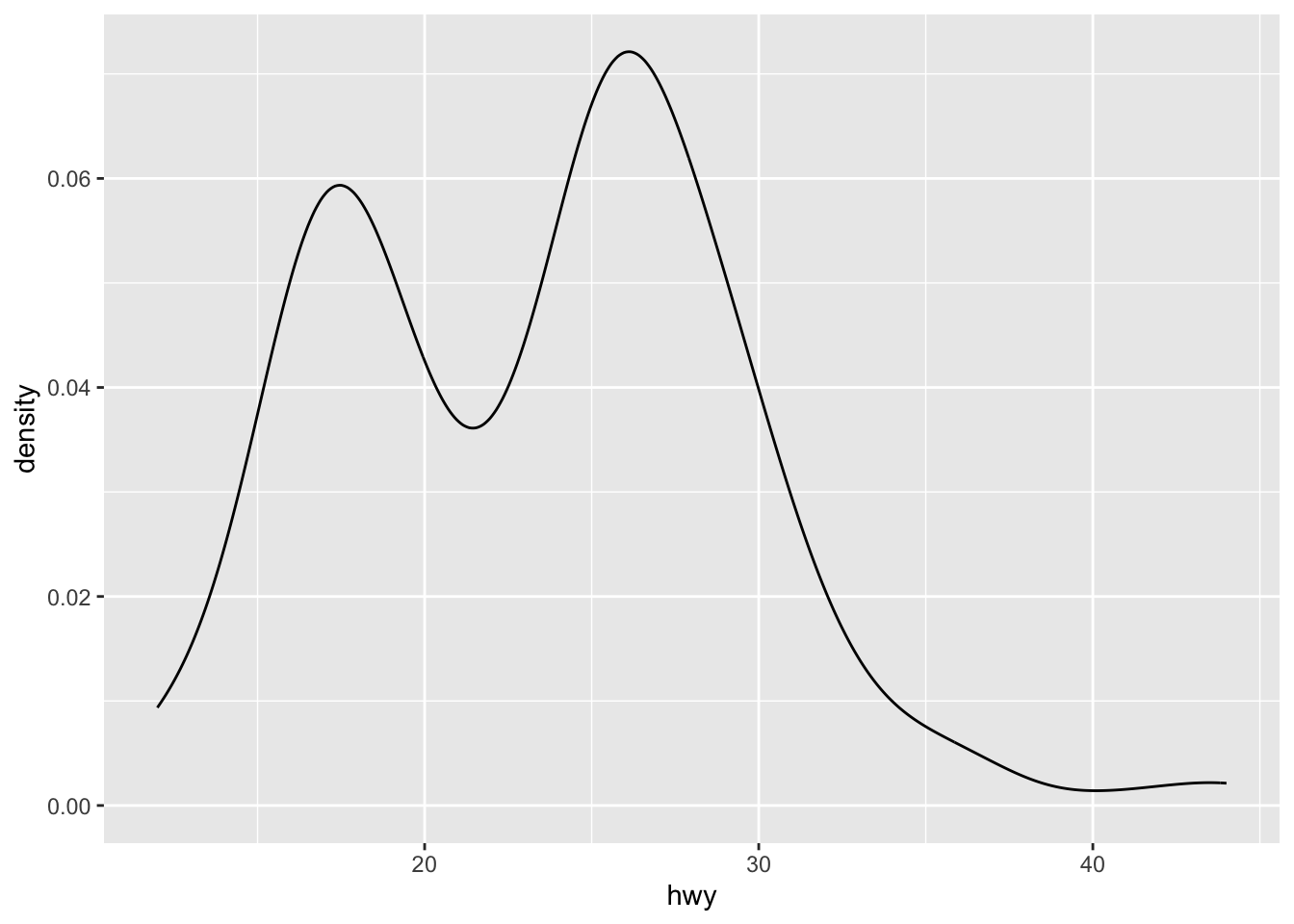
Combination of histogram and densities
We can also superimpose a histogram and a density curve on the same plot:
ggplot(dat) +
  aes(x = hwy, y = after_stat(density)) +
  geom_histogram() +
  geom_density()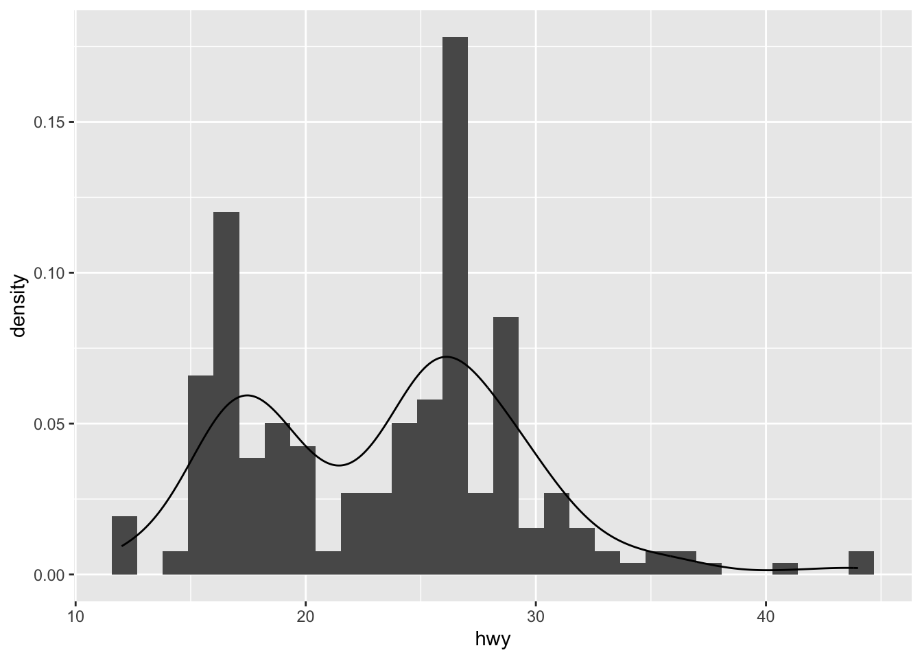
Or superimpose several densities:
ggplot(dat) +
  aes(x = hwy, color = drv, fill = drv) +
  geom_density(alpha = 0.25) # add transparency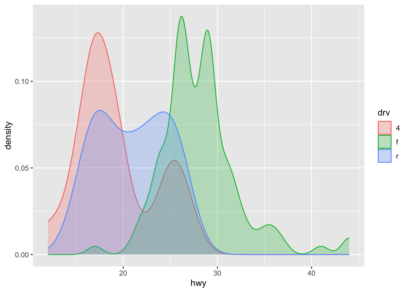
The argument alpha = 0.25 has been added for some transparency. More information about this argument can be found in this section.
Dotplot
A dotplot in {ggplot2} can be built with geom_dotplot():
# Dotplot for one variable
ggplot(dat) +
  aes(x = "", y = hwy) +
  geom_dotplot(binaxis = "y", stackdir = "center")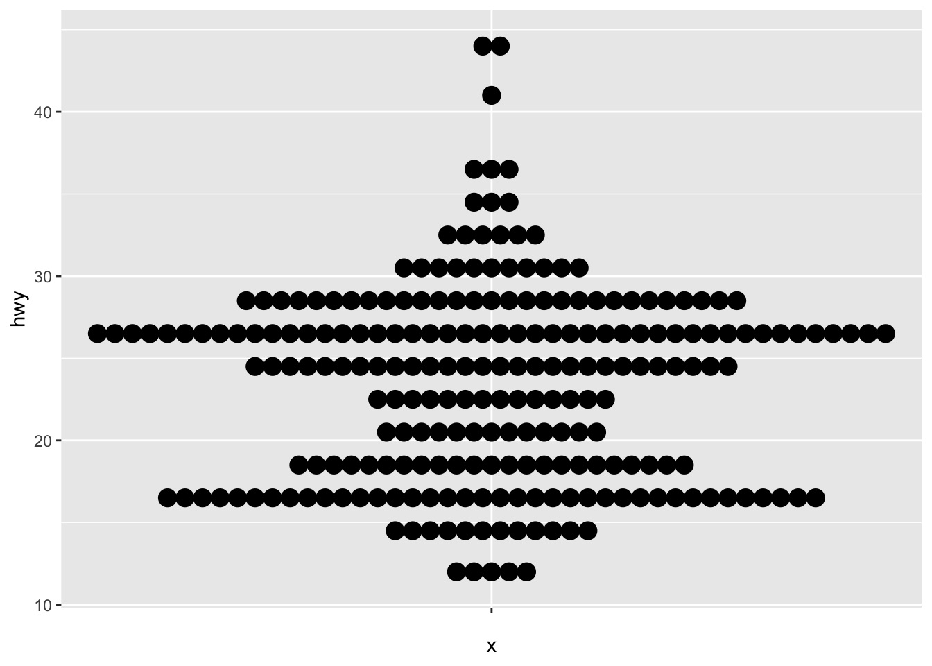
# Dotplot by factor
ggplot(dat) +
  aes(x = drv, y = hwy) +
  geom_dotplot(
    binaxis = "y", stackdir = "center",
    dotsize = 0.75 # decrease dot size
  )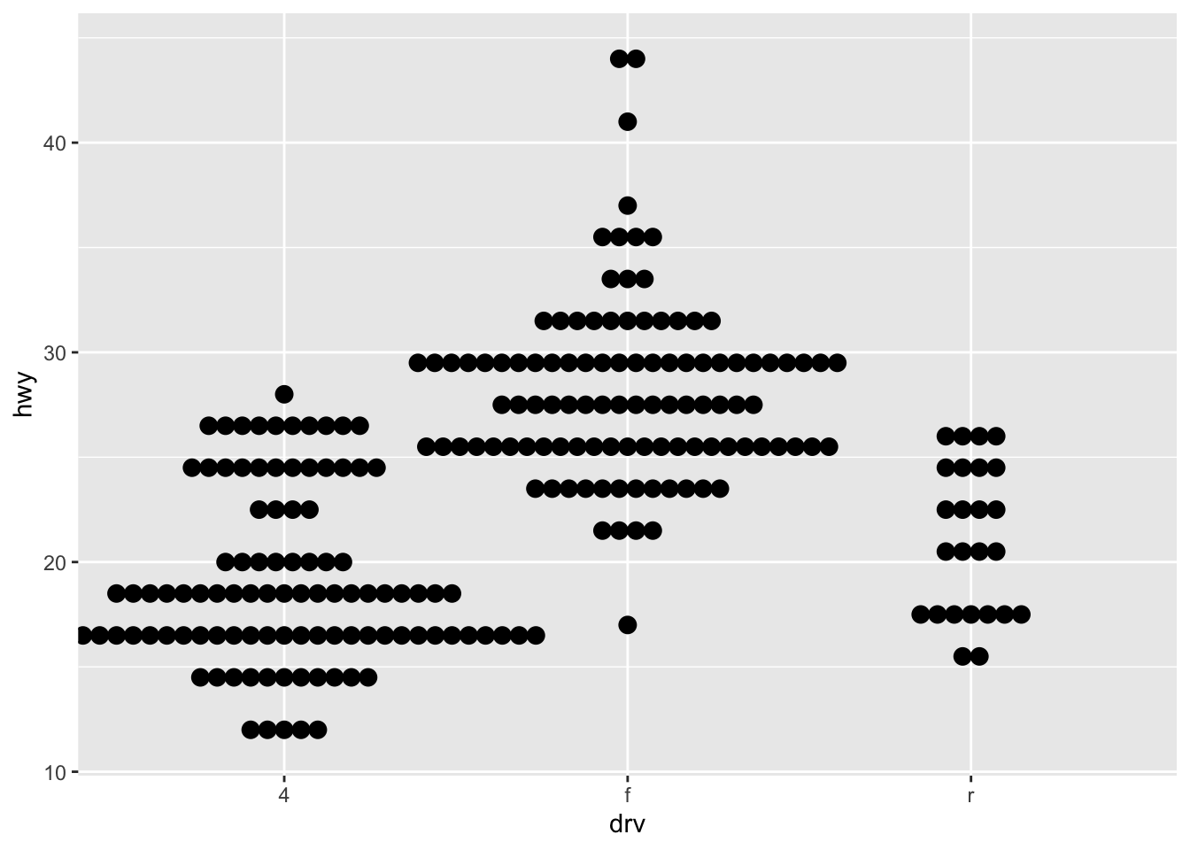
Dotplots are more appropriate with small samples (because the plot may be hard to read with too many points). For large samples, a boxplot may be used.
For the interested reader, see many personalization that is possible with a dotplot in this tutorial.
Boxplot
A boxplot (also very useful to visualize distributions and detect potential outliers) can be plotted using geom_boxplot():
# Boxplot for one variable
ggplot(dat) +
  aes(x = "", y = hwy) +
  geom_boxplot()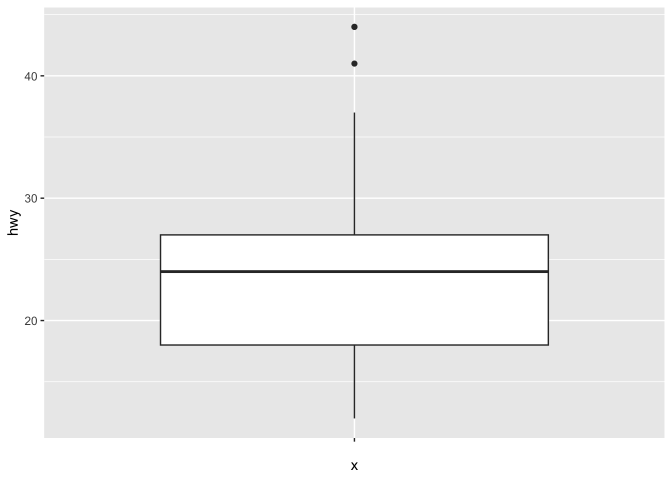
# Boxplot by factor
ggplot(dat) +
  aes(x = drv, y = hwy) +
  geom_boxplot()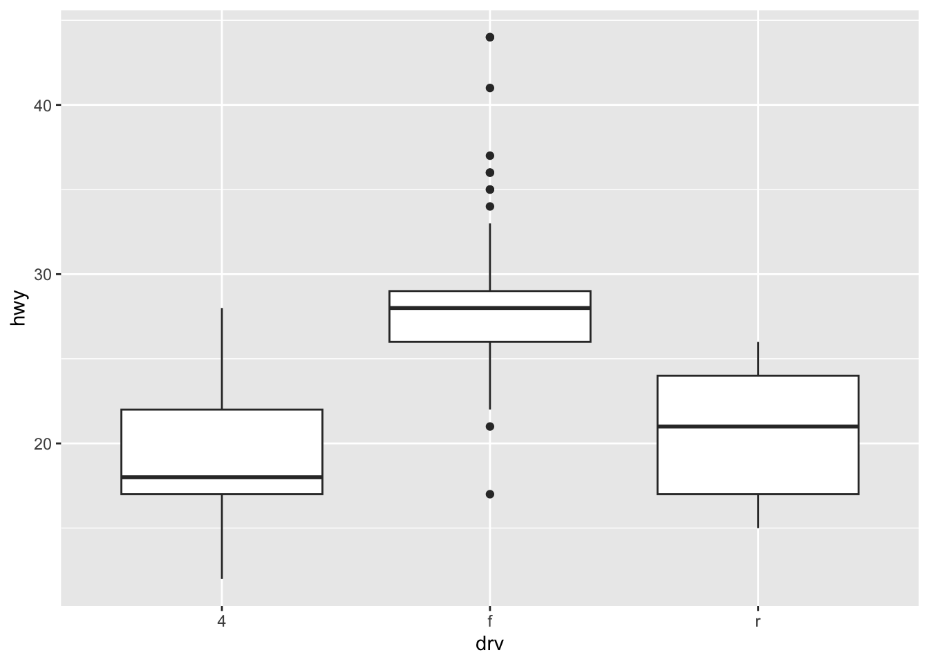
It is also possible to plot the points on the boxplot with geom_jitter(), and to vary the width of the boxes according to the size (i.e., the number of observations) of each level with varwidth = TRUE:
ggplot(dat) +
  aes(x = drv, y = hwy) +
  geom_boxplot(varwidth = TRUE) + # vary boxes width according to n obs.
  geom_jitter(alpha = 0.25, width = 0.2) # adds random noise and limit its width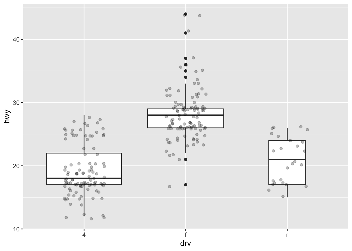
The geom_jitter() layer adds some random variation to each point in order to prevent them from overlapping (an issue known as overplotting).1 Moreover, the alpha argument adds some transparency to the points (see more in this section) to keep the focus on the boxes and not on the points.
Finally, it is also possible to divide boxplots into several panels according to the levels of a qualitative variable:
ggplot(dat) +
  aes(x = drv, y = hwy) +
  geom_boxplot(varwidth = TRUE) + # vary boxes width according to n obs.
  geom_jitter(alpha = 0.25, width = 0.2) + # adds random noise and limit its width
  facet_wrap(~year) # divide into 2 panels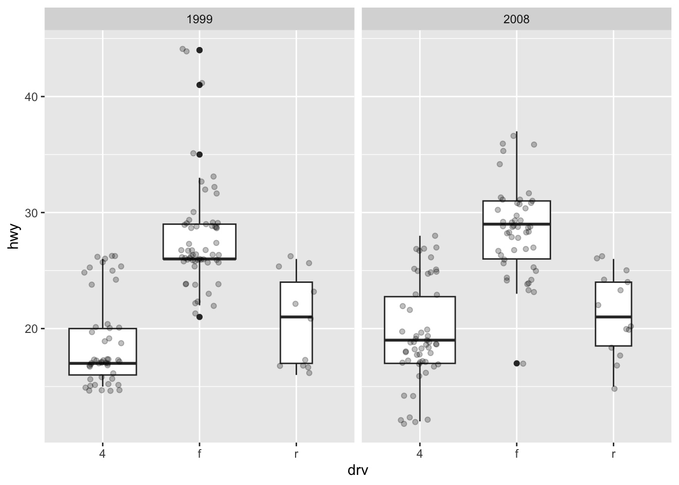
For a visually more appealing plot, it is also possible to use some colors for the boxes depending on the x variable:
ggplot(dat) +
  aes(x = drv, y = hwy, fill = drv) + # add color to boxes with fill
  geom_boxplot(varwidth = TRUE) + # vary boxes width according to n obs.
  geom_jitter(alpha = 0.25, width = 0.2) + # adds random noise and limit its width
  facet_wrap(~year) + # divide into 2 panels
  theme(legend.position = "none") # remove legend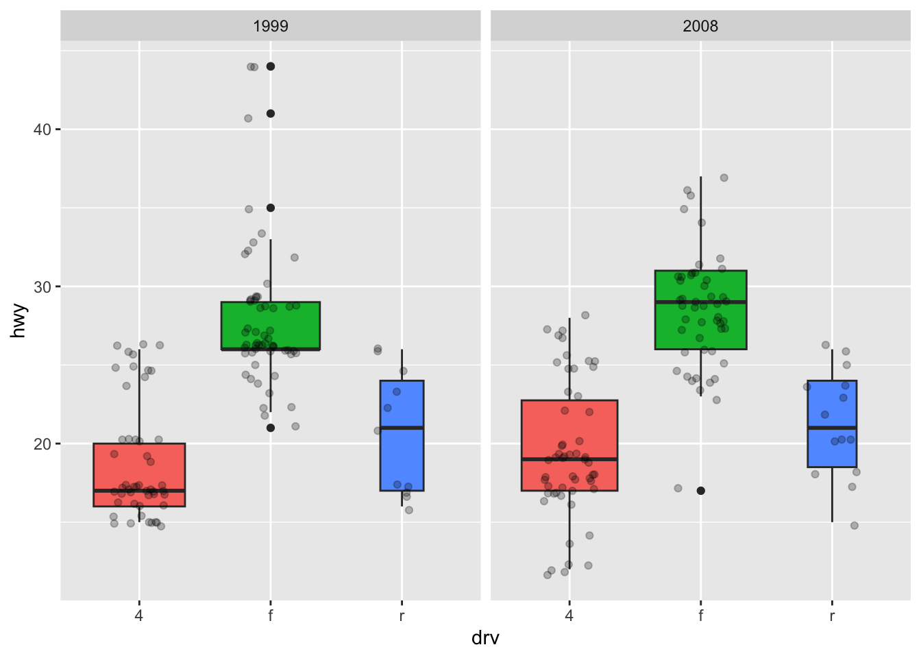
In that case, it best to remove the legend as it becomes redundant. See more information about the legend in this section.
If you are unhappy with the default colors provided in {ggplot2}, you can change them manually with the scale_fill_manual() layer:
ggplot(dat) +
  aes(x = drv, y = hwy, fill = drv) + # add color to boxes with fill
  geom_boxplot(varwidth = TRUE) + # vary boxes width according to n obs.
  geom_jitter(alpha = 0.25, width = 0.2) + # adds random noise and limit its width
  facet_wrap(~year) + # divide into 2 panels
  theme(legend.position = "none") + # remove legend
  scale_fill_manual(values = c("darkred", "darkgreen", "steelblue")) # change fill color manually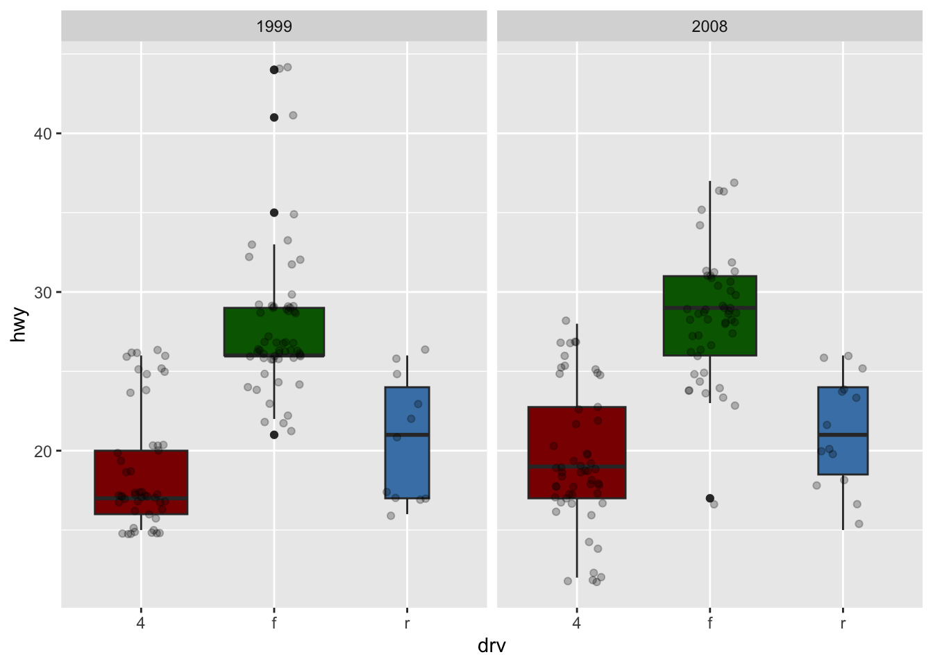
Barplot
A barplot (useful to visualize qualitative variables) can be plotted using geom_bar():
ggplot(dat) +
  aes(x = drv) +
  geom_bar()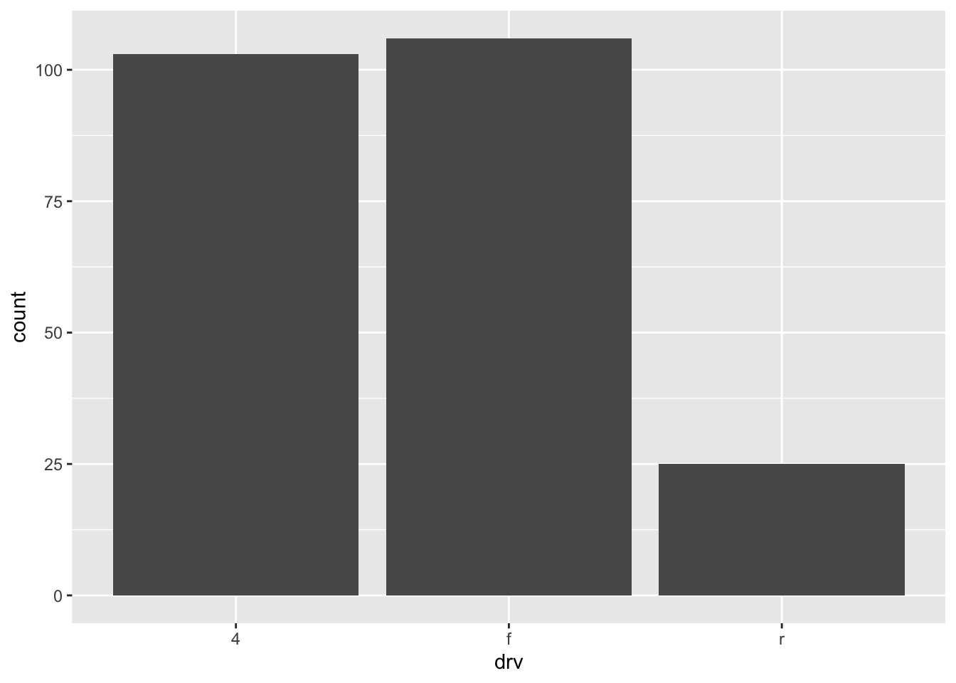
Bars’ heights correspond to the observed frequencies (i.e., the number of observations) for each level of the variable of interest (drv in our case).
Tip: by default, the order of the bars follows the initial order (by alphabetical order or numerical order if you did not change it). If you want to order the levels by frequency (largest first), use the fct_infreq() function from the {forcats} package.
library(forcats)

ggplot(dat) +
  aes(x = fct_infreq(drv)) + # order by frequency
  geom_bar()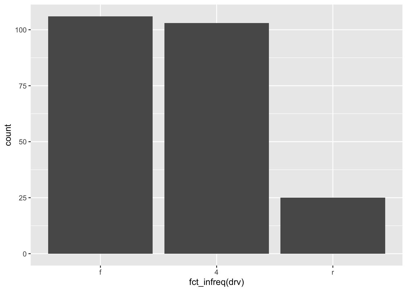
If you want to order levels in an increasing order (i.e., category with the smallest frequency first), use the fct_rev() in addition to the fct_infreq() function:
ggplot(dat) +
  aes(x = fct_rev(fct_infreq(drv))) + # order by frequency
  geom_bar()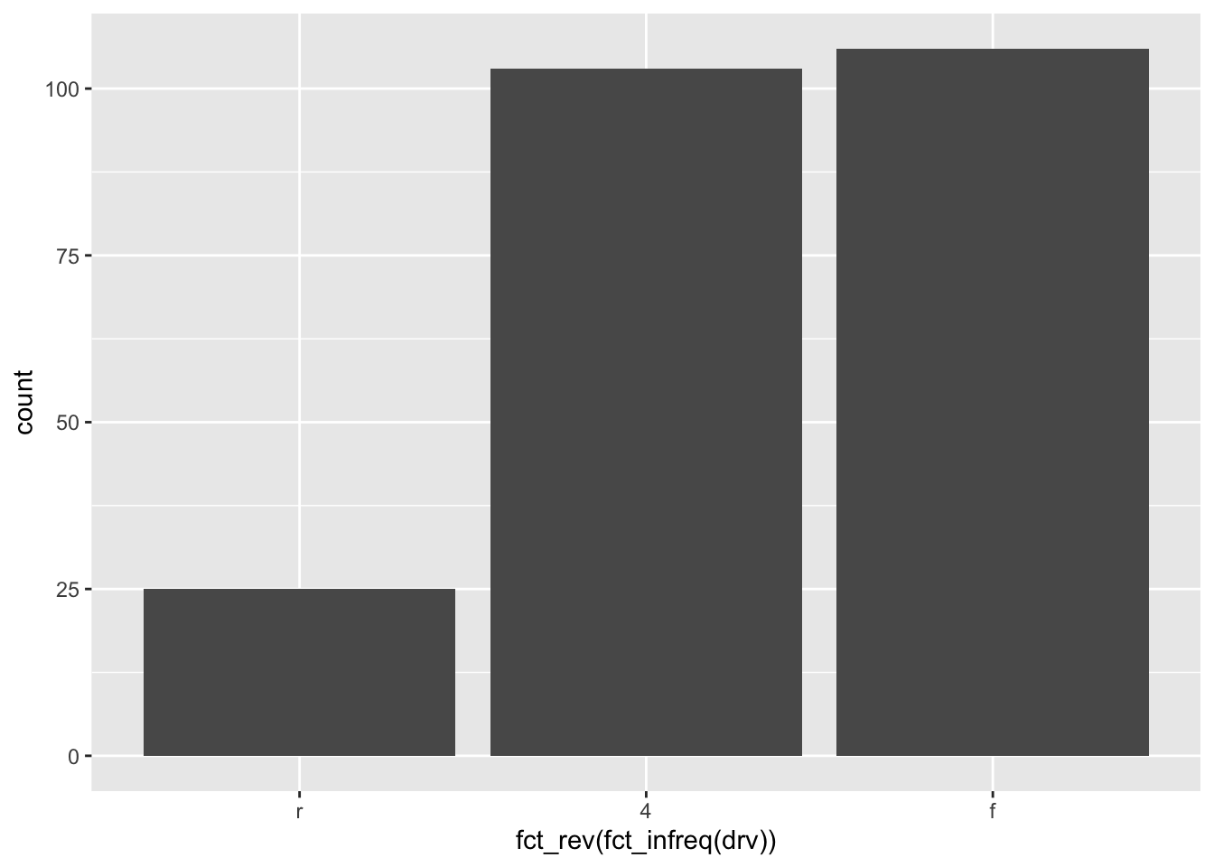
(Label for the x-axis can then easily be edited with the labs() function. See below for more information.)
Again, for a more appealing plot, we can add some colors to the bars with the fill argument:
ggplot(dat) +
  aes(x = drv, fill = drv) + # add colors to bars
  geom_bar() +
  theme(legend.position = "none") # remove legend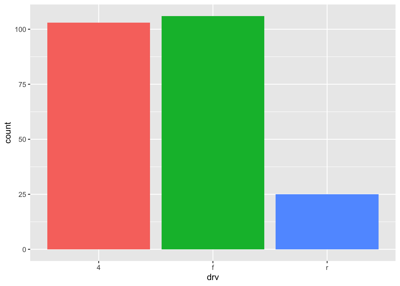
We can also create a barplot with two qualitative variables:
ggplot(dat) +
  aes(x = drv, fill = year) + # fill by years
  geom_bar()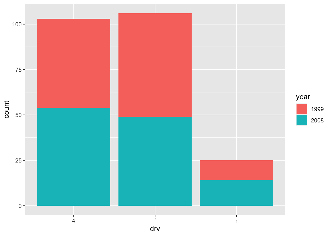
In order to compare proportions across groups, it is best to make each bar the same height using position = "fill":
ggplot(dat) +
  geom_bar(aes(x = drv, fill = year), position = "fill")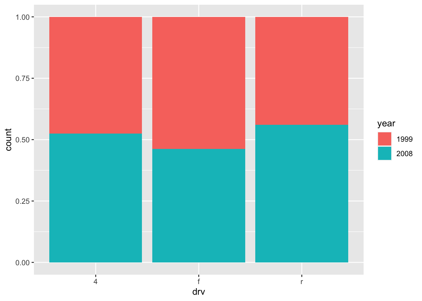
To draw the bars next to each other for each group, use position = "dodge":
ggplot(dat) +
  geom_bar(aes(x = drv, fill = year), position = "dodge")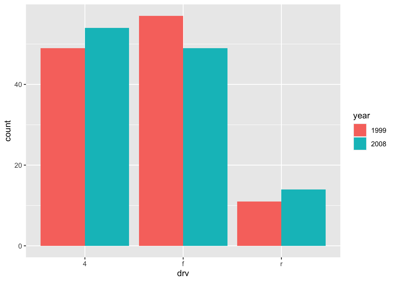
Raincloud plot
A raincloud plot is a graph that combines 3 visualizations:
- a density plot,
- a boxplot,
- and the raw data in the form of a dotplot or jittered points.
The advantage of this plot is that it illustrates, all at once, the distribution (with the density curve), the summary measures (first, second and third quartiles, and maximum/mininum without outliers thanks to the boxplot) and the number of observations (either via a dotplot or via jittered points).
Let’s illustrate the raincloud plot, first with jittered points (more appropriate with large samples):2
library(tidyverse)
library(ggdist)

# density plot:
dat %>%
  ggplot(aes(x = drv, y = hwy, fill = drv)) +
  stat_halfeye(
    adjust = 0.5, # set the smoothing parameter
    width = 0.5, # set the height of the curves
    justification = -0.2, # move curves to the right
    .width = 0, point_colour = NA # remove interval present by default
  ) +
  # boxplot:
  geom_boxplot(
    width = 0.12, # width of boxes
    outlier.color = NA, # remove color of outliers
    alpha = 0.5 # add transparency
  ) +
  # jittered points:
  geom_point(aes(colour = drv), # add color on points
    size = 1.3, # size of points
    alpha = .3, # add transparency
    position = position_jitter( # obtain shifted points
      seed = 1, # set seed for same random representation
      width = .09 # manage the width of the offset
    )
  ) +
  # further personalization:
  coord_flip() + # rotate plot
  theme(legend.position = "none") # remove legend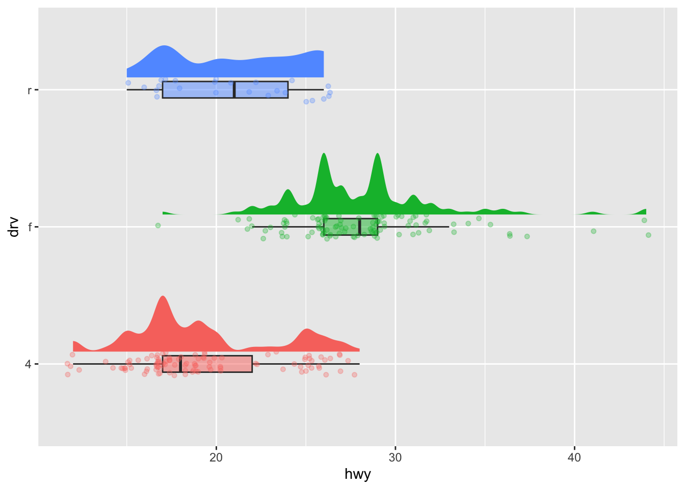
Now the same chart but with dotplots this time (more appropriate with small samples):
# density plot:
dat %>%
  sample_n(100) %>% # random sample of size 100
  ggplot(aes(x = drv, y = hwy, fill = drv)) +
  stat_halfeye(
    adjust = 0.5, # set the smoothing parameter
    width = 0.5, # set the height of the curves
    justification = -0.2, # move curves to the right
    .width = 0, point_colour = NA # remove interval present by default
  ) +
  # boxplot:
  geom_boxplot(
    width = 0.12, # width of boxes
    outlier.color = NA, # remove color of outliers
    alpha = 0.5 # add transparency
  ) +
  # dotplot:
  stat_dots(
    dotsize = 0.5, # size of points
    side = "left", # place points on opposite side of density curve
    justification = 1.1, # move points away from boxplot
    binwidth = 1 # group points together
  ) +
  # further personalization:
  coord_flip() + # rotate plot
  theme(legend.position = "none") # remove legend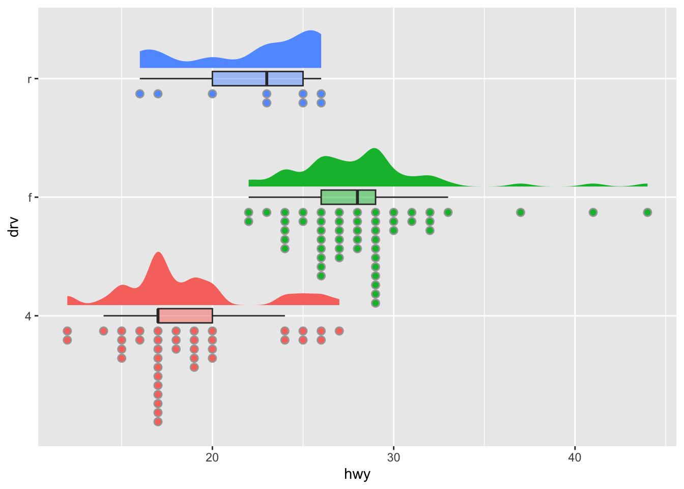
The code is much longer compared to the other plots, but the only line(s) to edit to adapt to your dataset is the aesthetics (aes()). The rest is mainly adjustments that should not be changed.
You may have notice that at the end of the code, there are some personalization which allow to improve the plot even further. The most common personalization are presented in the next section.
Further personalization
Title and axis labels
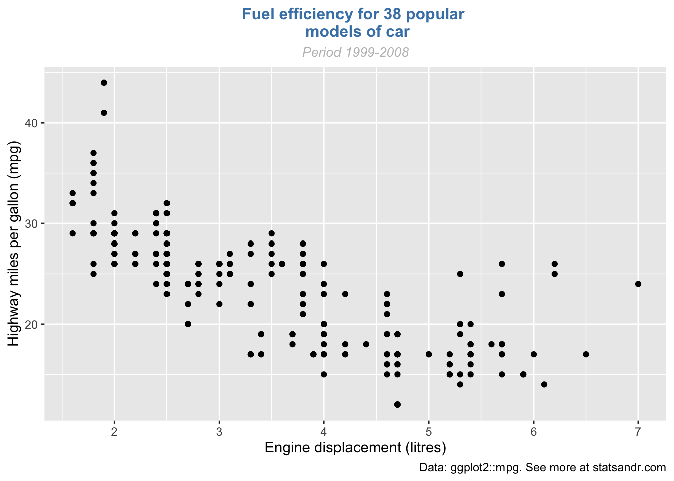
The first things to personalize in a plot is the labels to make the plot more informative to the audience. We can easily add a title, subtitle, caption and edit axis labels with the labs() function:
p <- ggplot(dat) +
  aes(x = displ, y = hwy) +
  geom_point()

p + labs(
  title = "Fuel efficiency for 38 popular models of car",
  subtitle = "Period 1999-2008",
  caption = "Data: ggplot2::mpg. See more at statsandr.com",
  x = "Engine displacement (litres)",
  y = "Highway miles per gallon (mpg)"
)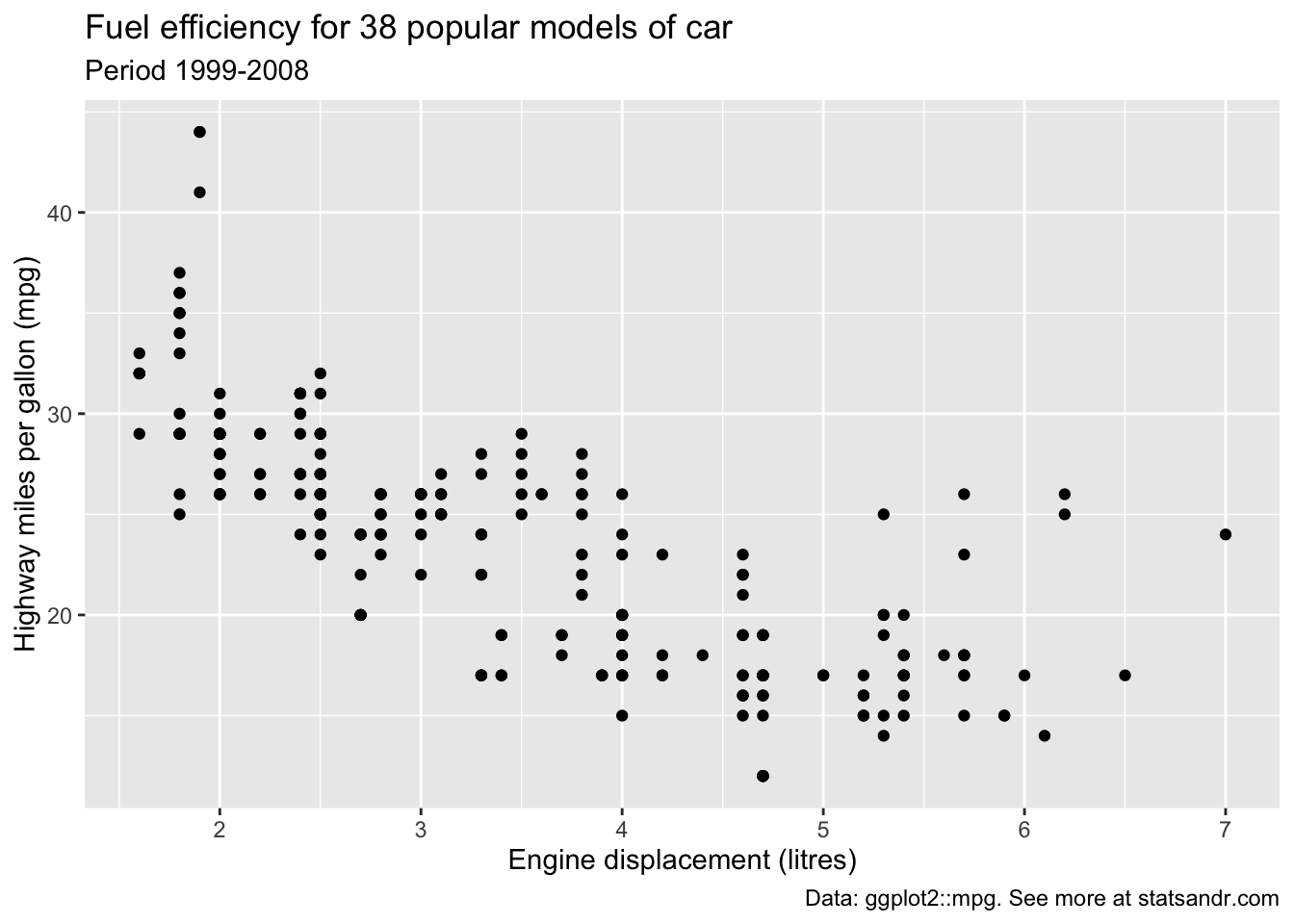
As you can see in the above code, you can save one or more layers of the plot in an object for later use.
This way, you can save your “main” plot, and add more layers of personalization until you get the desired output. Here we saved the main scatter plot in an object called p and we will refer to it for the subsequent personalization.
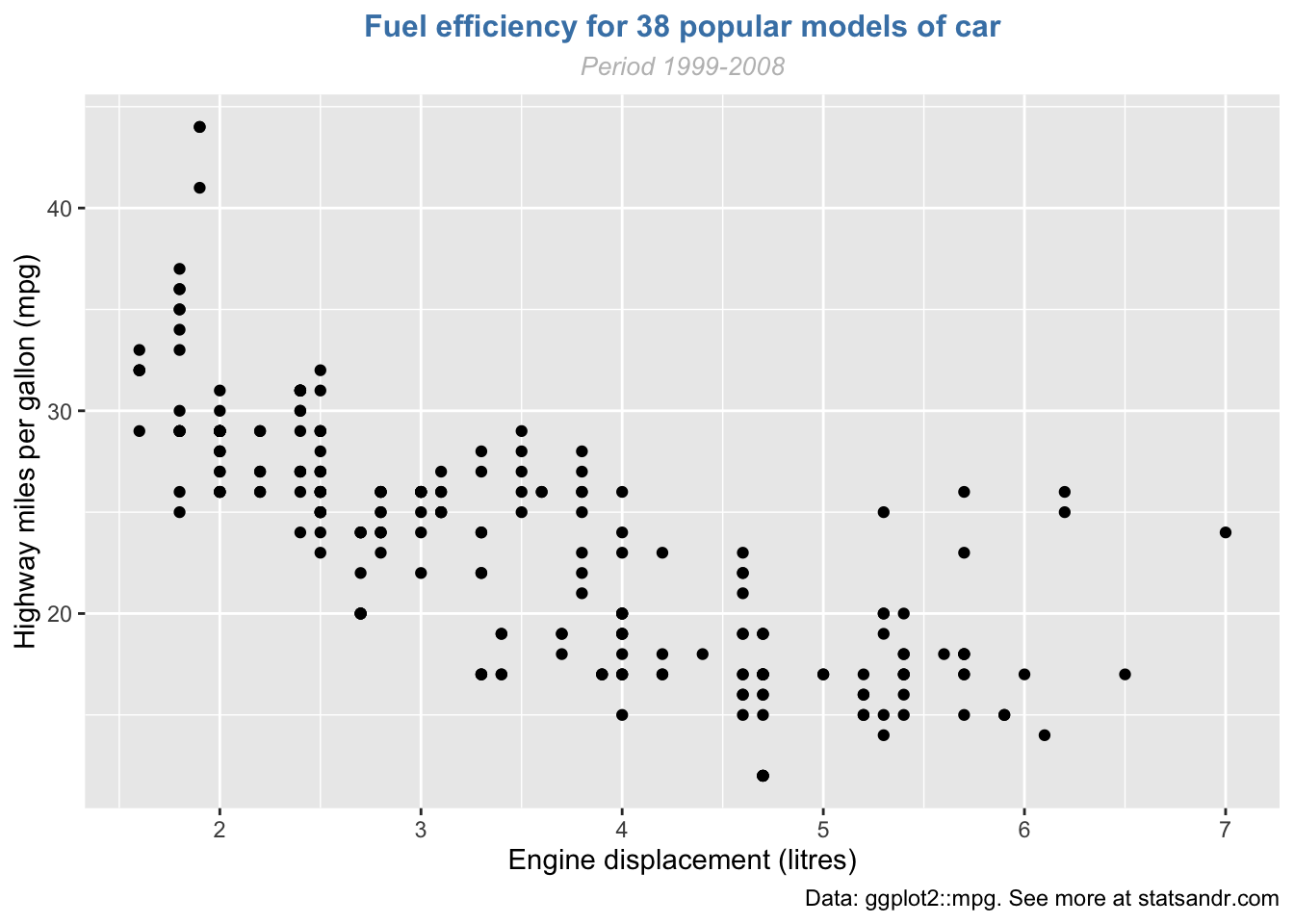
You can also edit the alignment, the size and the shape of the title and subtitle via the theme() layer and the element_text() function:
p + labs(
  title = "Fuel efficiency for 38 popular models of car",
  subtitle = "Period 1999-2008",
  caption = "Data: ggplot2::mpg. See more at statsandr.com",
  x = "Engine displacement (litres)",
  y = "Highway miles per gallon (mpg)"
) +
  theme(
    plot.title = element_text(
      hjust = 0.5, # center
      size = 12,
      color = "steelblue",
      face = "bold"
    ),
    plot.subtitle = element_text(
      hjust = 0.5, # center
      size = 10,
      color = "gray",
      face = "italic"
    )
  )
If the title or subtitle is long and you want to divide it into multiple lines, use \n:
p + labs(
  title = "Fuel efficiency for 38 popular \n models of car",
  subtitle = "Period 1999-2008",
  caption = "Data: ggplot2::mpg. See more at statsandr.com",
  x = "Engine displacement (litres)",
  y = "Highway miles per gallon (mpg)"
) +
  theme(
    plot.title = element_text(
      hjust = 0.5, # center
      size = 12,
      color = "steelblue",
      face = "bold"
    ),
    plot.subtitle = element_text(
      hjust = 0.5, # center
      size = 10,
      color = "gray",
      face = "italic"
    )
  )
Axis ticks
Axis ticks can be adjusted using scale_x_continuous() and scale_y_continuous() for the x and y-axis, respectively:
# Adjust ticks
p + scale_x_continuous(breaks = seq(from = 1, to = 7, by = 0.5)) + # x-axis
  scale_y_continuous(breaks = seq(from = 10, to = 45, by = 5)) # y-axis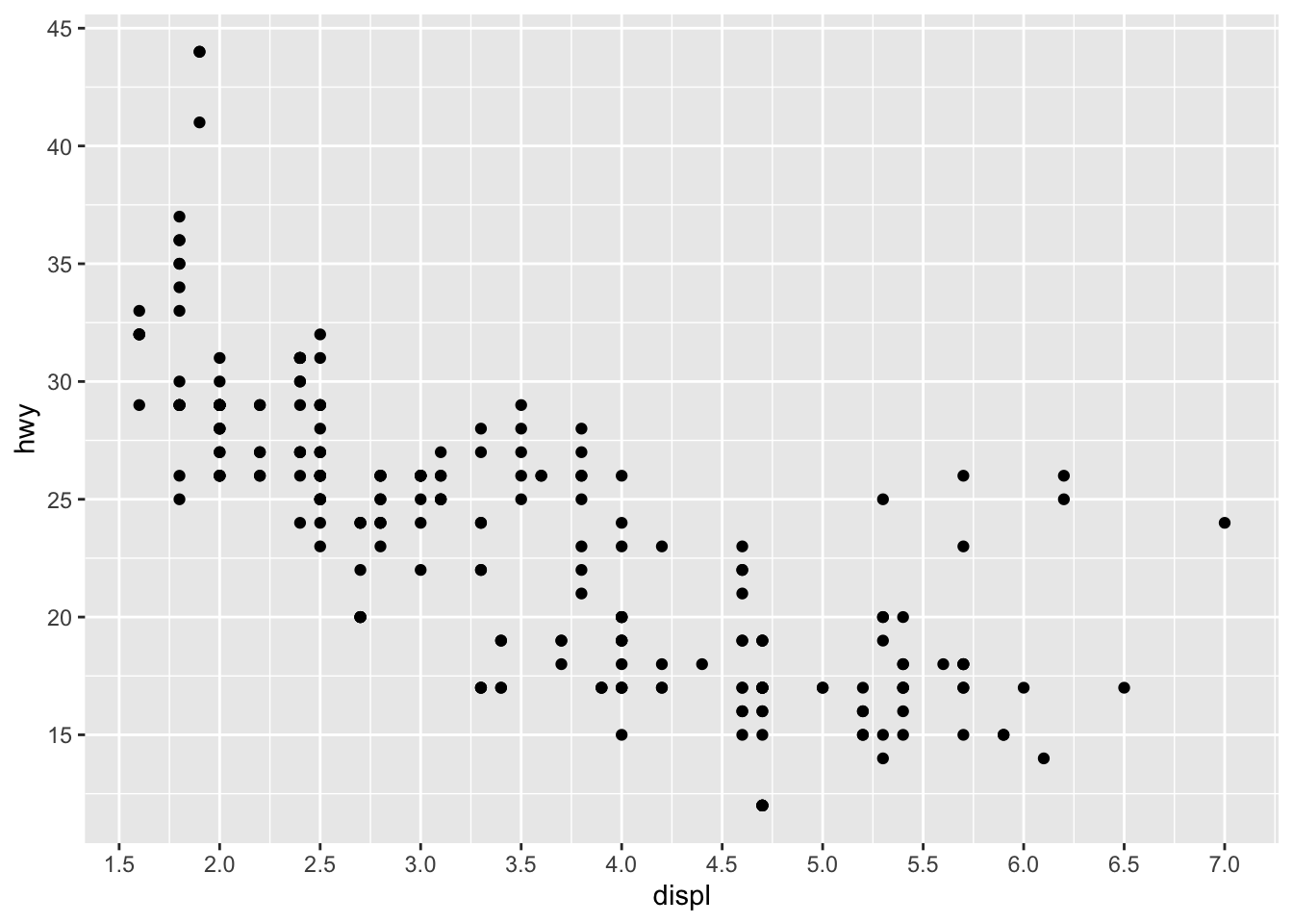
Log transformations
In some cases, it is useful to plot the log transformation of the variables. This can be done with the scale_x_log10() and scale_y_log10() functions:
p + scale_x_log10() +
  scale_y_log10()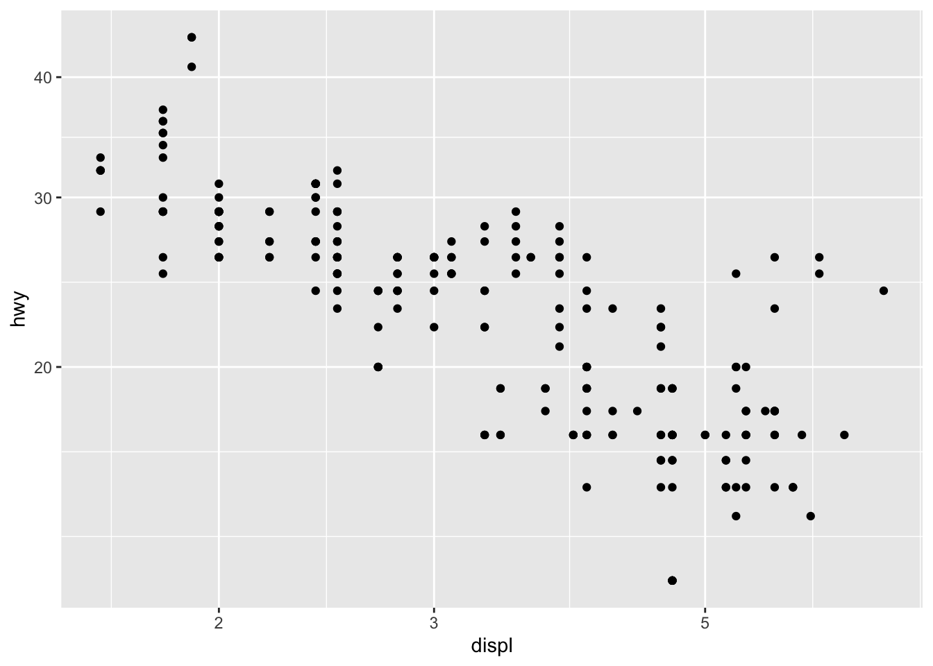
Limits
The most convenient way to control the limits of the plot is to use again the scale_x_continuous() and scale_y_continuous() functions in addition to the limits argument:
p + scale_x_continuous(limits = c(3, 6)) +
  scale_y_continuous(limits = c(20, 30))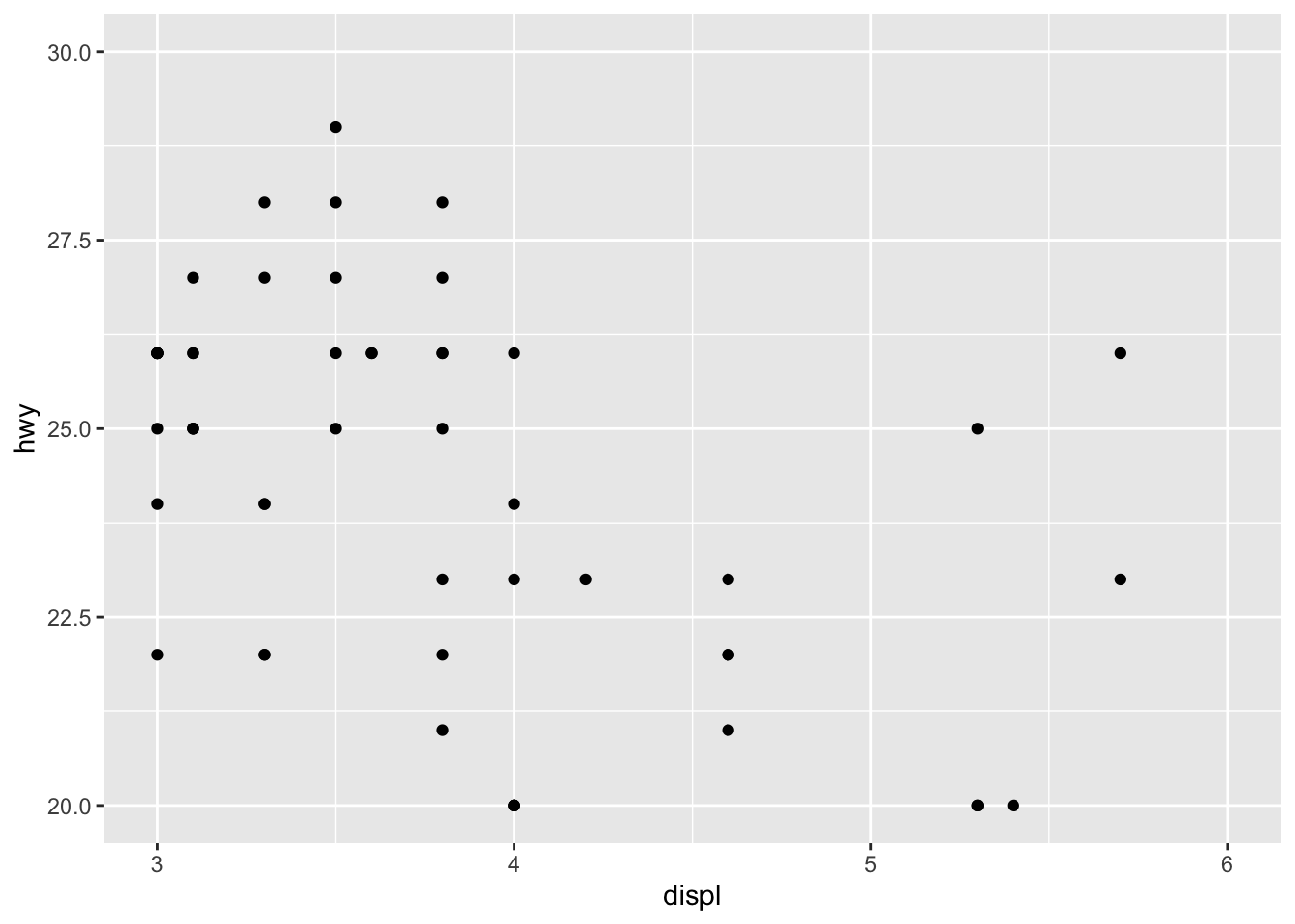
It is also possible to simply take a subset of the dataset with the subset() or filter() function. See how to subset a dataset if you need a reminder.
Scales for better axis formats
Depending on your data, it is possible to format axes in a certain way with the {scales} package. The format I use the most is comma which formats large numbers in a more-readable way.
For this example, we multiply both variables by 10000 to have larger numbers and then we apply the format to the y-axis (only to the y-axis so we can see the difference with the x-axis which is not formatted):
ggplot(dat) +
  aes(x = displ * 10000, y = hwy * 10000) +
  geom_point() +
  scale_y_continuous(labels = scales::comma) # format y-axis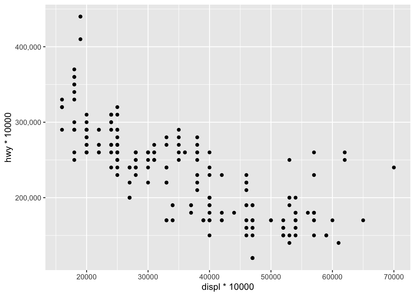
As you can see, numbers on the y-axis are displayed as 200,000, 300,000, etc. instead of 200000, 300000, etc., which makes it more readable.
Another common format is percent to display numbers as percentages:
ggplot(dat) +
  aes(x = displ, y = hwy / 100) +
  geom_point() +
  scale_y_continuous(labels = scales::percent) # format y-axis
These two formats make large numbers and percentages easier to read. Other formats are possible such as using dollar signs, dates etc. See more information in the package’s documentation.
Legend
By default, the legend is located to the right side of the plot (when there is a legend to be displayed of course).
To control the position of the legend, we need to use the theme() function in addition to the legend.position argument:
p + aes(color = class) +
  theme(legend.position = "top")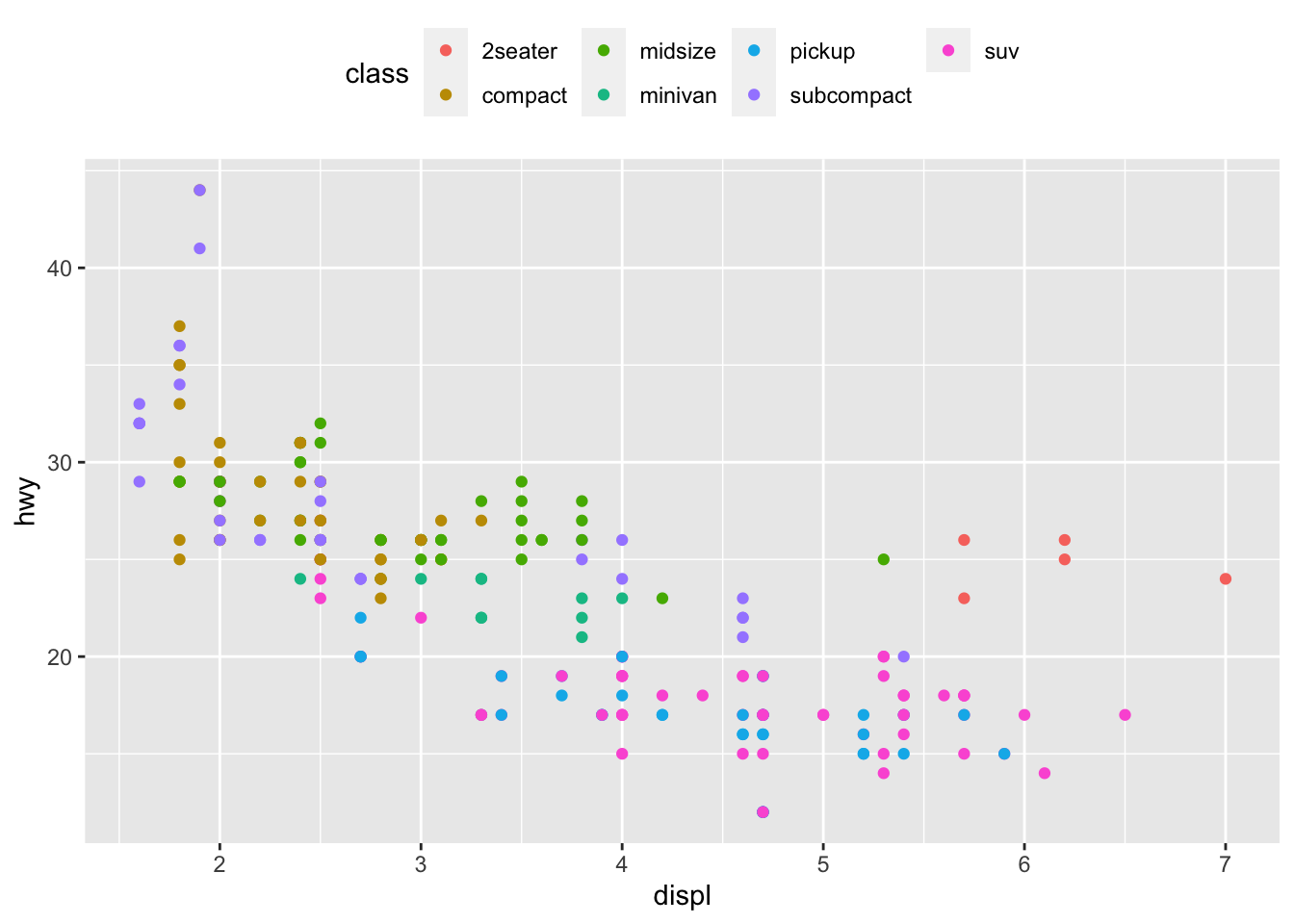
Replace "top" by "left" or "bottom" to change its position and by "none" to remove it.
The title of the legend can be edited with the labs() layer:
p + aes(color = class) +
  labs(color = "Car's class")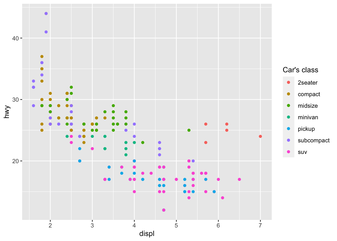
Note that the argument inside labs() must match the one inside the aes() layer (in this case: color).
The title of the legend can also be removed with legend.title = element_blank() inside the theme() layer:
p + aes(color = class) +
  theme(
    legend.title = element_blank(),
    legend.position = "bottom"
  )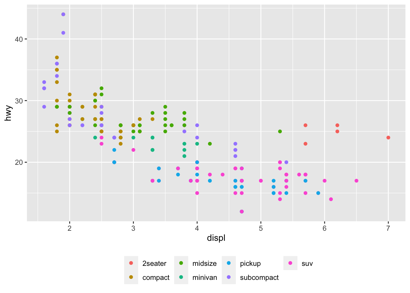
The legend now appears at the bottom of the plot, without the legend title.
Shape, color, size and transparency
There are a very large number of options to improve the quality of the plot or to add additional information. These include:
- shape,
- size,
- color, and
- alpha (transparency).
We can for instance change the shape of all points in a scatter plot by adding shape to geom_point(), or vary the shape according to the values taken by another variable (in that case, the shape argument must be inside aes()):3
# Change shape of all points
ggplot(dat) +
  aes(x = displ, y = hwy) +
  geom_point(shape = 4)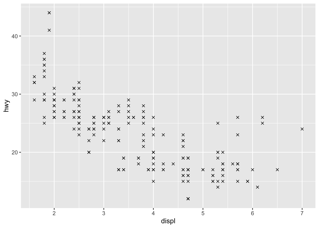
# Change shape of points based on a categorical variable
ggplot(dat) +
  aes(x = displ, y = hwy, shape = drv) +
  geom_point()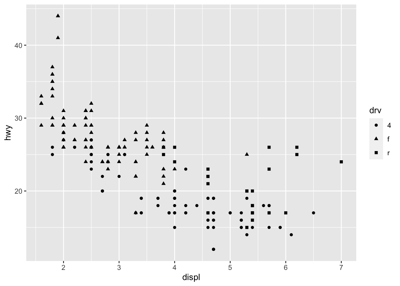
Following the same principle, we can modify the color, size and transparency of the points based on a qualitative or quantitative variable. Here are some examples:
p <- ggplot(dat) +
  aes(x = displ, y = hwy) +
  geom_point()

# Change color for all points
p + geom_point(color = "steelblue")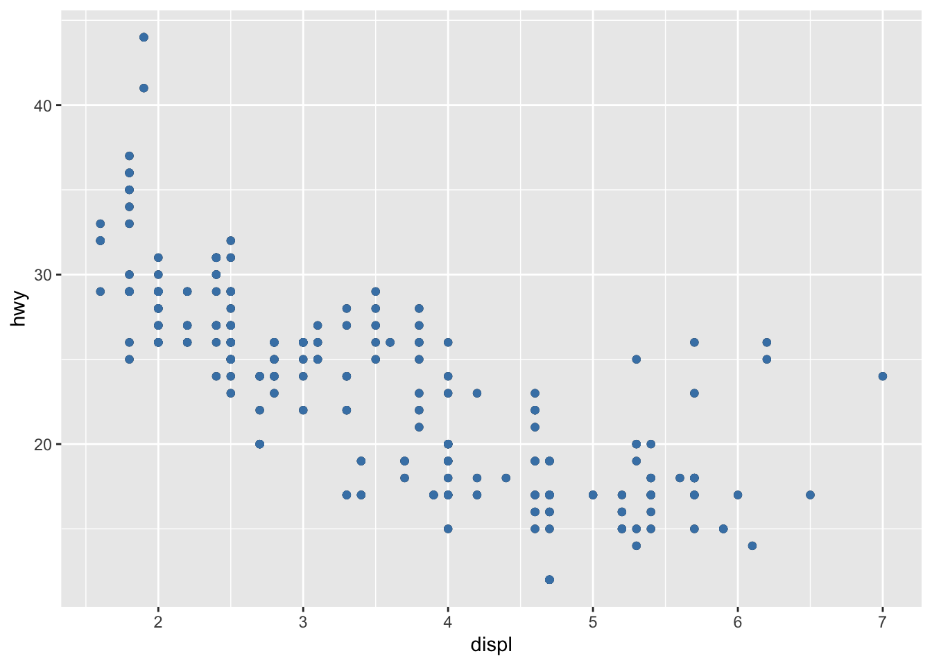
# Change color based on a qualitative variable
p + aes(color = drv)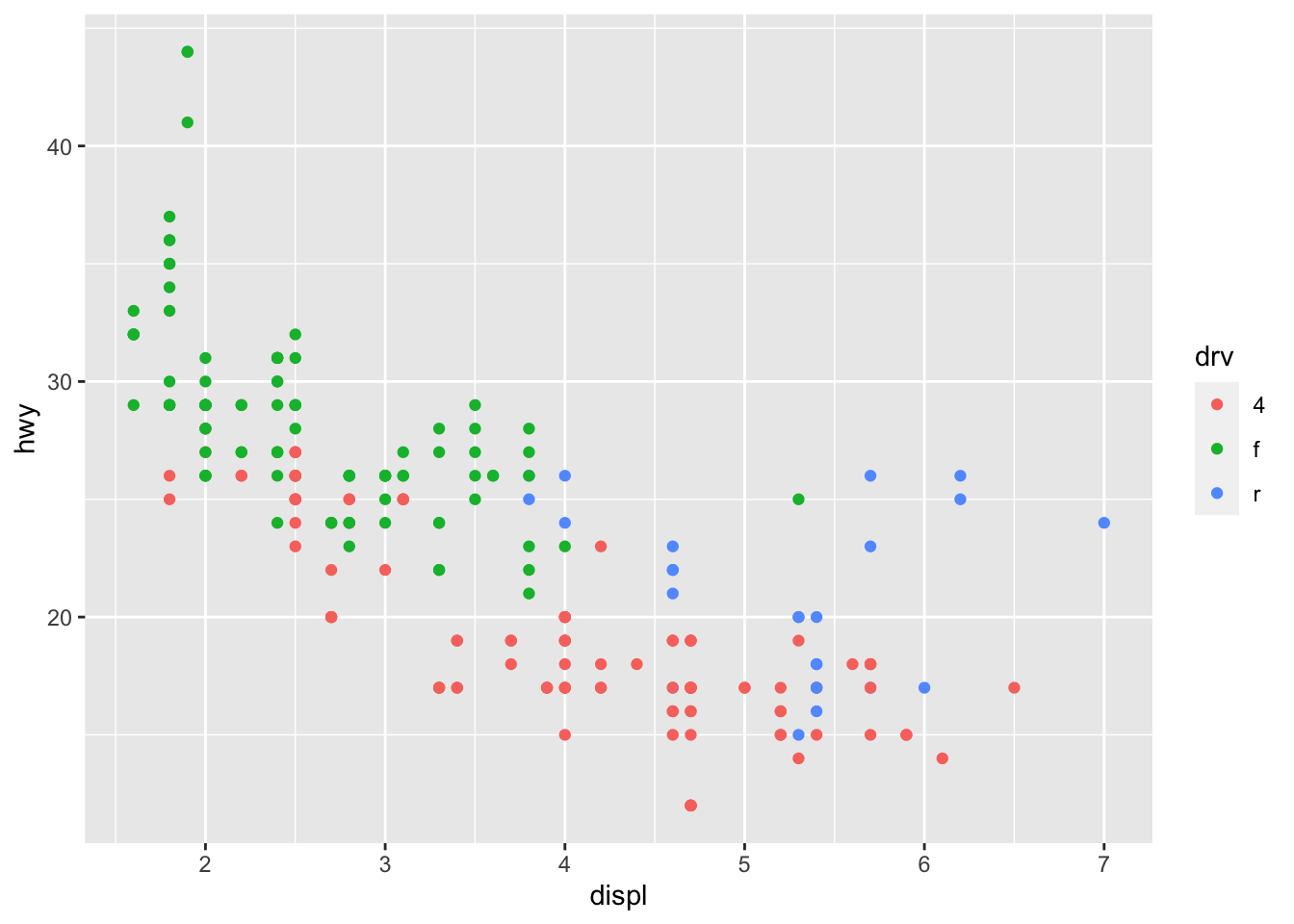
# Change color based on a quantitative variable
p + aes(color = cty)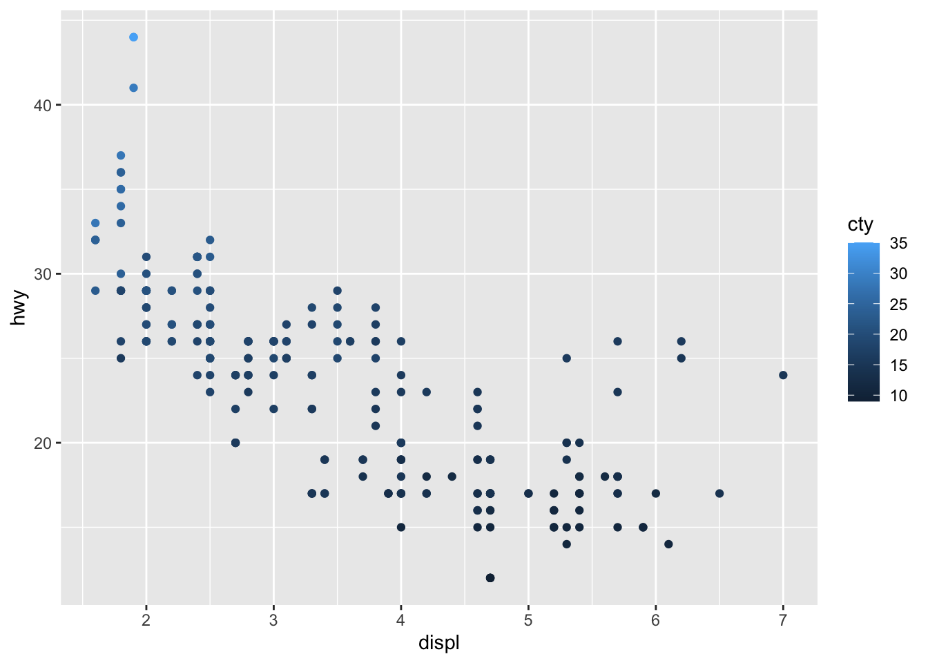
# Change color based on a criterion (median of cty variable)
p + aes(color = cty > median(cty))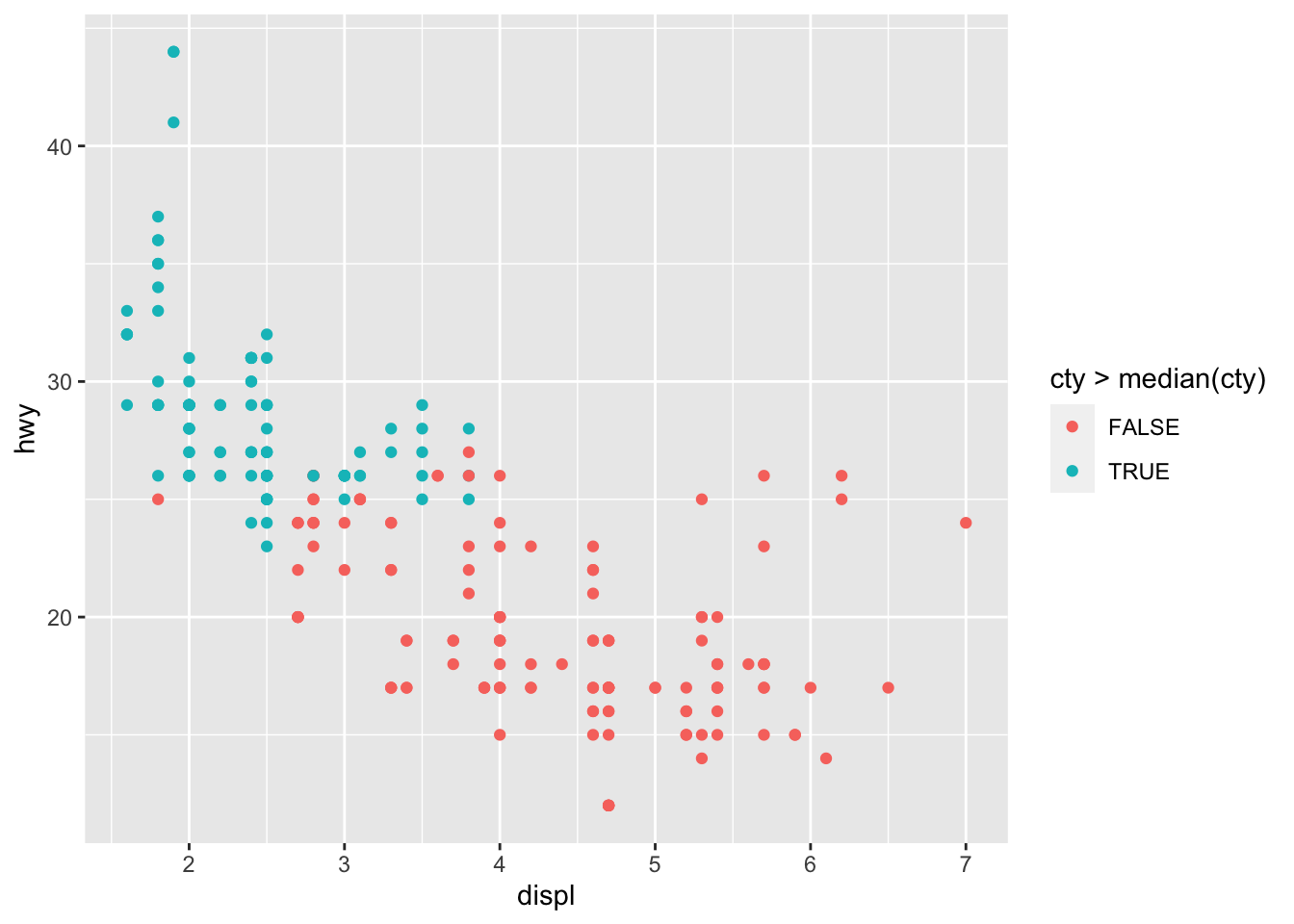
# Change size of all points
p + geom_point(size = 4)
# Change size of points based on a quantitative variable
p + aes(size = cty)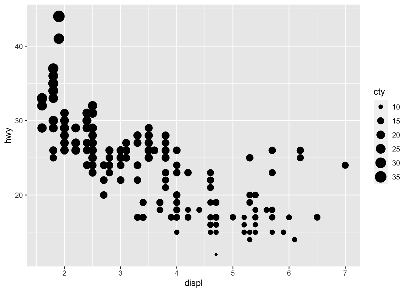
# Change transparency based on a quantitative variable
p + aes(alpha = cty)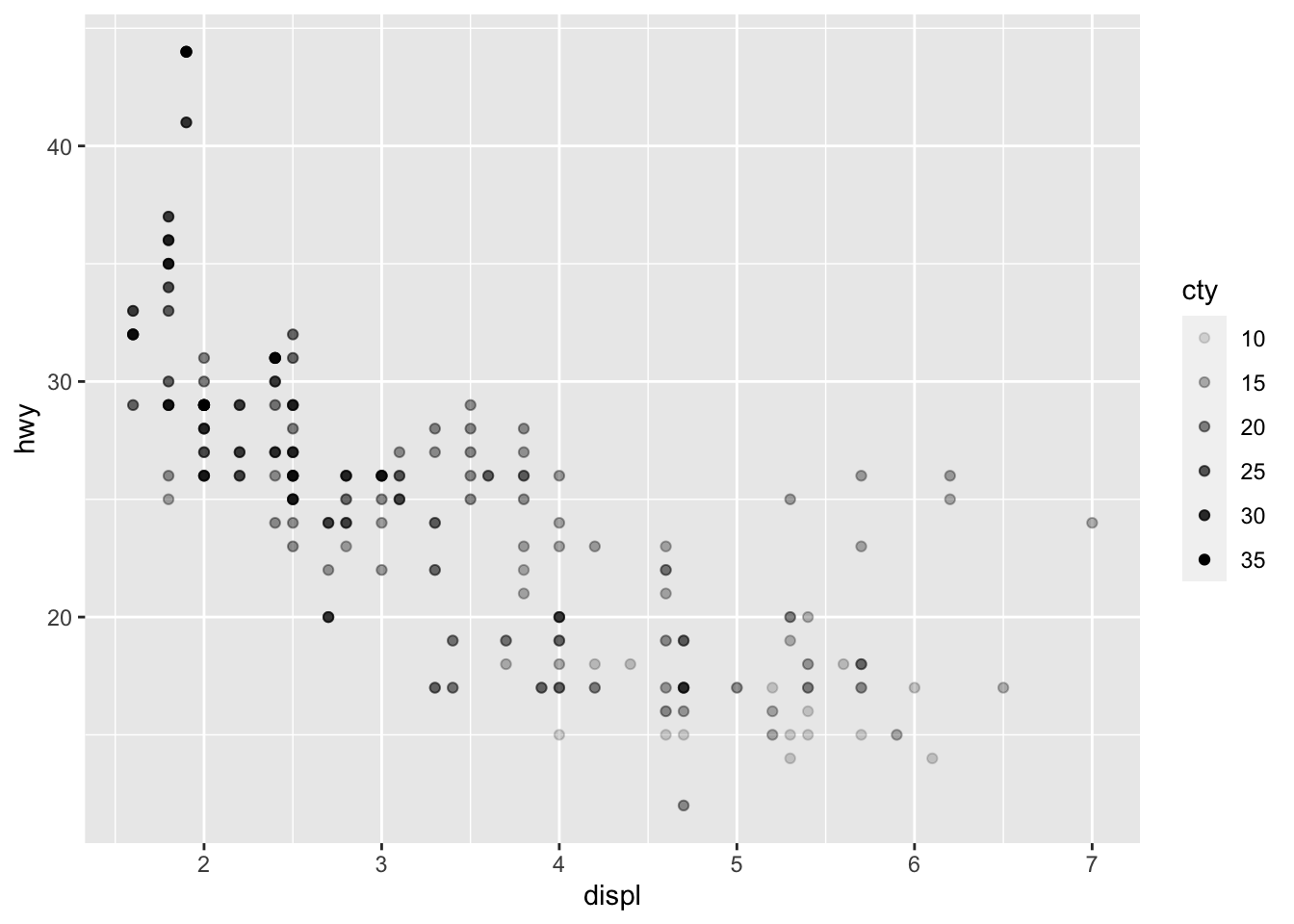
We can of course mix several options (shape, color, size, alpha) to build more complex graphics:
p + geom_point(size = 0.5) +
  aes(color = drv, shape = year, alpha = cty)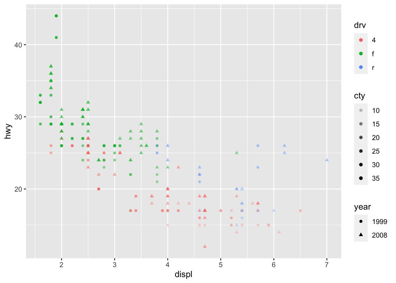
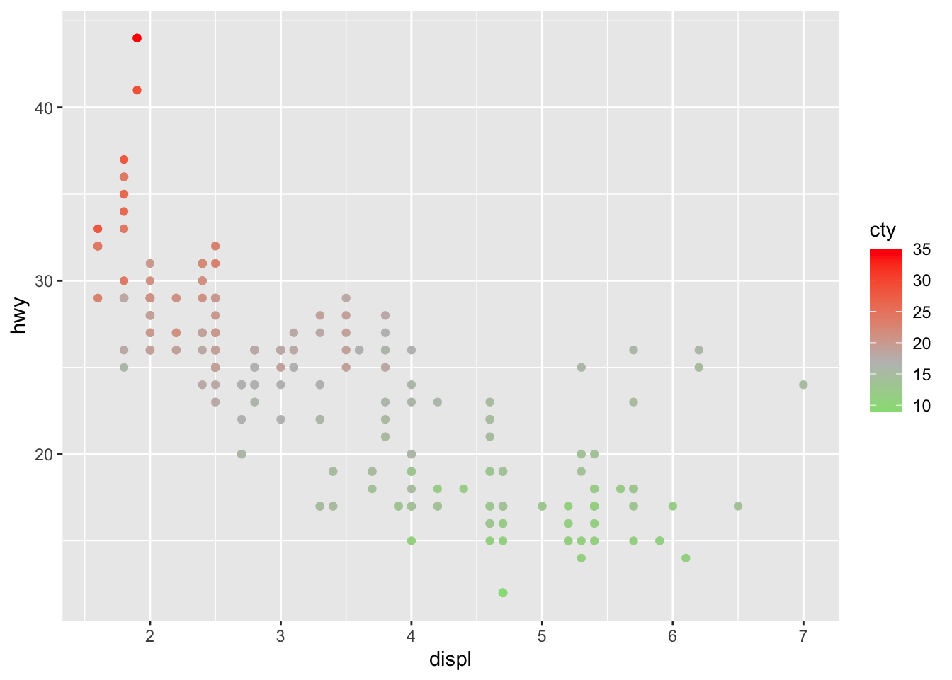
If you are unhappy with the default colors, you can change them manually with the scale_colour_manual() layer (for qualitative variables) and the scale_coulour_gradient2() layer (for quantitative variables):
# Change color based on a qualitative variable
p + aes(color = drv) +
  scale_colour_manual(values = c("red", "blue", "green"))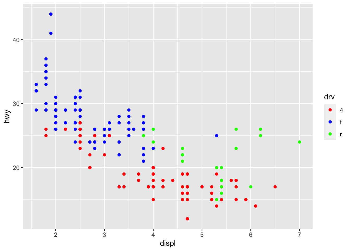
# Change color based on a quantitative variable
p + aes(color = cty) +
  scale_colour_gradient2(
    low = "green",
    mid = "gray",
    high = "red",
    midpoint = median(dat$cty)
  )
For your information, you can emulate {ggplot2} default color palette for a desired number of colors and produce a character vector of HEX colors. For example, with 4 colors:
library(scales)
show_col(hue_pal()(4))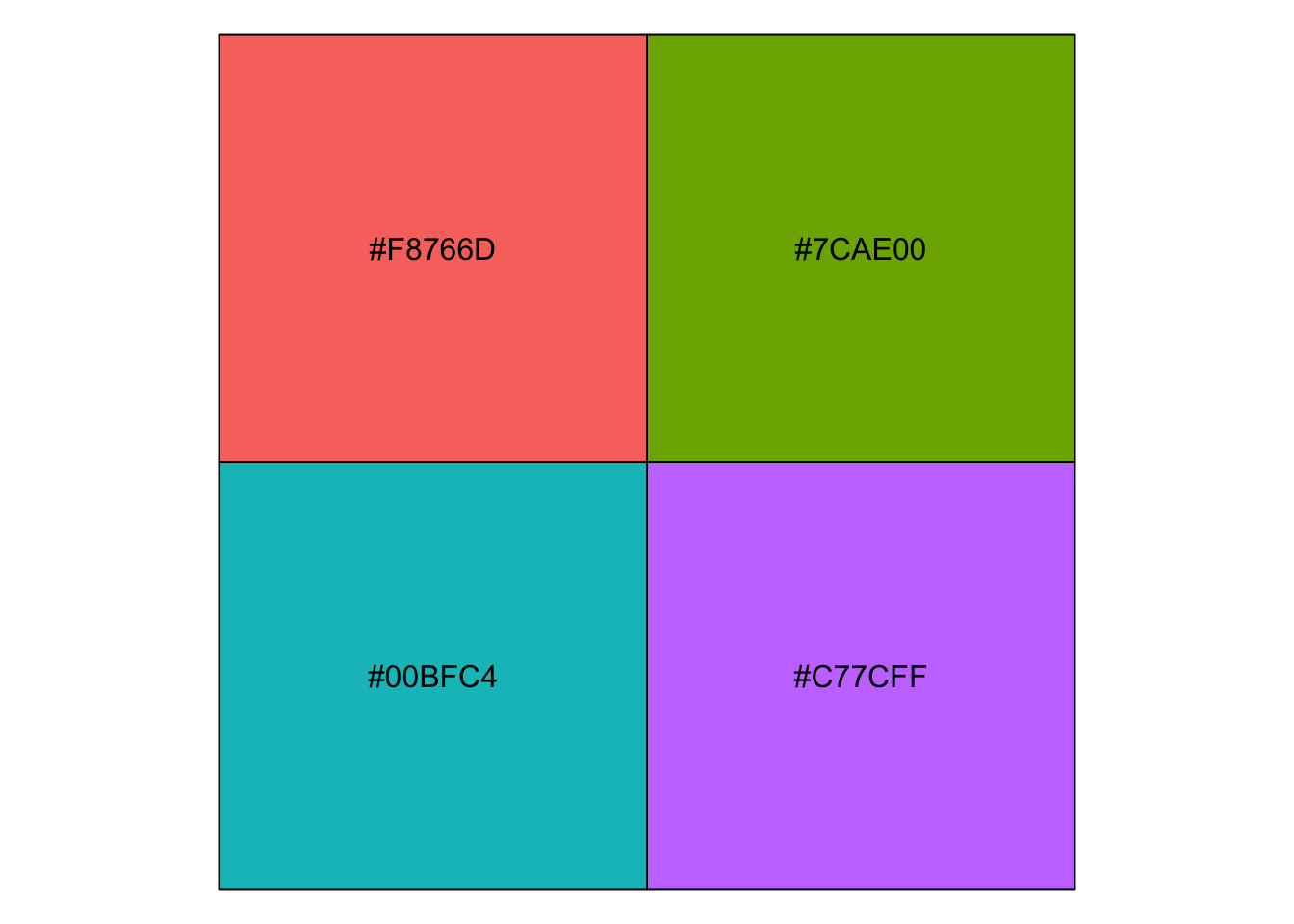
Text and labels
To add a label on a point (for example the row number), we can use the geom_text() and aes() functions:
p + geom_text(aes(label = rownames(dat)),
  check_overlap = TRUE,
  size = 2,
  vjust = -1
)
To add text on the plot, we use the annotate() function:
p + annotate("text",
  x = 6,
  y = 40,
  label = "hwy and displ are \n negatively correlated \n (rho = -0.77, p-value < 0.001)",
  size = 3
)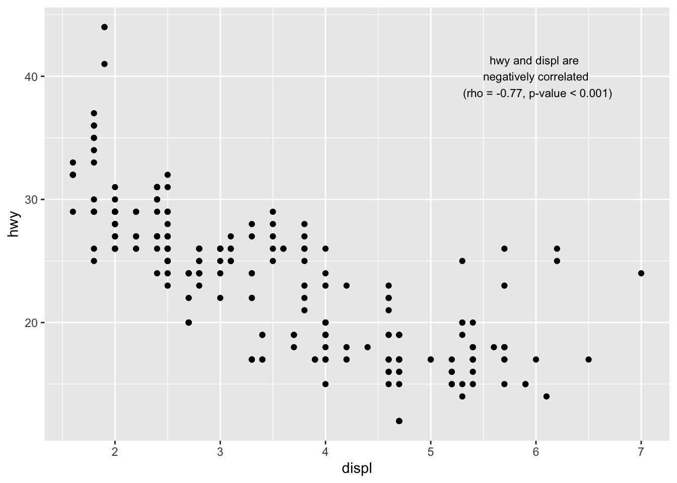
Read the article on correlation coefficient and correlation test in R to see how I computed the correlation coefficient (rho) and the p-value of the correlation test.
Smooth and regression lines
In a scatter plot, it is possible to add a smooth line fitted to the data:
p + geom_smooth()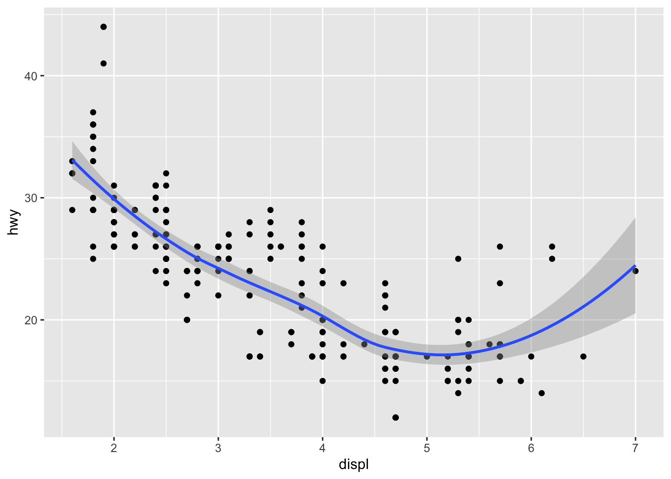
In the context of simple linear regression, it is often the case that the regression line is displayed on the plot.
This can be done by adding method = lm (lm stands for linear model) in the geom_smooth() layer:
p + geom_smooth(method = lm)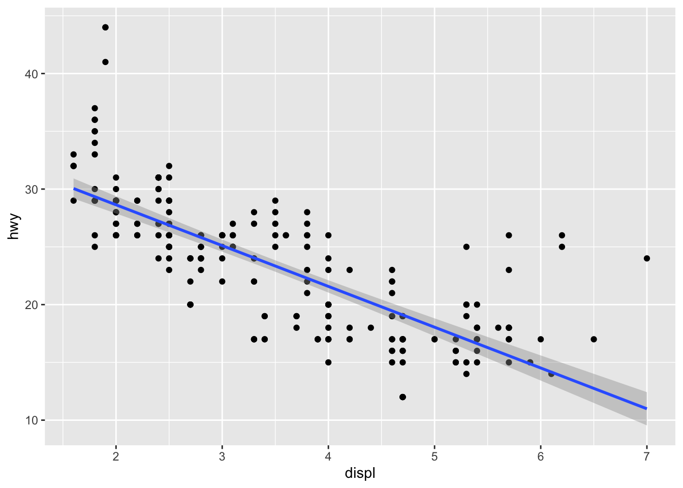
It is also possible to draw a regression line for each level of a categorical variable:
p + aes(color = drv, shape = drv) +
  geom_smooth(method = lm, se = FALSE)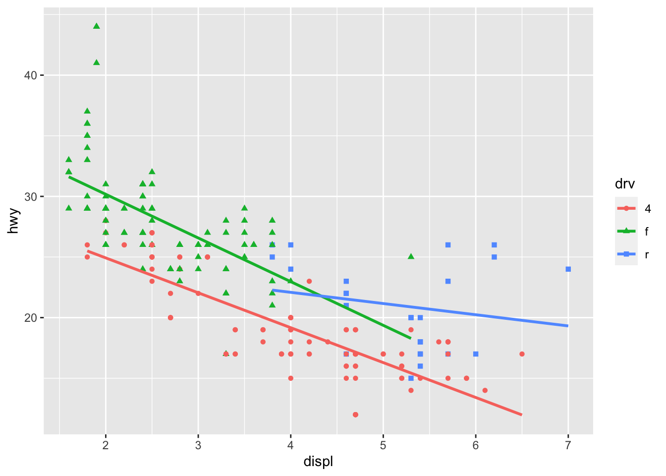
The se = FALSE argument removes the confidence interval around the regression lines.
Facets
facet_grid allows you to divide the same graphic into several panels according to the values of one or two qualitative variables:
# According to one variable
p + facet_grid(. ~ drv)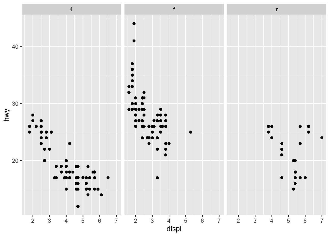
# According to 2 variables
p + facet_grid(drv ~ year)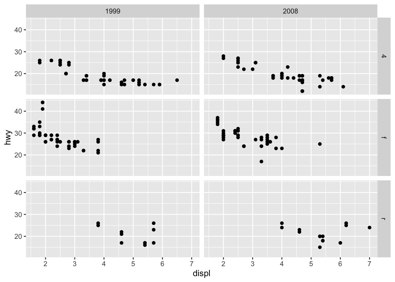
It is then possible to add a regression line to each facet:
p + facet_grid(. ~ drv) +
  geom_smooth(method = lm)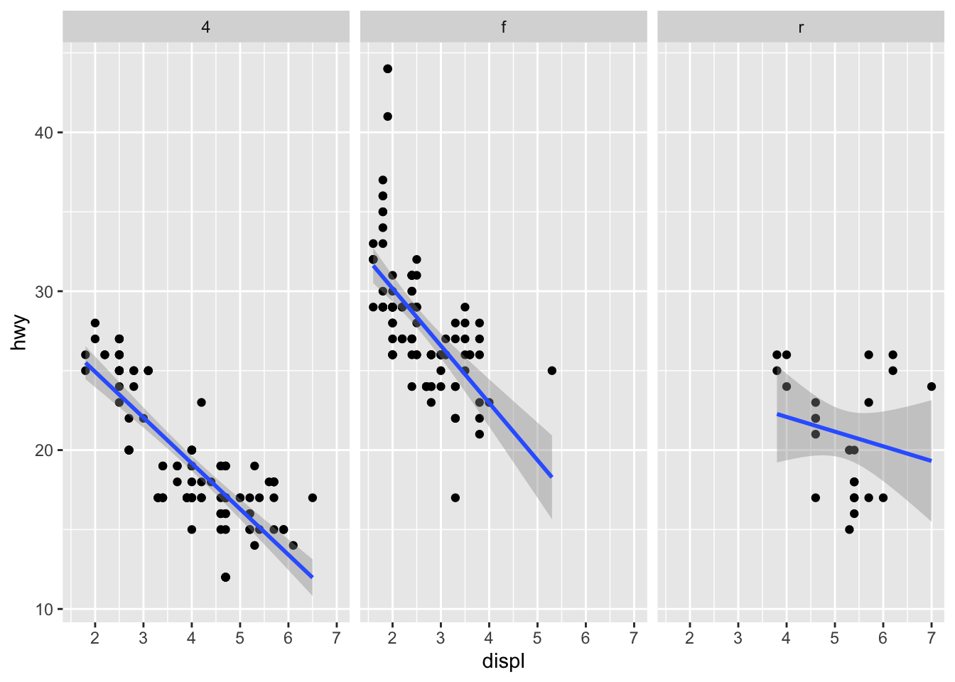
facet_wrap() can also be used, as illustrated in this section.
Themes
Several functions are available in the {ggplot2} package to change the theme of the plot.
The most common themes after the default theme (i.e., theme_gray()) are the black and white (theme_bw()), minimal (theme_minimal()) and classic (theme_classic()) themes:
# Black and white theme
p + theme_bw()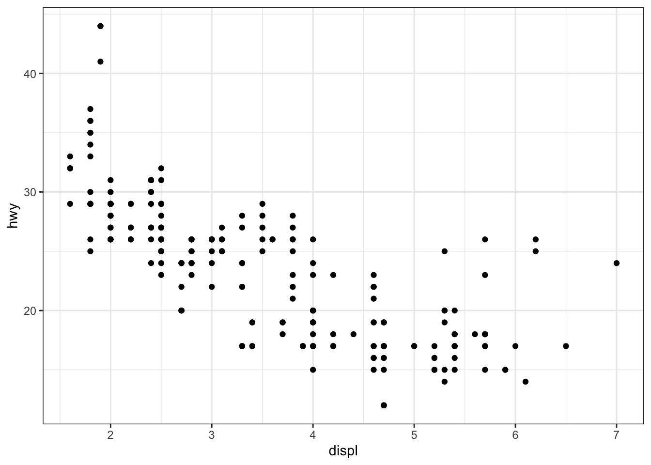
# Minimal theme
p + theme_minimal()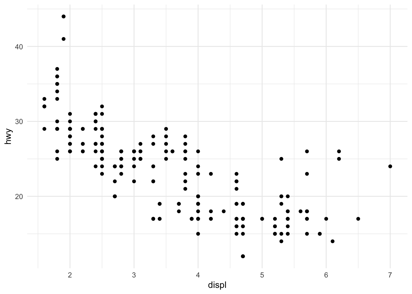
# Classic theme
p + theme_classic()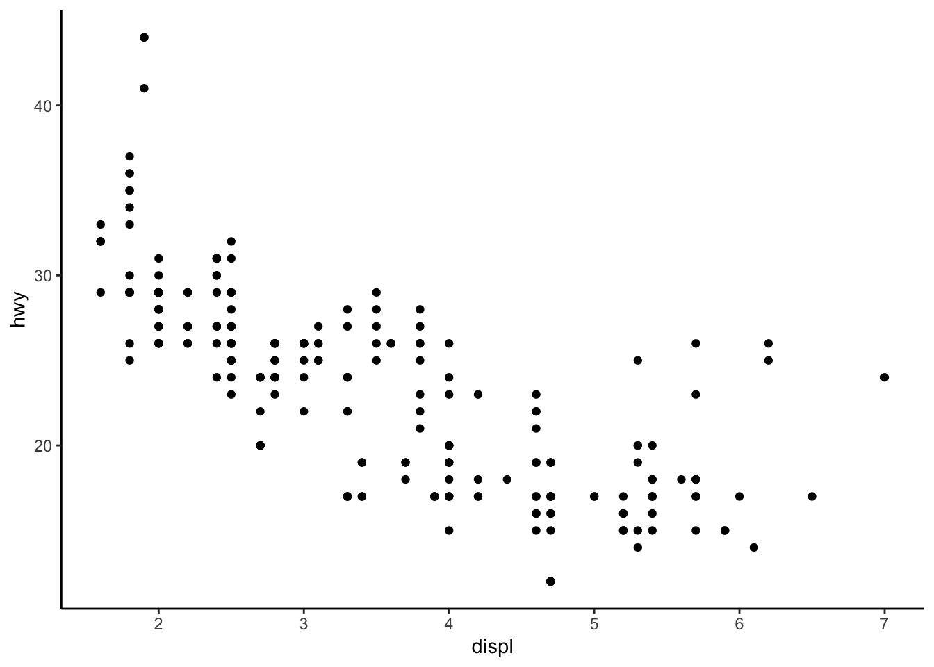
I tend to use the minimal theme for most of my R Markdown reports as it brings out the patterns and points and not the layout of the plot, but again this is a matter of personal taste. See more themes at ggplot2.tidyverse.org/reference/ggtheme.html and in the {ggthemes} package.
In order to avoid having to change the theme for each plot you create, you can change the theme for the current R session using the theme_set() function as follows:
theme_set(theme_minimal())Interactive plot with {plotly}
You can easily make your plots created with {ggplot2} interactive with the {plotly} package:
library(plotly)
ggplotly(p + aes(color = year))
You can now hover over a point to display more information about that point. There is also the possibility to zoom in and out, to download the plot, to select some observations, etc. More information about {plotly} for R can be found here.
Combine plots with {patchwork}
There are several ways to combine plots made in {ggplot2}. In my opinion, the most convenient way is with the {patchwork} package using symbols such as +, / and parentheses.
We first need to create some plots and save them:
p_a <- ggplot(dat) +
  aes(x = displ, y = hwy) +
  geom_point()

p_b <- ggplot(dat) +
  aes(x = hwy) +
  geom_histogram()

p_c <- ggplot(dat) +
  aes(x = drv, y = hwy) +
  geom_boxplot()
Now that we have 3 plots saved in our environment, we can combine them. To have plots next to each other simply use the + symbol:
library(patchwork)
p_a + p_b + p_c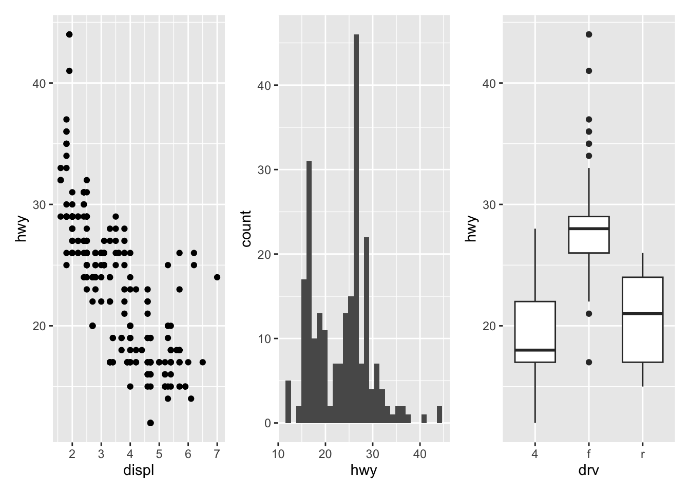
To display them above each other simply use the / symbol:
p_a / p_b / p_c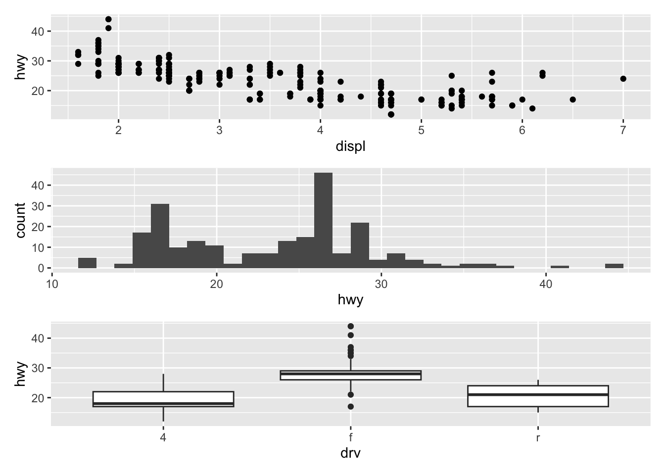
And finally, to combine them above and next to each other, mix +, / and parentheses:
p_a + p_b / p_c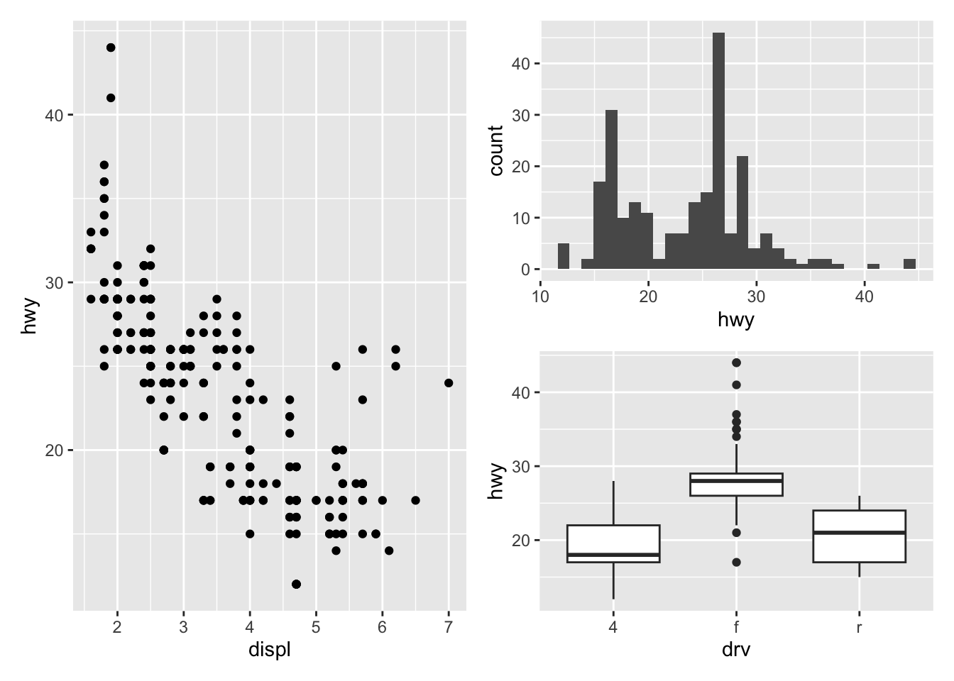
(p_a + p_b) / p_c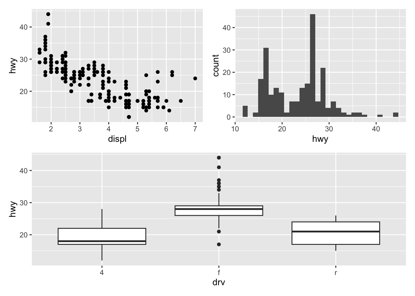
See more ways to combine plots with:
grid.arrange()from the{gridExtra}packageplot_grid()from the{cowplot}package
Flip coordinates
Flipping coordinates of your plot is useful to create horizontal boxplots, or when labels of a variable are so long that they overlap each other on the x-axis. See with and without flipping coordinates below:
# without flipping coordinates
p1 <- ggplot(dat) +
  aes(x = class, y = hwy) +
  geom_boxplot()

# with flipping coordinates
p2 <- ggplot(dat) +
  aes(x = class, y = hwy) +
  geom_boxplot() +
  coord_flip()

library(patchwork)
p1 + p2 # left: without flipping, right: with flipping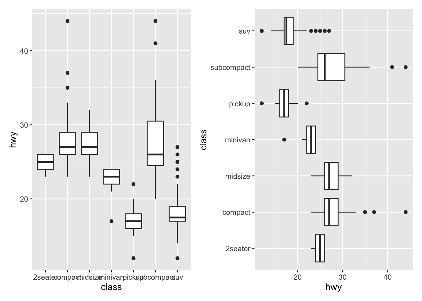
This can be done with many types of plot, not only with boxplots. For instance, if a categorical variable has many levels or the labels are long, it is usually best to flip the coordinates for a better visual:
ggplot(dat) +
  aes(x = class) +
  geom_bar() +
  coord_flip()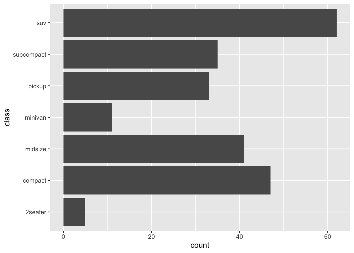
Save plot
The ggsave() function will save the most recent plot in your current working directory unless you specify a path to another folder:
ggplot(dat) +
  aes(x = displ, y = hwy) +
  geom_point()

ggsave("plot1.pdf")
You can also specify the width, height and resolution (dpi) as follows:
ggsave("plot1.pdf",
  width = 12,
  height = 12,
  units = "cm",
  dpi = 300
)
Managing dates
If the time variable in your dataset is in date format, the {ggplot2} package recognizes the date format and automatically uses a specific type for the axis ticks.
There is no time variable with a date format in our dataset, so let’s create a new variable of this type thanks to the as.Date() function:
dat$date <- as.Date("2020-08-21") - 0:(nrow(dat) - 1)See the first 6 observations of this date variable and its class:
head(dat$date)## [1] "2020-08-21" "2020-08-20" "2020-08-19" "2020-08-18" "2020-08-17"
## [6] "2020-08-16"str(dat$date)## Date[1:234], format: "2020-08-21" "2020-08-20" "2020-08-19" "2020-08-18" "2020-08-17" ...The new variable date is correctly specified in a date format.
Most of the time, with a time variable, we want to create a line plot with the date on the X-axis and another continuous variable on the Y-axis, like the following plot for example:
p <- ggplot(dat) +
  aes(x = date, y = hwy) +
  geom_line()
p
As soon as the time variable is recognized as a date, we can use the scale_x_date() layer to change the format displayed on the X-axis. The following table shows the most frequent date formats:
Run ?strptime() to see many more date formats available in R.
For this example, let’s add the year in addition to the unabbreviated month:
p + scale_x_date(date_labels = "%B %Y")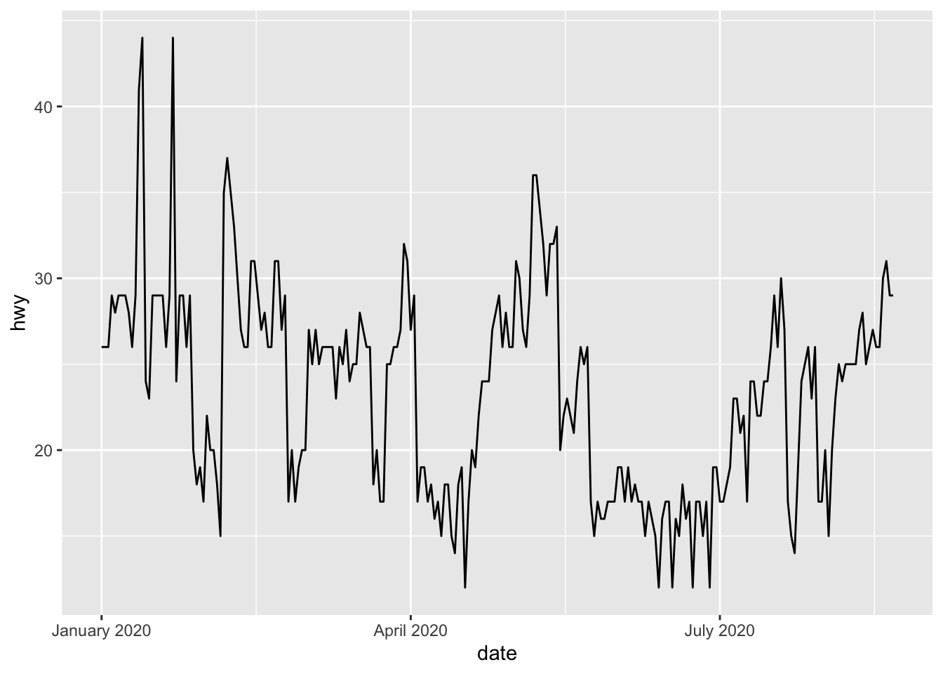
It also possible to control the breaks to display on the X-axis with the date_breaks argument. For this example, let’s say we want to display the day as number and the abbreviated month for each interval of 10 days:
p + scale_x_date(date_breaks = "10 days", date_labels = "%d %b")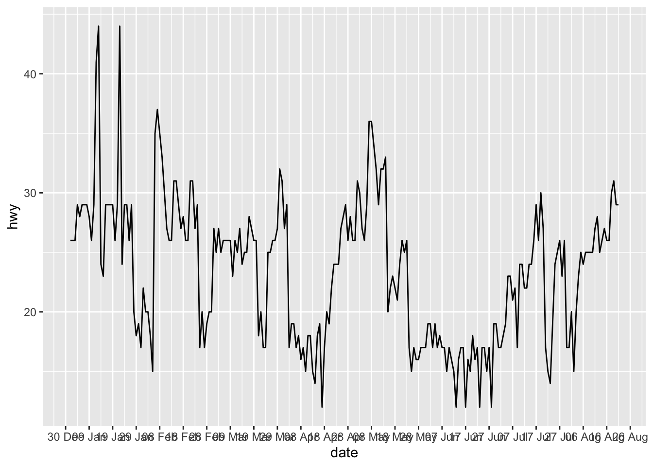
If labels displayed on the X-axis are unreadable because they overlap each other, you can rotate them with the theme() layer and the angle argument:
p + scale_x_date(date_breaks = "10 days", date_labels = "%d %b") +
  theme(axis.text.x = element_text(angle = 60, hjust = 1))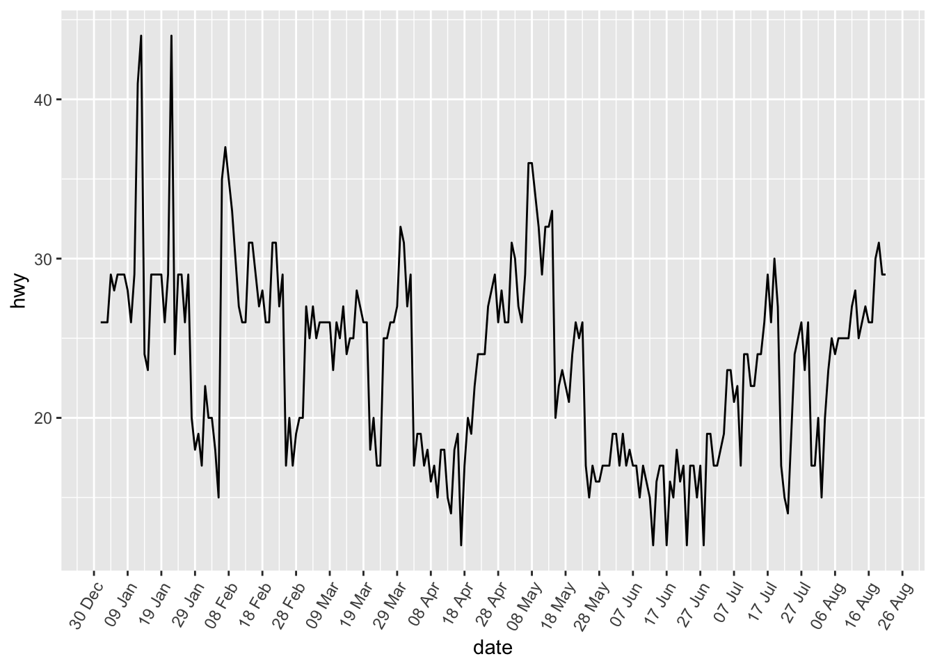
Highlight data with {gghighlight}
The {gghighlight} package allows, as its name suggests, to highlight some data directly on your ggplot. The highlighted data (that you define) are shown in bright color and the rest in gray.
Below example of how it works for a scatter plot, boxplot, barplot and histogram.
library(gghighlight)

# scatter plot
ggplot(mpg, aes(x = displ, y = hwy, color = cyl)) +
  geom_point() +
  gghighlight(cyl == "8") +
  theme(legend.position = "none") # remove legend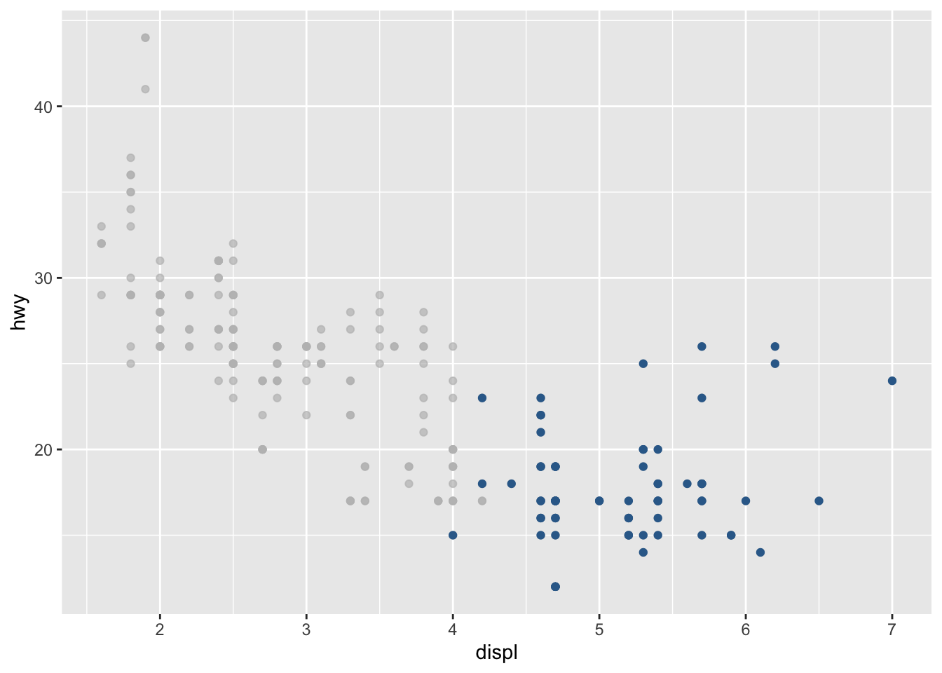
# boxplot
ggplot(dat) +
  aes(x = drv, y = hwy, fill = drv) +
  geom_boxplot() +
  gghighlight(drv %in% c("r", "4")) +
  theme(legend.position = "none") # remove legend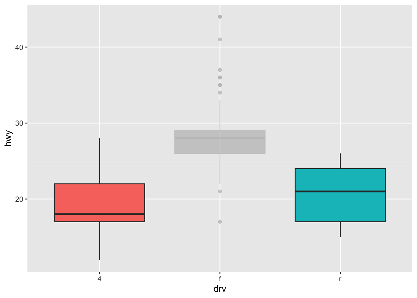
# barplot
ggplot(dat) +
  aes(x = drv, fill = drv) +
  geom_bar() +
  gghighlight(drv == "f")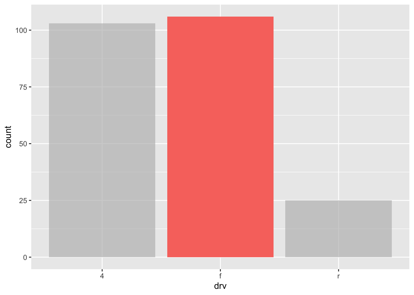
As you can see, the gghighlight() layer accepts different types of conditions, but also several of them at the same time:
# histogram
ggplot(dat) +
  aes(x = hwy, fill = year) +
  geom_histogram() +
  gghighlight(displ > 2 & year == "1999")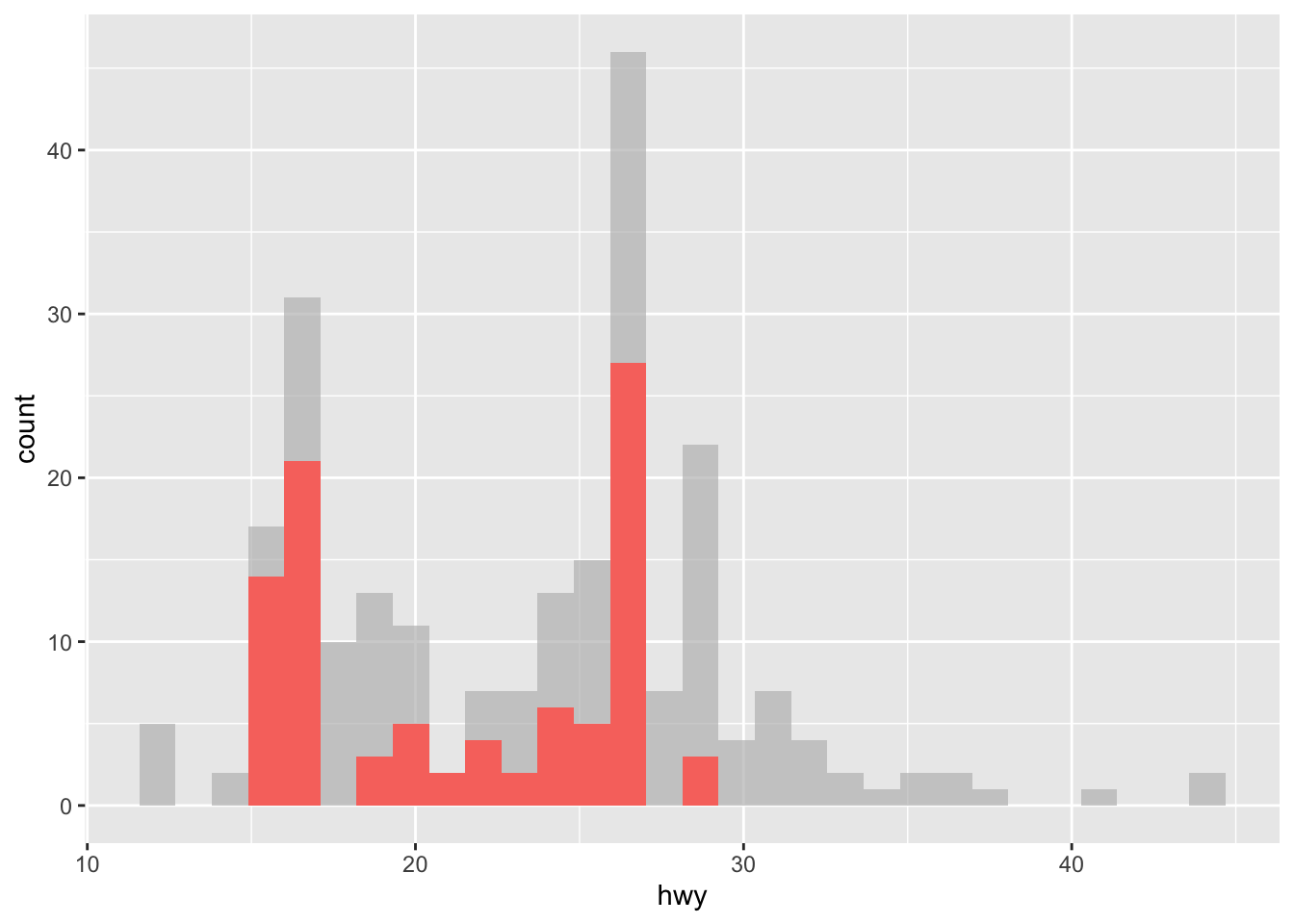
Tip
I recently learned a tip very useful when drawing plots with {ggplot2}. If like me, you often comment and uncomment some lines of code in your plot, you know that you cannot transform the last line into a comment without removing the + sign in the line just above.
Adding a line NULL at the end of your plots will avoid an error if you forget to remove the + sign in the last line of your code. See with this basic example:
ggplot(dat) +
  aes(x = date, y = hwy) +
  geom_line() + # I do not have to remove the + sign
  # theme_minimal() + # this line is a comment
  NULL # adding this line doesn't change anything to the plot
This trick saves me a lot of time as I do not need to worry about making sure to remove the last + sign after commenting some lines of code in my plots.
If you find this trick useful, you may like these other tips and tricks in RStudio and R Markdown.
To go further
By now you have seen that {ggplot2} is a very powerful and complete package to create plots in R. This article illustrated only the tip of the iceberg, and you will find many tutorials on how to create more advanced plots and visualizations with {ggplot2} online. If you want to learn more than what is described in the present article, I highly recommend starting with:
- the chapters Data visualisation and Graphics for communication from the book R for Data Science from Garrett Grolemund and Hadley Wickham
- the book ggplot2: Elegant Graphics for Data Analysis from Hadley Wickham
- the book R Graphics Cookbook from Winston Chang
- the ggplot2 extensions guide which lists many of the packages that extend
{ggplot2} - the
{ggplot2}cheat sheet - this presentation by Garrick Aden-Buie
- a detailed tutorial by Cédric Scherer
Conclusion
Thanks for reading.
I hope this article helped you to create your first plots with the {ggplot2} package. As a reminder, for simple graphs, it is sometimes easier to draw them via the {esquisse} addin. After some time, you will quickly learn how to create them by yourselves and in no time you will be able to build complex and sophisticated data visualizations.
As always, if you have a question or a suggestion related to the topic covered in this article, please add it as a comment so other readers can benefit from the discussion.
Use the
geom_jitter()layer with caution because, although it makes a plot more revealing at large scales, it also makes it slightly less accurate at small scales since some randomness is added to the points.↩︎Code inspired from Claire Della Vedova (DellaData) and Cédric Scherer. Thanks to both of them for this nice plot!↩︎
There are (at the time of writing) 26 shapes accepted in the
shapeargument. See this documentation for all available shapes.↩︎
Liked this post?
- Get updates every time a new article is published (no spam and unsubscribe anytime):


