The backing is warmer...
|
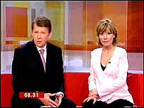
At the start of May, Breakfast moved to a new studio with a new look and two enormous video walls made up of several screens. Since then, we've been making a few minor changes.
But as of today, we've really warmed things up.
Breakfast's Editor David Kermode explains:
 We've been in our new home for a month now, so we've had time to settle in and listen to what our viewers think of our new look.

..and the clouds have gone
|
The general view appeared to be that, while our blue skies and cloud were light and bright, they looked a bit cold.
So, based on what Breakfast's loyal viewers told us, we've decided to warm it all up a bit, with some of the oranges and reds that we use in our opening 'titles', taken from images of sunrises around the UK.
 |
What you told Breakfast
 I like the new design of the set. It's reminiscent of early Picasso or George Braque perhaps! The only thing I'd quibble with is the colours used on the set: they clash with the ubiquitous pink that seems to be an unofficial BBC uniform. I like the new design of the set. It's reminiscent of early Picasso or George Braque perhaps! The only thing I'd quibble with is the colours used on the set: they clash with the ubiquitous pink that seems to be an unofficial BBC uniform. 
Leo Stephenson, artist, London
|
We've also made the design a bit more detailed, to cover some of the joins between our state-of-the-art screens.
Some of you said the joins - some called them 'cracks' - were irritating, so we've tried to deal with them.
Initially feedback seems really positive - and our viewing figures continue to rise, suggesting that we're hopefully getting it right. 
~RS~q~RS~~RS~z~RS~05~RS~)

~RS~q~RS~~RS~z~RS~05~RS~)