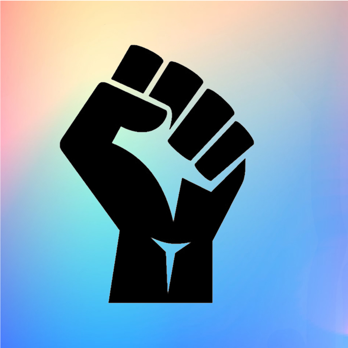
The Black Power Raised Fist
In the wake of the murder of George Floyd, we’ve seen this powerful icon as millions take to the streets in support of Black Lives Matter. The symbol came to prominence with the formation of the Black Panther Party in 1966 by Huey P. Newton and Bobby Seale, which sought black liberation and an end to racially motivated police brutality, which all sounds sadly familiar. The symbol was brought to life as a physical salute between members at conventions and other meetings.
It was quickly adopted as a gesture of strength and resistance: 1968 Mexico City Olympic medalists, sprinters Tommie Smith and John Carlos each donned a black glove and raised their fists while the national anthem played during the medal ceremony in a move (unfairly) decried by the US Olympic committee as violating “the basic standards of good manners and sportsmanship”. On release from prison after twenty-seven years in 1990, Nelson Mandela too raised his fist, signalling his resilience and heralding the start of negotiations to end apartheid in South Africa.
Black Lives Matter was co-founded by Alicia Garza, Patrisse Cullors and Opal Tometi in 2013 to campaign against and draw attention to ongoing, systemic racism towards Black people; and the movement has used the fist symbol since 2014, following eighteen-year-old Michael Brown’s death as he was shot six times by a white police officer in Ferguson, Missouri. The symbol rose to prominence as a representation of the “hands up, don’t shoot” pose; and has been widely used ever since in protest signs, as a physical gesture and on social media to signal strength and resistance. It became an emoji in 2015.
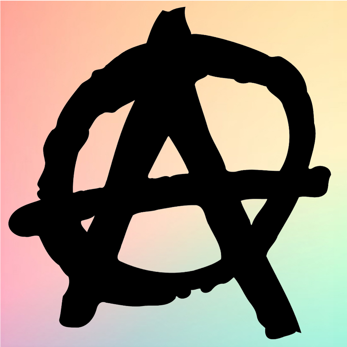
The Anarchist “Circle-A” Symbol
While anarchism—broadly speaking, a philosophy that rejects ideas of hierarchy, and prioritises collective self-organisation over state controlled rules—has a number of signs that denote an allegiance with its beliefs. Of these, the letter “A” enclosed in a circle is by far its most recognisable, though many anarchists are keen to emphasise the unimportance of symbols to anarchism as a political movement. The symbol proved particularly successful because the word for anarchism in many languages around the world begins with “A”; and it’s consistent across both Latin and Cyrillic scripts. The O (which forms the circle) references order, as the movement derives from French anarchist Pierre-Joseph Proudhon’s 1840 book What is Property?, in which he uses the phrase “society seeks order in anarchy”.
The Anarchist Writers website purports that the circled-A might be the group’s most famous symbol partly because “it lends itself so well to graffiti.” The symbol became particularly prominent during the 1960s and 70s: according to writer Peter Peterson, its “incredible simplicity and directness led [it] to become the accepted symbol of the restrengthened anarchist movement after the revolt of 1968”; referring to the year’s global movements that protested the US involvement in the Vietnam war and Soviet Union countries’ violation of rights such as freedom of speech under Communism. The year also included the rise of women’s liberation lobbying and the peak of the Civil Rights movement.
By the late 1970s the icon had become a touchstone of punk music, thanks largely to the band Crass: according to a 2005 piece in LA City Beat, Crass co-founder Penny Rimbaud first saw the symbol in France and “adopted it as just one of many symbols… always making a point to team it with a peace symbol, inevitably separating Crass from the thugs worshipping a different kind of ‘anarchy’.”
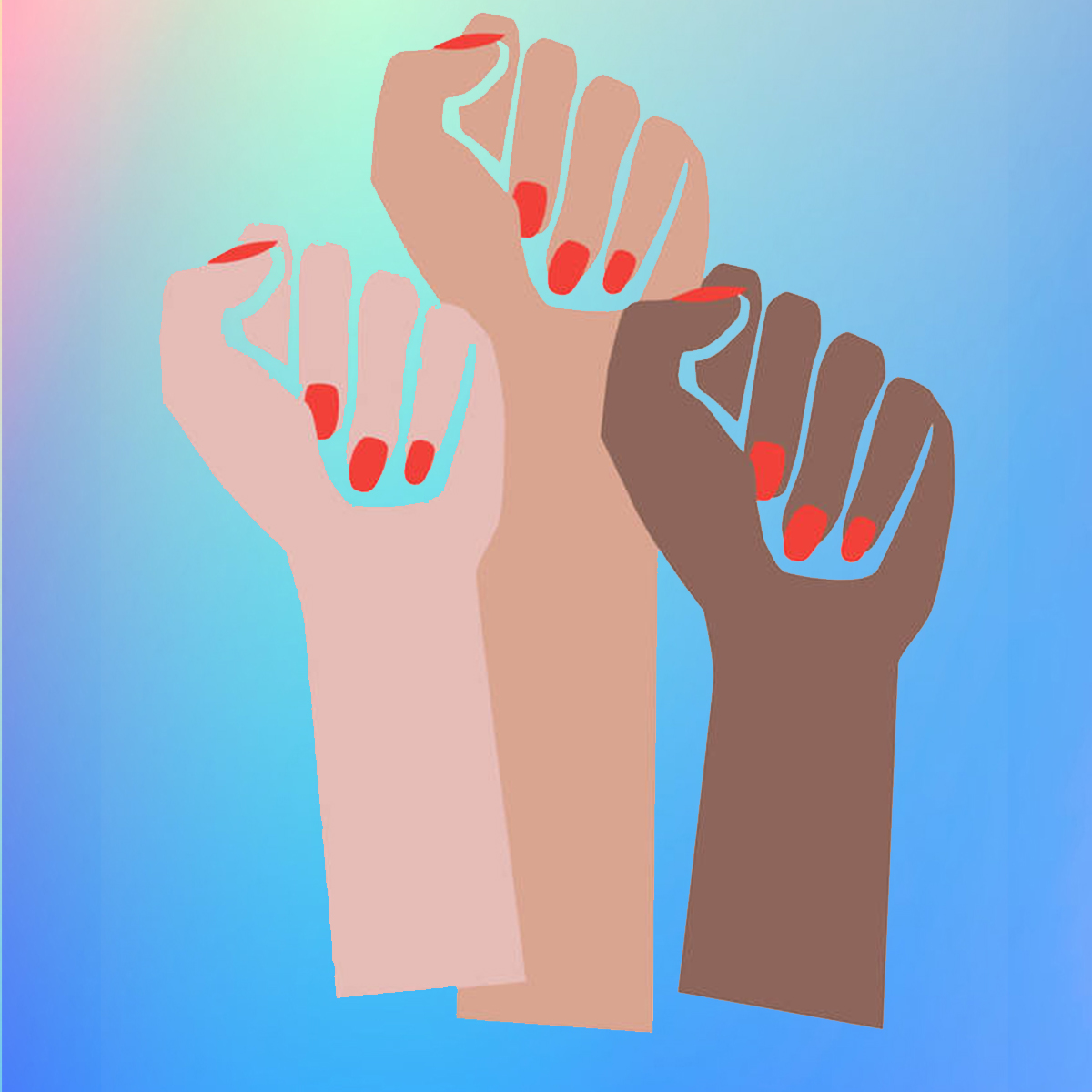
The Feminist “Femme Fists”
Brooklyn-based artist and designer Deva Pardue made headlines in 2017 when she discovered her Femme Fists design—which had been initially created ahead of the Women’s March—had been pinched for profit. Her distinctive illustration, which shows three raised fists of different skin colours, nails painted a bright crimson red, went viral on social media; the likes of Rihanna, Reese Witherspoon and Naomi Campbell shared it ahead of the protest.
A few months down the line, it seemed that Walmart-owned online retailer ModCloth had stolen the image wholesale (despite the fact it was copyrighted), plastered it on a t-shirt with the slogan “fight like a girl” and sold it for $29.99. While Pardue had been using the image for merchandise designs, her usage was as part of her design initiative For All Womankind. It was founded following Trump’s election in 2016 to raise money for charities such as the US’ Center for Reproductive Rights and Emily’s List, an American political action committee that aims to help elect Democratic female candidates in favour of abortion rights to office. Pardue has said that ModCloth initially ignored multiple cease and desist letters from her lawyer, and were infuriatingly slow to remove the t-shirt sales listing from their site, and also to respond to the designer’s requests to disclose the revenue it made, destroy any existing inventory and pay a retroactive licensing fee.
Speaking to Design Week, Pardue says her image was inspired by an unsuccessful search for “feminine-looking clenched fists,” finding that even those used for 1970s women’s movements “were all still quite aggressive and male looking.” Today there are certainly no shortage of them—Google feminine raised clenched fists for proof—though the designer demurs that this isn’t thanks to her image: “If I hadn’t done it then someone else would have.”
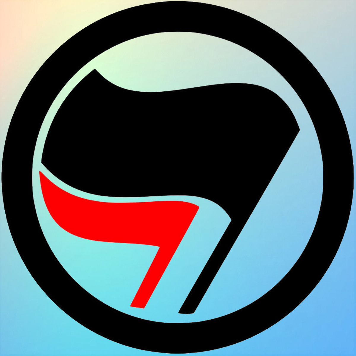
The Two-Flag Antifa Sign
The disparate Antifa movement—which isn’t a movement as such, more an umbrella term to describe various people and groups who are anti-fascist—has come to prominence again recently with Trump’s ever-ludicrous Twitter outlining blustering plans to designate it as a “terrorist” movement due to its small yet widely-reported presence in the Black Lives Matter protests.
Antifa was founded in 1932 as Antifaschistische Aktion, a Weimar Republic-based militant anti-fascist organisation, by members of the Communist Party of Germany (KPD), largely as a campaign during the German federal elections that year. This specific group was the precursor to the wider Antifa movement that has existed since; and the name abbreviation and its distinctive two-flag logo have been maintained (with slight modifications) to this day. The mark was designed by Max Gebhard and Max Keilson, who were members of the Association of Revolutionary Visual Artists, an organisation of KPD artists founded in March 1928 which produced posters, placards, and other propaganda graphics for Communist organisations.
According to a piece in Jacobin, modern-day Antifa “has no practical historical connection to the movement from which it takes its name, but is instead a product of West Germany’s squatter scene and autonomist movement in the 1980s.” The movement grew as the far right in Germany was rebuilding in the 1990s with mob attacks against asylum seekers; and Antifa gradually emerged as a national network of dedicated antifascist groups that were “expressly radical but vague and deeply heterogeneous in their specifics”, with Antifas outside of major cities often functioning “as a counter-cultural space with their own fashion styles, music scenes and slang, rather than a component of a rooted mass movement within wider society.”
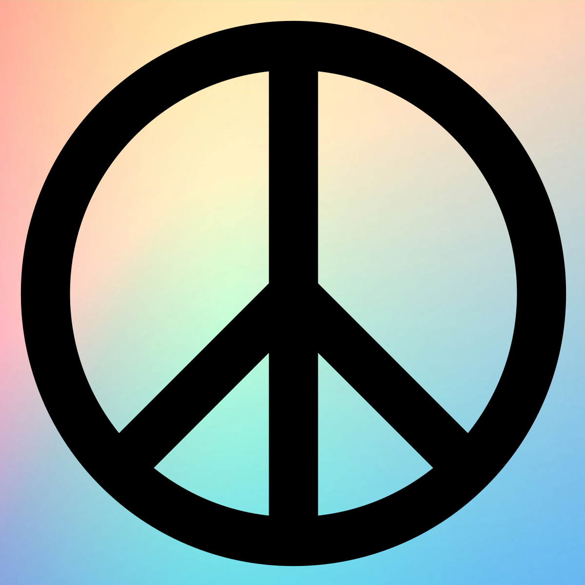
The Peace Sign
The symbol we understand today as representing peace—a circle halved by a central vertical line with two sloping lines emerging from it—is in fact the logo for the Campaign for Nuclear Disarmament (CND). The mark was designed by RCA grad Gerald Holtom in 1958, who had been invited to create artwork for the Direct Action Committee against Nuclear War (DAC). The vertical line represents the flag semaphore signal for the letter D, with its sloping lines representing the letter N as semaphore signals (the letters standing for Nuclear Disarmament).
The designer has reportedly said that the circular sign also represents despair; as the central line represents a person, the other two lines standing for their arms at their sides standing in front of a black, white planet Earth. “I was in despair. Deep despair. I drew myself: the representative of an individual in despair, with hands palm outstretched outwards and downwards in the manner of Goya’s peasant before the firing squad,” Holtom told Hugh Brock, editor of Peace News. “I formalised the drawing into a line and put a circle round it.”
According to the encyclopaedia Britannica, Holtom originally considered using a Christian cross “but disliked its association with the Crusades and ultimately chose something he considered to be more universal”. Though the symbol was specifically designed for the anti-nuclear movement, it was deliberately never copyrighted to allow for everyone to use it as a symbol of freedom without the need to seek permission.
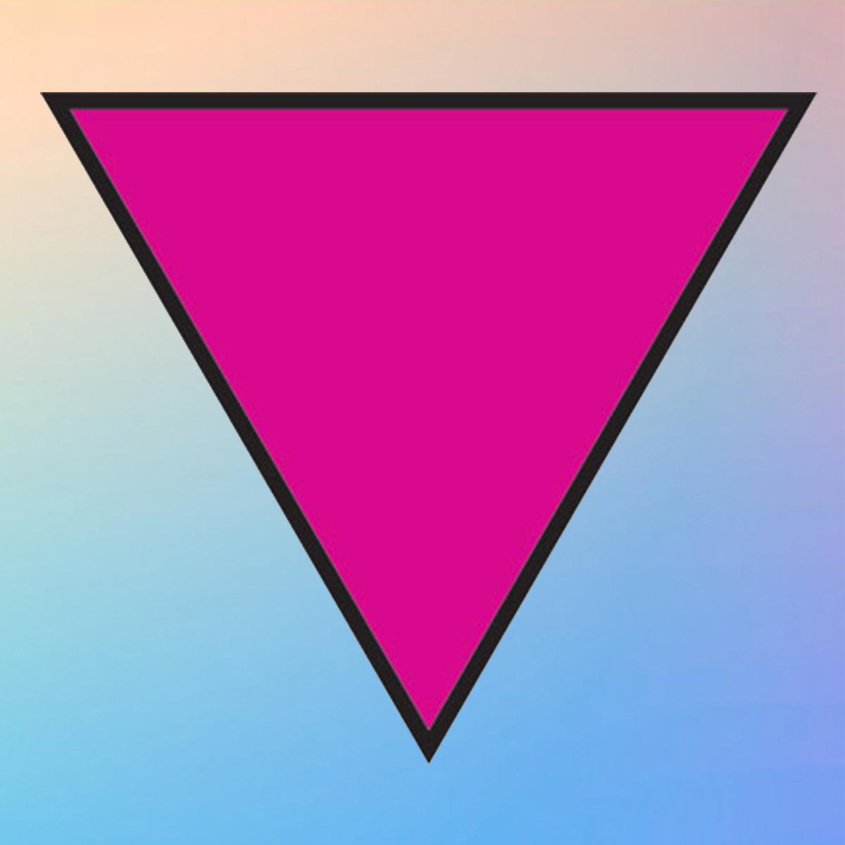
The Pink Triangle
While LGBTQIA+ rights groups use a number of symbols—a key one being the rainbow flag, now seemingly adopted as an unofficial logo for the NHS—the pink triangle is one of the simplest, most direct and widely-recognised signs for the gay community.
The symbol’s origins lie in the targeting of homosexuality by the Nazis when, in 1935, Hitler introduced the German legal clause Paragraph 175, which prohibited “same-sex fantasies, kissing, embracing and gay sex acts”. Around 25,000 people were convicted under the act from 1937 to 1939 alone, and were sent to prison, or later concentration camps, to be punished initially by sterilisation (usually castration for men) and in later years by death. The pink triangle was used in concentration camps, as each prisoner wore a sign that designated why they were incarcerated: red, for instance, was used for political prisoners; two yellow triangles overlapping to form a Star of David for Jewish prisoners; pink for homosexuals. According to Eastern Illinois University Centre for Gender Diversity, gay prisoners were given the worst tasks and hardest labour and faced frequent attacks from guards and other inmates, with “a great number of gay men” killed at Auschwitz. Between 50-100,000 gay men were estimated to have been killed during the Nazi regime, and countless homosexuals remained prisoners in the camps once the war was over as Paragraph 175 remained law in West Germany until 1969.
It was in the 1970s when gay liberation groups began to use the pink triangle as a sign of solidarity and pride as part of gay rights campaigning; harnessing its simplicity and the ease with which it can be recognised. The resurrection of the sign also looked to draw parallels between current and historical gay oppression and persecution. In the 1980s, ACT-UP (AIDS Coalition To Unleash Power) began to use an inverted pink triangle in its activism, having transformed the symbol to signify an active resistance.
In Elephant Academy’s mixed media online art classes you will learn different techniques that will allow you to create your own posters, symbols and illustrations. Classes for all skill levels available.