James Booth
The Gothic crown of Victoria belongs among that handful of coins which are regularly declared to be ‘the most beautiful in the English Series’. But what does it mean to describe the applied art of a coin as ‘beautiful’? In the case of the dekadrachms of ancient Syracuse or the didrachms of Thessaly, the question answers itself. Aesthetic appeal was clearly among the foremost aims of the makers of these coins. Some Syracusan die-cutters even signed their dies as works of art. More recently, the Committee on the Coinage set up in 1926 by the Irish Free State and chaired by the poet W. B. Yeats was charged with choosing designs of the ‘finest artistic effect’, in an assertion of cultural assurance exorcising centuries of oppression. The designs of the English engraver Percy Metcalfe, who won the competition (woodcock, pig, hen, hare, hound, bull, salmon and hunter), remain iconic examples of fine design.
But rarely in coinage are aesthetic motives so much to the fore. Artistic considerations may be of some relevance to the immobilised designs of late medieval pennies, florins, ducats, groats, dinars and dirhems. But the main motive is utilitarian: to reassure the user with familiar symbols of the power which guarantees the coin’s value, or, as in the case of the pennies of William the Conqueror or the European talers of the seventeenth and eighteenth centuries, to inspire awe for the monarch’s power and magnificence. It is this last motive which is most likely, if other circumstances happen to be right, to produce a ‘beautiful’ result. But, when the word ‘beauty’ is applied to a coin today, one suspects also that the gender of the monarch portrayed may be a factor. Coin collecting is a romantic pastime and the word ‘beautiful’ will perhaps come more readily to the lips of a modern collector when considering a 30 shilling sovereign of Mary Tudor than one of Henry VII, or a pound of Elizabeth I rather than Briot’s Scottish unite of Charles I.
In some cases, also, the pressures of the coin market compromise the evaluation of a coin’s ‘beauty’. Cataloguers and collectors overstate the attraction of the unfamiliar rarity in comparison with that of a commoner coin. The double leopard of Edward III is lauded above the more imaginative design of the commoner noble. Similarly lavish praise is heaped on William Wyon’s early proof five-pound piece of Victoria, whose faintly preposterous Una and the Lion reverse has a solemnity verging on the unintentional self-parody of ‘Victoriana’. In contrast the commoner Gothic crown, with its elaborate bust rather than high relief head, and its cross-of-shields reverse, retains a less ‘dated’ appeal.
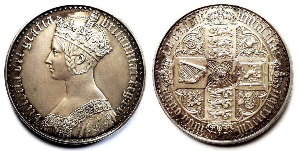
In the early nineteenth century, the Romantic Movement replaced the ‘neoclassicism’ of the Enlightenment with medieval, ‘Gothic’ styles in art and architecture. Three elements of the design of the Gothic crown manifest this ‘retro’ fashion. First there is the lettering, which is an exquisite Victorian reimagining of the Gothic scripts and typefaces of Northern Europe of the Medieval and Renaissance periods, familiar to us today from Tudor incunabula printed with ‘black letter’ type, or the prints of Dürer. The year this coin was issued, 1847, saw the opening of the Lords Chamber in the Palace of Westminster, designed by Charles Barry and ornamented with a profusion of gold-leaf gothic script by the Catholic convert, Augustus Pugin. But the script in the Houses of Parliament and on the coin shows a characteristic Victorian paradox. The immaculate precision of each letter manifests all the characteristics of industrial mass-production, making its effect far indeed from the quaint irregularities of real medieval black-letter type produced with wooden blocks. As with the pinnacles and crockets of Barry’s Houses of Parliament or the cast-iron columns of Victorian railway stations, a confident modern mastery of technology contradicts the archaic past which it nostalgically evokes. The Victorians’ medievalism is expressed with ultra-modern sophistication.
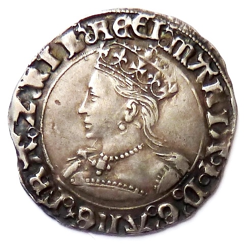
The second ‘Gothic’ characteristic is the medieval hairstyle with its long plait framing the ear, and the bodice with its square colletage and elaborate lacework, making the queen into a version of Madeline in Keats’s Eve of St Agnes or Beatrice in a painting by Millais or Dante Gabriel Rossetti. It is a style that would certainly have been attractive to Albert, the German royal consort, whom the queen had married in 1840. This English queen is at the same time a German Mädchen. The monarch also makes a personal appeal to the viewer as a glamorous celebrity. In a similar way photographs of the young Elizabeth II gave her a touch of the Hollywood film star. Victoria, here, with her half open lips is vulnerable and, very discreetly eroticised. This is a version of female royalty rare in earlier periods, though we can detect it perhaps in the bust on the first sole-reign groat of Mary Tudor, with its refined profile and flowing, unrestrained hair. Medieval romances were still popular in the Tudor period, and Mary has something of the appearance of a Lady from the world of chivalry. The coins of Mary’s sister Elizabeth also evoke the mystique of romance, but only rarely in her portrayals does femininity prevail over majesty.
It is Victoria’s femininity which, perhaps, made possible the third ‘Gothic’ feature of this crown: the crown itself. After the Restoration in 1666 Charles II had briefly reasserted the ‘divine right’ to kingship which his father had so sincerely, and disastrously, claimed. On his initial hammered coinage Charles wears the crown which he had so unexpectedly regained. But this bravado was short-lived. Charles II, unlike his father, was a modern pragmatist. On his subsequent milled issues he wears the Roman wreath seen on the ‘laurel’ coins of James I and also on the coinage of the republican Cromwell. Charles knew better than to tempt providence by insisting on the more archaic symbols of kingship. In what was now a ‘constitutional monarchy’ his subjects were beginning to see themselves as citizens rather than subjects. Perhaps, also, it seemed inappropriate to proclaim an out-of-date ideology on the new, machine-made ‘milled’ coins. For the best part of two centuries rulers were content to confine the wearing of crowns to their coronation medals. The circulating coins showed the less contentious image of a defender of a Roman res publica, the men wearing a wreath, the women a fillet.
But by the time of Victoria, the world had moved on. The republican spirit of the French Revolution had succeeded in crossing the channel only in diluted forms, and an idealizing medievalism gave support to political and religious atavism. By 1847 it seemed safe once more to show the monarch wearing a crown. And where better to do this than on a ‘crown’ coin? Victoria’s gender must surely also be relevant. On the head of a young woman the crown no doubt seemed less provocative than on the head of a man, incurring less risk that the ‘dei gratia’ in the legend would be take to mean literally what it said, as it had done to the followers of Charles I. Now, rather, it carried a Romantic, Anglican, metaphorical meaning. Like Mary this queen was again a figure of romance, but ‘romance’ revisited: performative and sophisticated. On a more abstract level Wyon’s artistic use of the silver medium in his portrayal of the young queen, is in itself subtly beautiful. The way that filigree lace and the delicate surface of skin are rendered through the relief and texture contrasts of this mutedly reflective metal is quite different from the bolder, sculpturesque effect at which Wyon aimed in the Una and the Lion coin, struck in highly reflective gold. The crown is analogous to an oil painting; the five-pound piece to a statue.
The gothic crown was struck first in 1847, eleven years after the queen came to the throne, when she was twenty-nine years old. The mintage was limited to 8000. The edge of most specimens bears in raised lower case gothic lettering, interspersed with roses and crowns: ‘decus et tutamen’ (‘an ornament and safeguard’, originally against clipping) ‘anno regni undecimo’. A few coins in the issue, like the specimen illustrated here, have a plain edge. A very small number of proofs was also issued with the date 1853. The 1847 coins had only limited circulation and the perfect preservation of many specimens has produced a strange market in which some collectors will pay prices many times greater than the EF value for specimens with a blue or rainbow-toned mirror finish. In early 2013, a coin with a patchy dark red and blue tarnish, far indeed from Wyon’s intention, and which to an inexpert eye quite spoils the visual impact of the design, was billed as ‘The Most Beautiful of all Gothic Crowns?’ and fetched more than $50,000 (inclusive). Alexander Pope derided pale antiquaries for poring over ‘the sacred rust of twice ten hundred years’. In our postmodern times, it seems, the ‘rust’ of a hundred and sixty years has even more value. The slippage of the word ‘beautiful’ from the design and fabric of the coin to its surface and colour, is amusing. All gothic crowns have the same design, and it is difficult to see how the chance effects of oxidization can make it more ‘beautiful’, except in the most trivial of senses.
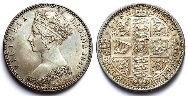
The Gothic bust and shield reverse of the crown proved popular, and the basic elements of the design were transferred two years later in 1849 to the first modern florin of two shillings.
This replaced the Gothic lettering with plain capitals, but bears a bust even more delicate and romantically feminine than that of the crown, with a fetching, slightly protruding upper lip. The archaic design was thus paradoxically used as the vehicle of the first step towards modernisation of the coinage. The coins bore the reverse legend ‘ONE FLORIN – ONE TENTH OF A POUND’. The mint can have had little idea that ingrained British conservatism would delay the completion of the planned decimalisation until 1971! In another sign of modernity the ‘D.G.’ claim of divine right was omitted, to the disapproval of religious conservatives. The coin is still primly designated ‘Godless’ in coin catalogues.
In 1851, the year of the Great Exhibition, the archaic script was restored on the new ‘Gothic florin’ (not illustrated here), which showed a simpler version of the shield reverse. The open lipped, girlish look was replaced with an image of regal formality, more appropriate perhaps to a monarch who presided over an international empire, presenting the public face of British imperialism and mercantile expansion. It was minted for the next thirty-six years, the bust becoming severer as the queen aged. In 1887 it was replaced by the ‘Jubilee’ designs, showing a quite different image of the monarch, now sixty-eight years old.