
In the three months since the Guardian redesigned and reshaped to tabloid size, readers have sent about 2,400 pieces of feedback. Broadly, the response has been positive. Most readers accepted the change as partly a necessary cost-saving measure in the face of difficult market conditions for newspapers. Expressions of loyalty towards the Guardian were a tonic. “Don’t worry, dedicated supporters will keep your GREAT PAPER going,” wrote a devotee.
At the beginning, 15 January, reflex responses – pro and con – had comparable intensity. But they soon gave way to a flow of thoughtful and detailed emails and letters. Some who welcomed the smaller size also focused on how the redesign had perhaps moved, or for space reasons dropped, aspects of the paper which they enjoyed. Specific puzzles or weather details or listings were missed, but the overall response to the layout and pacing of the paper was approving. Some early resisters warmed to the changes, others said they had adapted.
I put the main themes of readers’ responses to the designers and to the editor-in-chief, Katharine Viner. She is open to considering changes, within constraints of space and cost.
Wrote one reader: “The main body of your excellent newspaper in my hands has developed migratory tendencies.” Readers commented on how they disassemble the paper and share parts of it for simultaneous reading among members of their household, or take only one section with them on the bus or train.
The habits of many are matched by the stapled G2 and the well-received Journal section that can be removed whole from the centre of the main paper. Some lament that sport is no longer separate. A frequent request was for the main paper to be stapled, but the production process and the deadlines of the operation do not permit it.
I am told the initial boost that novelty and promotion gave to newsstand sales has eased back now, but subscriptions since the change have grown strongly.
A highly visible innovation was the introduction of patches of yellow. Adverse response was significant, and usage is being cut back. Viner says the technique will be used judiciously and “the randomness will stop”.
Although various readers perceived the body type as smaller, the ink less intense and the paper itself perhaps different, I am assured that the font size of the body type is fractionally larger and the ink and paper are the same.
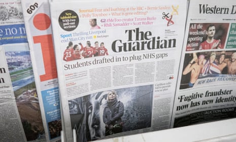
The change of masthead drew attention, partly because some readers thought it didn’t draw enough attention to itself on newsstands among its competitors. Watch though, it is evolving. More on this and other feedback in future columns.