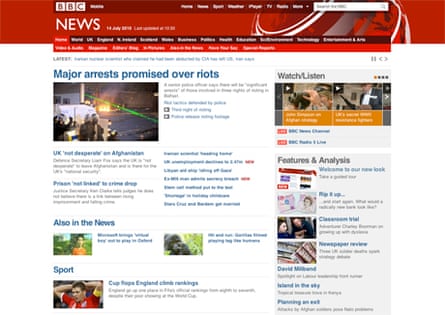
BBC News has a new look from today, the first major redesign since 2003.
It has everything you might expect from a 2010 redesign: share buttons for Twitter, Facebook, Digg, better links to related stories that provide context and a crisper, less cluttered design with more white space.
There's also more emphasis on video, with suggested video stories in a high-profile box on the top right of every page and a bigger, better quality video player.
Predictably, there have been more than a few teething problems. The new site doesn't seem to serve up an iPhone version, which means a "rilly rilly rilly rilly" tiny page that needs a lot of zooming in to read anything. On Blackberry, the old site is still being served up.
Journalist Louise Bolotin pointed out that the fully accessible site isn't ready yet. "Not good enough," she tweeted, and pointed to the BBC's explanation that it has removed the low graphics version of the site as part of the upgrade, but that a "suite of accessibility tools" would be added later this year.
That said, feedback on Twitter has been pretty balanced.
Jordon Dias: "I know: what happened to the internet generation being one of change? If people don't like it, they go elsewhere."
J Templar: Where previously there was simplicity, clarity and uniformity there is now a disjointed, & ugly disunity: http://bit.ly/9YuoPe
The BBC design is conventionally safe and easily navigable for its least web-savvy users, but is definitely more attractive, graphically stronger and rightly gives more prominence to video. There's also more white space on the home page which gives the impression that there's less on it, and much of the grumbles have been about a white gutter on the page.
As Labour candidate Luke Pollard said in response: "New look BBC website is like new look Facebook - I hate it today but will love it tomorrow."
That's normally the way we react to changes on sites we use the whole time, but after a few days we can't remember what they used to look like.
Ah, it's all part of a new 'global visual language'
In an introductory blog post, BBC News website editor Steve Hermann explained some of the research that informed the design:
"We talked to audience groups, held one-to-one user testing sessions, and invited several thousand of you to try out a prototype version of today's new design. With this feedback, we arrived at the design you see today," he wrote.
"There's also been some major behind-the-scenes work on our production system which means we'll be able to adapt even more quickly in future, whether to the changing expectations of our users or to new technology as it emerges."
The BBC's Future Media and Technology director Erik Huggers added that this redesign is the first to implement the BBC's new 'global visual language' that is eventually supposed to make the BBC's services look and feel more consistent. On the back end, the redesign has improved the content management system for journalists uploading text, images and video.
The BBC couldn't say exactly how many people worked on the project, but confirmed that the in-design team did consult external design experts.
"At the same time as the in-house team has been working on the News redesign, we have worked with Neville Brody and his team at Research Studios on establishing a new 'global visual language' to establish consistency in design and interaction across all of the BBC websites," said a spokesperson.
So... what's your verdict?
Comments (…)
Sign in or create your Guardian account to join the discussion