|
By Finlo Rohrer
BBC News Magazine
|

The Helvetica font is celebrating its 50th birthday. You've probably seen it a thousand times today. Why? At this moment in boardrooms across the globe, captains of industry are leafing through sheet after sheet of typefaces. There are hundreds of choices, but many of these movers and shakers don't take a lot of leafing before plumping for Helvetica.
We live in a world where we are surrounded 24 hours a day by adverts and corporate communications, many in typefaces chosen to subliminally complement the message.
 |
COMPARE MAJOR FONTS
Helvetica and its rivals
|
Helvetica's message is this: you are going to get to your destination on time; your plane will not crash; your money is safe in our vault; we will not break the package; the paperwork has been filled in; everything is going to be OK.
It is sans serif. There are no wiggly bits at the end of the letters. It has smooth, clean lines, and an unobtrusive geometry that almost suggests it was designed not to stand out.
Lars Mueller is a Helvetica devotee. He has published a book, Helvetica: Homage to a Typeface, and recently donated an original set of lead lettering to a Helvetica exhibition at the Museum of Modern Art in New York.
"It has a modern attitude which lines up with the aesthetic premises of the 1950s and 60s. Helvetica is a corporate typeface, but on the other hand it's the favourite of hairdressers and kebab shops. It is the butter on the bread."
|
 It also says bland, unadventurous, unambitious It also says bland, unadventurous, unambitious 
|
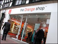
Gap, Orange, Currys, Hoover, Lufthansa, Panasonic, Royal Bank of Scotland, Tupperware, Zanussi. The list of brands that use the Swiss typeface - celebrating its 50th anniversary this year - would fill this page.
"It's durable. It comes from natural design forms. It doesn't have an expression of fashion. It has very clear lines and characters, it looks like a very serious typeface," says Frank Wildenberg, managing director of Linotype, the German firm that owns the font.
The typeface, inspired by the 1896 font Akzidenz Grotesk, was designed by Max Miedinger in 1957 in conjunction with Eduard Hoffmann for the Haas Type Foundry, in Muenchenstein, Switzerland.
As Wildenberg notes, its Swissness is part of the appeal. The land where clocks run meticulously and the streets are spotless carries the kind of cultural resonance that the logo makers and brand masters of the major corporations might like a bit of. For others, its neutrality is a platform for daring design.
The typeface's dominance over the past half-century, cemented by the release of Neue Helvetica in the 1980s, has now inspired a documentary, Helvetica, and exhibitions on both sides of the Atlantic.
Bland uniformity
But not everyone is a Helvetica lover. Type "I hate Helvetica" into Google and there are forums for people who rage at the mindless "corporate chic" of this dominant font. They see it as a vehicle for social conformity through consumerism, shifting product with a great big steam-roller of neutrality.
Clear and simple
|
Leading graphic designer and typographer Neville Brody, who sparked a spate of Helvetica use with his design for Arena magazine in the 80s, says the typeface represents a safe choice for businesses. "When people choose Helvetica they want to fit in and look normal. They use Helvetica because they want to be a member of the efficiency club. They want to be a member of modernism. They want to be a member of no personality. It also says bland, unadventurous, unambitious.
"Typefaces control the message. Choice of font dictates what you think about something before you even read the first word. Imagine Shakespeare in large capital drop shadow. Our response would be quite different towards the content."
It's perhaps understandable that corporations don't want to take any typographic risks, bound as they are by the bottom line. Choose a wacky typeface in your logos or advertising, and turnover may suffer. Helvetica, on the other hand, offers clarity and neutrality. When used in adverts, it is a platform for other parts of the message.
Nadine Chahine, who works in sales and marketing for Linotype, advises companies on what font to use.
"If you take a script typeface [with a handwriting-like appearance] and use it as the logo for a bank, there's a problem. You need something reliable - it's where you keep your money. It is not about a fun, personal message.
"It uses subliminal messages so that you get a feeling. All of these different meanings are implied within typefaces."
Hence the font Frutiger is used for airports and European motorway signs, New Johnston is the choice of London Underground, Cooper Black for Easyjet, and Dunkin Donuts bears the unmistakable Frankfurter font.
Default setting
But away from the boardroom, many ordinary computer users follow the same path of choosing fonts that say something about themselves when they send an e-mail or write a letter or CV.
You've probably endorsed Helvetica yourself by using one of its digital clones, the Arial typeface, to write e-mails - perhaps because it's easy to read, because it looks reassuring familiar or because it may be the default font on your system.
Others might use a Courier or a Times New Roman to impart their authority, or choose the cartoonish Comic Sans to go with their Mickey Mouse tie.

It speaks of reliability
|
And just as with the hegemonic Helvetica, these choices arouse strong feelings. There is a "ban Comic Sans" campaign, which has attempted to get legislation enacted in Canada. In Germany, the battle between typefaces ran alongside the country's turbulent history and struggle for national identity in the 19th and 20th Century.
Black letter Gothic typefaces like Fraktur were alternately endorsed and then banned by the Nazis. Now, despite being most associated outside Germany with footballers' tattoos and covers of heavy metal albums, there is still a group dedicated to its return to common usage.
Helvetica may be the most dominant of the fonts, but it has not squashed the opposition in either advertising or the e-mail. And whether you use it, or choose not to, you are sending out a message.
Here is a selection of your comments. Studies of reading speed and comprehension (Paterson and Tinker 1940) strongly suggest that all 'normal' typefaces are equally legible and that differences are perceived or learned. But try writing maths in a sans serif font and see what happens ...
Richard, Bath
Gareth, Beddoes, I use Comic Sans on my CV specifically to avoid working for people like you to whom presentation means more than content.
Ben, Phimai, Thailand
Coolvetica for me please, helvetica's know-it-all sister expanded to about 150% width. Serifs have gone the way of the nehru jacket.
rb korbet-wootton, brighton UK
I'm sure I read once that serif fonts are supposed to be easier to read on the page because the little tails and strokes help guide the eye from letter to letter. That's what the serifs are for apparently. Seems to be contrary to what people think here so is that theory total bunkum?
Paul, London
I can not believe that I am joining a debate on fonts. However, Beddoes of London blaming the prolilfic use of Comic Sans on women? Please! As a woman, I am offended by this. I am all up for freedom of speech, but please do not use Comic Sans to express it. Sorry, was this a discussion on Helvetica? Oh yes, sorry. Well, it's a bit 'new gastro pub' don't you think?
Laura, London
Two fonts walk into the bar, and the barman says, "sorry lads, we don't serve your type".
JB, Gerrards Cross
Helvetica is a very large type family, not just one face. Proper Helvetica is OK, clean and simple and well formed - but the digital so called clone Arial is horrid as are all such faces in my view, they lack the subtlety and elegance of the originals. But give me Gill Sans anyday, designed by stone cutter Eric Gill as a tribute to Johnston's competition (to design it) winning London Underground face. Both are based on straight lines and circles. The BBC uses Gill and it always looks cool to me. The digital clones don't look as good as the original in the case of Gill too. Like I say, proper Helvetica is OK. But don't get me started on Comic Sans..... I said don't....
Ian Kendrick, Wirral, UK
How dare Paris Hilton call our lives mundane when we can talk so passionately about fonts!
Mark, Chester
Typefaces can reflect cultural trends too- thinking-man's musician Max Tundra has a track named "The Gradual Disappearance From Food Packaging Of The Lettres Ornées Typeface Since The Nineteen Sixties". Once you recognise the font you'll see what he means!
Brother Wetlands, Bristol, UK
Helvetica, Like Comic sans, is a font that is easy to read and decipher becuase of its flowing, even curves and lack of serifs. They are ideal fonts for children learning to read and adults with reading/learning difficulties. Surely we should encourage and welcome the use of these fonts rather than ban them as boring and unstylish.
Simon Hunt, London
A Helvetica priest was trying to persuade a young couple to have their new baby baptised. "Sorry" said the mother "we do not want him Christened in your font.".
tony, Derby UK
This discussion is almost as important as whether cucumber sandwiches should be cut on the diagonal or the square
Barry P, Havant England
I'm a bit of fence-sitter when it comes to the relative pros and cons of Helvetica (I guess I get out quite a bit), but I do find it odd the Microsoft have decided to exclude it from Word 2007. I'm still allowed to write in 'Wingdings' (why?), 'Baby Kruffy' (I'm 31 years old) and Croobie (What a hoot!) but not bog-standard Helvetica. What's with that, Bill?
Andy Jackson, London
It's Verdana for me. It has Helvetica's clean lines, but with a modern sleekness. I like to think of it as Helvetica's sexier sister. And yes, I really should get out more...
Michael S, Lancaster
I am visually-impaired and find Arial or Verdana easier to read on screen but Helvetica is easy enough to read for print - Anything with fancy or with serifs makes life very difficult. I think the same applies to people with literacy difficulties as well
AJF, C Scotland
Much more important than the 50th anniversary of Helvetica, it's the 50th anniversary of Univers ¿ the thinking man's Helvetica. The former is just an amalgam of designs developing through the 19th century, while Univers is a truly groundbreaking design and the first real 'rational' type system. Thing is, you probably see Univers every day too!
Clive Bruton, United Kingdom
Think of the time those monks could have saved if they'd used Helvetica for their hand-crafted illuminated letters!
Andy Gallant, Leicester
Being an American graphic artist, I prefer Morris Benton's News Gothic over Miedinger's Helvetica, which is perfectly appropriate for contintental Europe, in the same way that Gill's Gill Sans belongs to the UK. But it sure is impossible to deny that Helvetica is the cream that has risen to the top. It is universal. It says us.
Mike Koppa, Viroqua, WI, USA
Anyone who uses 'Comic Sans' (what' so comic about it?) needs to be taken outside and shot! - espcially in serious work-related emails. Similarly, those using Times New Roman are compelling readers to squint and struggle to read the document. I support Helvetica for anything that requires clarity and ease of reading. The white space it creates on a page is also easy on the eye (I have written and maintained an 380 page NHS Trust formulary for years and have listened to what readers prefer...)
John, Altrincham UK
You're only really creative if you can be creative with Helvetica - This type face is perfect - It's all you need.
Rick, London
I went through a period when I was big into typefaces, and would go to the St. Brides printing library off Fleet Street. It's nice to be reminded of that period, and a dormant interest. I read then that "there is no such thing as a bad typeface", although I share a dislike for Comic Sans! Helvetica is clearly an excellent typeface, but seems to be getting blamed for sentiments aimed at the organisations using it. It's also worth noting that Serif typefaces are designed to help the eye read a large body of text (which is why Time New Roman was used by The Times newspaper), whilst Sans Serif is good for section titles etc. - it provides a useful contrast to the Serif font.
Turkeybellyboy, Newcastle upon Tyne
While it is important to chart the success and use of this typeface by companies such as Orange and Gap, it is also worth mentioning that the Helvetica that they use is not always the same one that you will find installed by default on your home computer. The more 'designed' version of Helvetica bears more resemblance with the original Haas Grotesque and is generally better known as Helvetica Neue, or even it's predecessor Akzidenz Grotesque. These come in a much wider array of weights and have a cleaner look than the standard installer fonts you get for free.
Karl Randay, Lichfield
Beddoes, you have nailed it. Comic Sans has to be the most inappropriately used font on the globe. If I receive an official memo or form by email created using this ghastly, on might say flippant typeface, I immediately have to change it all into a more sober and reflective one (such as our good friend Helvetica or even the much maligned Courier New - after all, we used typewriters for decades with no ill effects.) But, yes, Comic Sans - fine if you're doing a worksheet for kids, but in the adult workplace? On a C.V.? On an information panel or sign? Nein danke!
Gareth Davies, Manchester
Helvetica is a marvellous font. It looks clean and efficient, the epitome of good modernist design. Compare that with the fussy, stuffy, excessive formality of Times New Roman. It's the sort of thing Telegraph readers would send emails in. If they weren't still using typewriters.
Patrick, Leicester
Helvetica is a solid, plain and structured font that is incredibly easy to read. That is part of what makes it so useful for logos. It doesn't overshadown the name itself or the logo/colours that accompany it. I prefer fonts that are a little more decorative, and my faviourite is Garamond, which is more interesting than Helvetica and more round than Times New Roman, so it seems more friendly and less rigid than most other fonts.
Heather, Wolverhampton
Aaaaaggghhh - Helvetica! I hate this typeface, are people really that lacking in creativity that they have to slump for a font that is used on every other thing that you see! I would start a petition against it's use but it would probably be printed in helvetica or it's PC based twin Arial... Don't start me on Times Roman....
Chris Brown, Thame Oxfordshire
I think the more pressing issue here is to drum up support for the "Ban Comic Sans" campaign. I hate comic sans, it's everywhere. I'm looking at you girls! I also hate small business/pubs advertising local events using "Word Art" in Microsoft Word, which has not changed since 1997. Sort it out!
Beddoes, London
The MOD have many policies regarding documents, and the usage of fonts is included in that. Arial (strikingly similar to Helvetica) is encouraged to be used to ensure the legibility and clarity of a document, as well as to be as easy as possible for those with reading difficulties to absorb. Clarity over the zeitgeist is certainly preferable....I'm talking to you, "trendy" website designers!
KR, Cheltenham, UK
It all depends on use. Sans-serif fonts are simply ugly when seen on the printed page, whilst having the benefit of clarity on a screen (and it is about time we recognised that the two are very different media, working together, rather the replacing each other). Fortunately most of my work is still in print, so I can continue to use the far more elegant Old-Style Latin fonts (complete with Old-Style numbers, which most generic fonts ignore, spoiling the line of any text). Indeed my fiancee has just decided they look so much better as to have our wedding invitations etc printed in Old-Style. The early humanist printers (both French and Italian) had far more appreciation of the book as a thing, as well as a mode of communication, and that aesthetic feel is lacking in the modern typefaces.
Anon, Cambridge

~RS~q~RS~~RS~z~RS~58~RS~)
~RS~q~RS~~RS~z~RS~58~RS~)