Visualizing data isn't just about seeing numbers—it's about unlocking insights! 🚀 Swipe to discover how data visualizations can unveil the trends and patterns in your data to help drive impactful decisions. 👉 Click here to read the full blog: https://lnkd.in/e2JDHztQ
Flourish
Software Development
London, London 7,445 followers
Beautiful, easy, powerful data visualization
About us
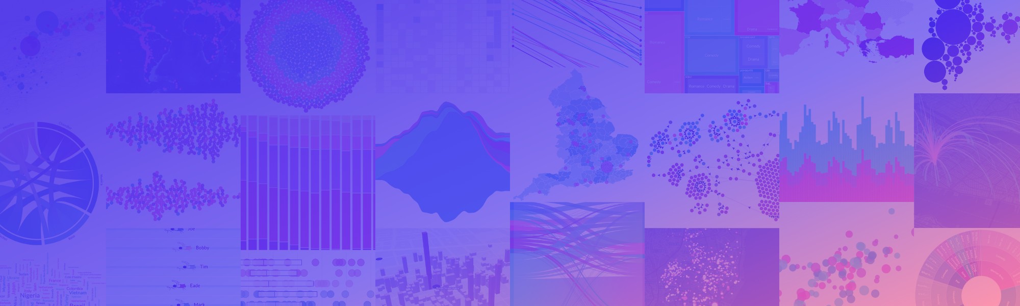
Flourish is a powerful and flexible platform for data visualization and storytelling. Flourish makes it easy to turn spreadsheets into world-class responsive visualisations, maps, interactives, and presentations. Flourish grew out of Kiln, the multi-award-winning data visualisation studio that has helped dozens of companies, governments, newsrooms, universities, and NGOs to visualize and tell stories with data.
- Website
- http://flourish.studio
External link for Flourish
- Industry
- Software Development
- Company size
- 11-50 employees
- Headquarters
- London, London
- Type
- Privately Held
- Founded
- 2016
- Specialties
- data visualisation, data analysis, charts , graphs, and maps
Products
![Click here to view Flourish]() Flourish
Flourish
Data Visualization Software
Flourish is a tool that enables everyone to turn their data into beautiful visualizations and interactive stories. It offers an unmatched selection of easy-to-use templates, from animating charts and detailed maps to rich data explorers. Each year tens of thousands of companies create millions of Flourish graphics that are viewed billions of times.
Locations
- Primary
Get directions
33 Hoxton Square
London, London N1 6NN, GB
Employees at Flourish
Updates
-
Curious to know how the Flourish team makes the most of Flourish? Here are some of our top tips and tricks for making the most out of the tool! Ready to give it a try? Get started now: https://lnkd.in/eStU74HR
-
Flourish reposted this
The Global Gender Gap is 68% closed and gender parity will be reached in 2154, according to the World Economic Forum. In this visual exploration, crafted by Vanessa Fillis and María Fernanda Callejón at Flourish, navigates the gender gaps from education to executive leadership. Data visualization brings clarity to complex issues, tracks progress, empowers advocacy, and fosters informed discussions towards tangible change. #GenderEquality
-
April 22nd is #EarthDay, a day dedicated to amplifying awareness, sparking positive change, and deepening our bond with the natural world. 🌍🌱 The theme for this year is planet vs. plastics, looking to spotlight the pressing issue of plastic pollution and advocate for a substantial 60% decrease in plastic production by 2040. We’ve created three charts to help emphasise the importance of this goal: 1️⃣ Grid of area charts - looking at the current state of plastic waste accumulating in oceans and rivers since 2000. 2️⃣ Bar chart - what are the prime culprits of contamination. 3️⃣ Line chart - the future facing us if we don’t improve the levels of plastic pollution.
-
Join us at the Best Countries reception at the Houses of Parliament! This year's BAV Best Countries Annual Report is a collaborative work between Flourish, WPP, and Canva. Together, we've turned complex data about how countries are perceived by the public, business leaders, and opinion makers into captivating visual stories. 🎨📊 Learn more about the creativity behind our 'Data Art' in our latest blog post: https://lnkd.in/epdP5Kyf
-
As the world prepares for the significant 2024 elections, understanding how to visualize electoral data is crucial. From pre-election polls to result coverage, there are numerous chances to craft engaging data stories. Join our webinar on Tuesday May 14th to learn how you can use Flourish to bring your data to life. Click here to register: https://lnkd.in/etq7diBE
-
Flourish reposted this
#30DayChartChallenge | Day 15: "Historical" In collaboration with Citizen Codex, I created this sunburst using data from The Nuclear Weapons System Project. We originally wanted to use this data to create a heatmap, plotting each country with its unique weapon types. However, we saw how adding a 3rd dimension (decades) brought many more insights to light around the historical development of these programs. The sunburst handled that 3rd dimension really well. I built this in Flourish and cleaned/styled in Illustrator. 💡 Lesson of the day: choose the visualization based on the data; don't squeeze the data into the visualization. (https://lnkd.in/eFUu2BkM)
-
Today marks the 112th anniversary of the Titanic's sinking, a tragedy that claimed an estimated 1,490 to 1,635 lives. The disaster sent shockwaves around the globe, sparking outrage over insufficient lifeboats, inadequate regulations, and the unequal treatment faced by third-class passengers during the evacuation. This visualization shows how survival chances varied dramatically, shaped by the 'women and children first' policy. Notably, it led to a tragically high fatality rate among third-class male passengers.
-
Legends aren’t just your chart’s sidekick - they’re storytelling superheroes! 🦸 Here are some of our tips on how you can use legends in your #data visualizations to supercharge your storytelling! Click here to get started with Flourish: https://lnkd.in/eCaGdh79
-
Flourish reposted this
🎉 Thanks to everyone who came along to ManyHands London this week - your enthusiasm and creativity made it a fun night! 🎉 Jane Minto showed us how to break down problems into their rawest form, and Luisa Bider gave an honest account of challenges product teams face when deciding what to build. We explored another randomly generated creative challenge: a health and wellbeing product for clowns 🎪 The teams came up with some cracking ideas: 🥧 Reduce clown anxiety with Trustpielot, the community app to help clowns protect themselves from unexpected pies to the face. "The pie is coming, are you ready?" 🧘♀️ "Made for clowns, by clowns". Introducing Unmasked, a reddit style support group for verified clowns to unwind & debrief on the trials and tribulations of #clownlife. 🫂 Prevent clown villains by protecting clowns' mental health triggered by crying toddlers. Welcome Circus, a safe space of community, therapy and coaching. --------- Fancy joining in the fun next time? Register your interest for our summer event so you don't miss out! --> wearemanyhands.com Brought to you by Digital Product People #productdesign #event #london #uxuidesign