Page MenuHomePhabricator

Come up with a better re-usable UI concept for a button to switch editor-mode; the current one is confusing, and hard to discover
Closed, ResolvedPublic8 Estimated Story Points

Assigned To
Authored By
Quiddity
Oct 23 2015, 6:57 PM
Referenced Files
F5976800: Screen Shot 2017-03-01 at 12.27.45.png
Mar 1 2017, 8:37 PM
F5976799: Screen Shot 2017-03-01 at 12.27.54.png
Mar 1 2017, 8:37 PM
F5955396: Flow-switch Copy 4.png
Mar 1 2017, 8:21 AM
F5942075: github2.png
Mar 1 2017, 4:27 AM
F5941425: Snímek_z_2017-01-18_19-23-04.png
Mar 1 2017, 4:27 AM
F5916721: Flow-switch Copy 3.png
Feb 28 2017, 12:54 PM
F5916715: Flow-switch Copy 2.png
Feb 28 2017, 12:54 PM
F5916728: Flow-switch Copy.png
Feb 28 2017, 12:54 PM
Tokens
"Like" token, awarded by Jan_Dittrich."Piece of Eight" token, awarded by RandomDSdevel.

Description

The single icon used in Flow to switch between wikitext-editing and visualeditor-editing is still very confusing, and also hard to notice, for many users.
We need a good standard design, before the design gets replicated in T49779: Provide a way for the user to switch between VisualEditor and wikitext source editor modes without saving.

Main problems

(Specific to the usage in Flow)

  • Using the same icon, (with a "pressed" and "unpressed" state) does not make it clear which editor-mode the user is currently in.
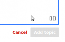
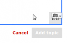
  • Placing just the icon in the bottom-corner, makes the overlap with the ULS keyboard-icon, more of a problem. (See image below).

(Relevant to usage in both Flow and non-Flow (articles, etc))

  • The icon itself is not representative of "visual editor", and hence is a bad icon to use for switching to the visual editor.
  • The icon is hard to notice, because it's such a simple grey, and made of basic geometric shapes, and tucked into the opposite side from all other toolbar buttons.
  • The icon is just an icon. It would be a lot clearer with a text-label, and is important enough to deserve it, just like "Cite" does in the current wikitext toolbar. (However, it would take up more room, and the exact wording is very difficult to decide - it would need to use a verb, and not use acronyms or codenames (i.e. "visual editor")). https://www.goodui.org/#47 ("Try Icon Labels instead of opening for interpretation.") is a good pattern for usability here.

Prior discussion

There is extensive discussion in T101316: Make the VE/source toggle more discoverable
There are still-applicable quotes from users about the previous icon (</>) at T110259: Change the </> button in Flow to something more intuitive, perhaps a text label for the button and a few related comments in T97451: Make source/wikitext icon consistent


Current status

Current Flow design:

Visual editing Wikitext
Selection_003.png (148×228 px, 3 KB)
Selection_008.png (143×223 px, 3 KB)

Current VisualEditor button, like Flow uses, at the right-side (in LTR languages) of the wikitext toolbar):

Screen Shot 2017-01-26 at 10.01.22.png (176×839 px, 33 KB)

Proposed solution

A drop-down at the toolbar that exposes explicitly both options, similar to the "style" option or the "list" one (more details in T116417#2955333):

Visual Editor Flow
VE-switch-right.png (690×1 px, 500 KB)
Flow-switch.png (490×811 px, 59 KB)

Additional considerations:

  • A label can be used in the drop-own when space allows (using icon-only version on more compact contexts).
Related Objects

Event Timeline

There are a very large number of changes, so older changes are hidden. Show Older Changes

@Esanders I don't think embedding an actual button select widget looks too cluttered with the extra borders. Here are some another possibilities I can think of:
Tab switching

pasted_file2.png (159×1 px, 19 KB)

Navy blue background (proposed by @Nirzar)
pasted_file3.png (159×1 px, 19 KB)

Gray-white switch
Nepojmenováno.jpg (159×1 px, 28 KB)

I see your problem with the ButtonSelectWidget Ed. But I think the issue of it being a bit cluttered can be managed, and the clarity it provides is worth the cost. I find the toggle switch above far from obvious.

This. It's the most immediately clear what's going on, which is... important.

Tab switching... works, but how well would it translate to other themes/skins? And is there anything else that would use this, or would this be a totally unique interface?

Navy blue background - this makes it unclear what all you're toggling between. You need to distinguish between the two things that are being switched between, and all the other things. This looks like you might be switching between the help
and the menu, too. Possibly even the save.

Gray-white switch - works, stands out from the things around it as well as the blue ButtonSelectWidge above, but this looks a bit out of place and doesn't really match the rest of it either. It is clear which thing is active, though, which is good.

I like the blue background version. @Isarra is right that we need to make it clear which choices are part of the toggle. Isarra, I believe that is why Ed had added an extra, inner border. I'm sure that with proper assistance from Design, the issue can be managed. Perhaps @Pginer-WMF would like to step in?

Tab switching... works, but how well would it translate to other themes/skins? And is there anything else that would use this, or would this be a totally unique interface?

Flow:

Snímek z 2017-01-18 19-23-04.png (119×680 px, 10 KB)

Navy blue background - this makes it unclear what all you're toggling between. You need to distinguish between the two things that are being switched between, and all the other things. This looks like you might be switching between the help
and the menu, too. Possibly even the save.

I think the issue of it being unclear can be managed, e.g. both blue (below) or the WE button's background light blue or something similar.

pasted_file3.png (159×1 px, 19 KB)

To illustrate the problem with the MW theme, here are two tools in a group:

pasted_file (159×1 px, 27 KB)

The slight inner shadow makes it less obvious that those two tools form one control.

Yeah, the principal problems are connection and weight. They need to be obviously a pair of controls that provide the options (including in disabled mode), and yet not take up too much cognitive weight. In particular, they should be less prominent than the most important button on the page (immediately to the right), the save button.

(We also need a design to use for mobile-sized screens, of course; the current switching via a cog menu is a little too hidden, but we have precious little space.)

Embedding an actual button select widget looks cluttered with the extra borders:

pasted_file (159×1 px, 27 KB)

Yeah. Maybe we could tone down the borders in this case, without making it too weak? The extra borders drag the eye away from the rest of the controls.

@Esanders I don't think embedding an actual button select widget looks too cluttered with the extra borders. Here are some another possibilities I can think of:
Tab switching

pasted_file2.png (159×1 px, 19 KB)

Sadly, this fails to associate which options are which. I know that you can only pick the pencil or the brackets, but how does a user know that the menu isn't a third choice? There's no affordance.

Navy blue background (proposed by @Nirzar)

pasted_file3.png (159×1 px, 19 KB)

This has the same problem as the above, but also adds having two primary buttons in an interface at once (which is a violation of the design principles).

Gray-white switch

Nepojmenováno.jpg (159×1 px, 28 KB)

This feels a little heavy, but it could work.

Flow:

Snímek z 2017-01-18 19-23-04.png (119×680 px, 10 KB)

In Flow you can get away with something like this, because there's nothing else around it to confuse the issue (at least, for now). However, the plan is to have the same control everywhere to hook in to user familiarity, so I'm not sure we could use this model. When we release the editor widget for Flow/etc. to use, it'll be a real pain to have to reach in and replace such a core part of the widget.

The problem with most of the proposals is that there is no clear grouping of the two icons that is necessary to tell you that it is a binary switch. Is the hamburger menu icon another edit mode?

The problem with most of the proposals is that there is no clear grouping of the two icons that is necessary to tell you that it is a binary switch.

This.

Is the hamburger menu icon another edit mode?

Yes, though without the usual pointy marker, which is odd.

pasted_file (159×1 px, 27 KB)

Yeah. Maybe we could tone down the borders in this case, without making it too weak? The extra borders drag the eye away from the rest of the controls.

This might be your best approach if you can make them fit the colouring of the rest of the toolbar. There's likely to be other use cases that merit these down the road, too, so establishing a good way to embed these in a toolbar here only seems like a good thing.

This might be your best approach if you can make them fit the colouring of the rest of the toolbar. There's likely to be other use cases that merit these down the road, too, so establishing a good way to embed these in a toolbar here only seems like a good thing.

The dark blue doesn't work, but recolouring an existing widget to fit in the toolbar seems like introducing more UI inconsistencies. I can't think of other prominent use cases.

One possibility worth considering is to use a drop-down at the toolbar that exposes explicitly both options, similar to the "style" option or the "list" one:

VE-switch-initial.png (690×1 px, 493 KB)
VE-switch.png (690×1 px, 500 KB)

Some thoughts:

  • This solution avoids adding additional options to the top level toolbar, which is already crowded. In a 1024px wide display (iPad-like) there is not much room already.
  • Existing patterns are reused. The switch will be provided in a similar way as other frequently used options such as styling or bullet lists. While switching editing modes is a common action, I'm not sure we should emphasise it over using bold, creating lists or adding images.
  • The drop-down menu allows to provide an explicit description of both actions, which helps users make more clear what to expect before using them. The initial discovery still depends on the icon recognition, but being it a dropdown makes it more inviting to check its options without fearing unexpected side effects. It is easier for a user looking for the way to view the source to check the dropdown than to try to act on an action or toggle with unclear consequences. In addition, a tooltip currently announces when the preferred editor is selected initially in Visual Editor which helps to introduce the feature the first time already.
  • Keyboard shortcuts provide a way for experienced users to switch quickly between modes once those are discovered.

VE-switch.png (247×1 px, 89 KB)

In the example above I was using the icon to represent the current mode. It is also possible to make the dropdown to become a general "view" menu where the different ways to view a document are shown (which could include more modes in the future such as "preview" or "mobile" views):

VE-view.png (690×1 px, 500 KB)

I really like @Pginer-WMF solution, it is much better than any other one in this discussion

+1 @Pginer-WMF – think it makes the state switch very clear with the simple addition of the dropdown.

I did have a few minor suggestions building off this proposal:

pasted_file (951×1 px, 361 KB)

  • Label the dropdown when it is a wider screen and collapse to an icon-only dropdown when narrowed – this helps add clarity to somewhat unknown symbols (source editor especially) for the average desktop user.
  • Move the Help, 'Edit notices' and 'More options' controls so that they are with the other controls in left-hand side (LHS) of the toolbar. This groups things that relate to editing the page on the LHS, and 'higher' level actions to change the state of the editor and save on the RHS.
  • Move the Omega icon for inserting a symbol out of the toolbar and instead make it a menu option under the 'Insert' dropdown. This not only helps reduce space in the toolbar, but also since the omega symbol alone is not a very recognizable icon, nor does it appear to be so widely used as to warrant prime real estate on the toolbar (<-- though happy to be corrected if this is not the case)
@RHo
  • +1 to putting the Symbol button in the Insert menu.
  • +1 in principle to spelling out the Source/Visual menus in wide mode.
  • I think the Help and 'Page options" menus may want to stay where they are, as they seem to relate directly to the editor. (Though I don't know where the LHS menu is, admittedly.)
  • is the button you're calling "Alert" the "Edit notices" button? What does it do? (I looked for it in the VE Help, btw, but it's not there...)

Hi @jmatazzoni – apologize for the jargon, by LHS I mean the left-hand side of the toolbar where actions that related to text editing are located.
And yes, I meant the 'Edit notices' button – have edited my comment to clarify.

I was not that familiar with how 'Edit notices' works in VE to be honest, but seems like usage is restricted to administrators and template admins on article pages, based on the info from this guide: https://en.wikipedia.org/wiki/Wikipedia:Editnotice

For what it's worth, I found the following example of an Edit notice on a user page in VE vs source mode... depending on if there is any action that can be taken from it perhaps 'Edit notice' should appear as an icon on the toolbar at all but sit outside of the editing space as the full notice does in source mode.

VE mode
pasted_file (1×2 px, 276 KB)
Source
pasted_file (1×2 px, 296 KB)

The Omega icon is apparently not movable: T93243#2354640

The Omega icon is apparently not movable: T93243#2354640

I see that @Esanders comments on this, saying:

Special character is a separate tool because it is a toggle button for the panel, mostly because we couldn't find a place for a hide button in the special character panel.

That would seem to be a surmountable problem (easy for me to say, I know). E.g., couldn't the Special Character panel become a pop-up window, like the Media window?

I'd suggest creating a separate ticket for the omega button discussion. There are several solutions that can be considered (e.g., adding a close action to the panel to make it independent of the action that opens it) and it is more of an VE-specific issue, while the editing mode switch also applies to other contexts such as Flow.

To avoid the proposals for editing mode switching to get lost into the comments I created a section in the ticket description on top with a summary of the proposal. Feel free to keep updating it as more clarity is reached through the comments.

I'd suggest creating a separate ticket for the omega button discussion. There are several solutions that can be considered (e.g., adding a close action to the panel to make it independent of the action that opens it) and it is more of an VE-specific issue, while the editing mode switch also applies to other contexts such as Flow.

Great idea, anybody please help to add some basic information from this discussion.

'Edit notices' includes warnings about page protection and messages that people have created about the page. They can (usually/the way we typically configure sites) only be created by admins, but they're shown to everyone. Go to the English Wikipedia's main page, find today's featured article, and open it in the visual editor to see one such edit notice.

Thanks @Whatamidoing-WMF. Now I know! (BTW, there was a formatting issue with the notice, so I filed T156407.)

I think we should go with the dropdown. I would suggest using the '[[ ]]' icon in both states as it is instantly recognisable (we have yet to find a great icon for "visually edit") - there is precedent using one of the tools' icons for the toolgroup icon with the bullet list toolgroup.

@Esanders The dropdown could be a solution for T153306 too, both these options in the right of the top bar would help to keep design unified.

And as @Tgr mentioned in that task: "the usual advice for dropdown buttons is to make sure you don't put behind them anything that's not reachable in other ways, since not all users recognize the control", there is no obstacle, because these options are reachable from the buttons above (Edit + Edit source)

@Esanders, sorry, I must have missed a step; but re. this suggestion:

I would suggest using the '[[ ]]' icon in both states as it is instantly recognisable (we have yet to find a great icon for "visually edit") -

You are not, I hope, talking about adopting the Flow solution, where clikcing [[ ]] literally means both "switch to wikitext" and "switch to visual"?

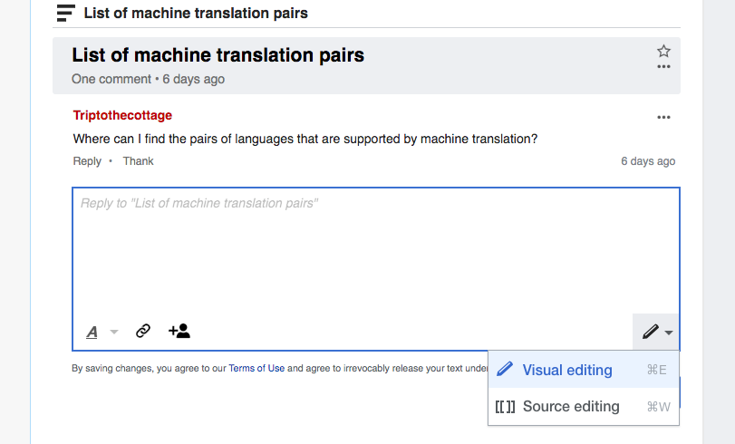
Not quite, it will look like the proposal below, but the button that launches the dropdown will always be the '[[ ]]' wikitext icon with a small triangle next to it. In the dropdown itself the icons will be as pictured below.

Flow-switch.png (490×811 px, 59 KB)

Change 339959 had a related patch set uploaded (by Esanders):
Use list tool group for editor switching

https://gerrit.wikimedia.org/r/339959

@Esanders , thanks, but i still don't understand why you say you "would suggest using the '[[ ]]' icon in both states." If we're using a pencil to symbolize visual editing, as above, then presumably the icon would switch between visual (pencil) and wikitext (brackets) as the user switches modes, no? I had the experience recently of literally not understanding how to switch out of wikitext mode in Flow, because it simply never occurred to me that clicking on the "recognizable" (as you say) Wikitext icon would be my route to get to visual edit mode. I KNEW there had to be a way, yet I couldn't find it.

If we don't like the pencil, we should find something better (easier said than done, I'm sure). But simply avoiding it in situations where it is indicated because we like the other icon better does not seem logical to me, assuming I understand the proposal properly.

We could create a new icon combining the edit pencil and the [[]] perhaps?

Or make it textual (e.g. "Mode v")?

Or make it textual (e.g. "Mode v")?

Given the main problem is "this is too wide and not understandable", a text label which will be dozens of characters in some languages and still totally confusing is not a good direction.

Note that we don't need an icon that tells the whole story, we just need an icon that users looking for a different editor expect to find options about it. Some options for the visual to code transition:

  • The pencil could read as "you are editing the document", and invite you to check in which other ways the document can be modified. Those expecting a way to modify the code may want to check if that option is provided there.
  • The eye icon could read as "visual editing", but it can also read as "view modes", where a user looking for the code view may look for such mode.
  • I'm not sure the wikitext icon works as a generic entry point for the available modes or announces the current one ("visual editing" in this particular scenario) for users to figure out there are more.

I illustrate the possibilities described:

A. Pencil for visual mode B. Eye for visual mode C. Eye for the general entry point D. Code for the general entry point E. Pencil for general entry point
Flow-switch.png (490×811 px, 59 KB)
Flow-switch Copy 3.png (490×811 px, 59 KB)
Flow-switch Copy 2.png (490×811 px, 59 KB)
Flow-switch Copy.png (490×811 px, 59 KB)
Flow-switch Copy 4.png (490×811 px, 59 KB)

I think the questions to ask are:

  • Is it clear in which mode I am, or how to figure that out?
  • If I'm looking for a different mode ("like code editing"), is it clear where to find it?

I think options A, B or C can work (with different strengths and weaknesses), but in option D it is confusing to know in which mode you are in since we are telling you the icon you see in the "visual editing" mode means "source editing".

Change 339959 merged by jenkins-bot:
Use list tool group for editor switching

https://gerrit.wikimedia.org/r/339959

I would also add to that table "E. Pencil for the general entry point", with 'eye' and '[[]]' for the respective editors in the list.

I would also add to that table "E. Pencil for the general entry point", with 'eye' and '[[]]' for the respective editors in the list.

I like that option.

Change 340428 had a related patch set uploaded (by Esanders):
[mediawiki/extensions/VisualEditor] Use pencil icon for editor switcher dropdown

https://gerrit.wikimedia.org/r/340428

Change 340428 merged by jenkins-bot:
Use pencil icon for editor switcher dropdown

https://gerrit.wikimedia.org/r/340428

Assuming that for option A, the pencil icon isn't the general entry point but instead is representing visual editing as the default choice, and that if source editor were to be selected the brackets would replace the pencil as the represented active state/icon with the dropdown arrow. Otherwise, same concern as the one for D.

Here are my concerns about the other 3 options:

B Same assumption as for A + introduces a general entry point icon that is not familiar to users, and as mentioned previously, can depict any of these: visual editing, preview, watch, privacy setting, etc.
C See latter issue from B + it is perhaps even more confusing initially because it is not represented by either choice.
D Doesn't make any sense from a usability standpoint. And if my assumptions for A and B aren't the case, similar concerns.

Even if my assumptions held for A and B (and active mode would be very clear), it might be useful to further discuss a best way to depict 'visual editing' in a separate icon. I haven't put a GREAT deal of thought into it but it seems to me that it'd make the most sense to have the pencil as general entry point, the brackets for source editing, and some other icon for visual editing. The issue of what is the active mode would, at least for Flow, be clear through some version of the text on this earlier image.

Snímek_z_2017-01-18_19-23-04.png (119×680 px, 10 KB)
I do have some concerns wrt that because I'm not sure how this would be visually/conceptually (having contextual confirmation separate from the UI element) consistent with edit mode everywhere else.

Which brings me to: much about Flow's visuals are inconsistent with editing experiences elsewhere on wikis. [disclaimer: i do claim relative ignorance on this subject, but should we be making an effort to make them more consistent? Tagging @Volker_E for his thoughts.]

I also wanted to bring up three past comments that are relevant and comment on them:

  1. @Pginer-WMF suggested a version of this earlier in the thread with a settings cog icon
  2. @Volker_E disagrees with dropdown with only two options. I concur, but also agree with concerns around using buttonselectwidget and toggle... are there any other possibilities?
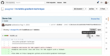
  3. Re the github icon @Pginer-WMF referenced.
    github2.png (1×2 px, 229 KB)
    Would it be too wild to make one editor the default, and you can turn on/off the other editor? It would be an icon in the toolbar, and it would be highlighted or not similarly to a formatting button. [i reiterate my earlier disclaimer; not a seasoned phab-er, disregard if this has been considered and rejected previously.]

I would also add to that table "E. Pencil for the general entry point", with 'eye' and '[[]]' for the respective editors in the list.

I added it to the table in T116417#3060905

Re. the options above, I do not like

  • "C: eye for general entry point" --because I don't think eye is good at suggesting the concept of "Editor"
  • "D: code for general entry point"-- because, as I've said before, I think it's a leap to think that users looking for visual editor will click on a [[ ]], which, if it means anything, means "code".

I think the best option is "A: pencil for visual mode." Eye for visual mode could work, but it's a bit odd. ("E: pencil for general entry point" could be a viable suggestion—because a pencil does suggest the general idea of "editor"—but I see no advantage to this over A.)

OK, so, to sum up:

  • "Option E" is (almost) the same as mobile VE/WTE has had for ~4 years now.
  • I'm sure there are better designs, but I feel that this will be better, so I'm going with it for now.
  • We'll adjust mobile to be exactly the same.
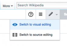
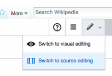
  • We've changed VE/NWE desktop, shipping in wmf.15:
VE->NWE
Screen Shot 2017-03-01 at 12.27.45.png (189×274 px, 16 KB)
NWE->VE
Screen Shot 2017-03-01 at 12.27.54.png (190×278 px, 17 KB)
  • I'll be looking carefully at editor feedback to make sure it's OK when it rolls out next week.
  • Currently Flow is unchanged. We could pretty easily make it align, but leaving that to Collab for now.

@Jdforrester-WMF One little observation: Is it okay that there is a text "Switch to visual editing" if I am currently in the visual editing mode (or the same for source editing)? I think the textual representation of the current state should not be "Switch to ...", but something like "Using visual editing" or just "visual editing" instead. It seems to be a little bit confusing or misleading to me.

@Jdforrester-WMF One little observation: Is it okay that there is a text "Switch to visual editing" if I am currently in the visual editing mode (or the same for source editing)? I think the textual representation of the current state should not be "Switch to ...", but something like "Using visual editing" or just "visual editing" instead. It seems to be a little bit confusing or misleading to me.

Certainly we could fiddle with that; I was going to wait for wider feedback before adding to translators' load, though. :-)

  • Currently Flow is unchanged. We could pretty easily make it align, but leaving that to Collab for now.

Sounds great to me, let's make this control consistent between VE/NWE and Flow.

@Catrope I have a local patch for that.

Sounds good to go with option E. I'd also suggest to remove the "Switch to" part since we are capturing the status (current mode) as opposed to the action (which does not make much sense for the current mode you are already in).

Jdforrester-WMF claimed this task.
Jdforrester-WMF set the point value for this task to 8.
Jdforrester-WMF moved this task from Freezer to TR1: Releases on the VisualEditor board.
Jdforrester-WMF removed a project: Patch-For-Review.

@Catrope I have a local patch for that.

Can you upload it, please? :)

Re-opening, because it hasn't been solved for Flow.

Right, I forgot that it was already uploaded. I'll review it soon.

Right, I forgot that it was already uploaded. I'll review it soon.

Yay!

Change 340741 had a related patch set uploaded (by Catrope; owner: Esanders):
[mediawiki/extensions/Flow] New editor switching widget

https://gerrit.wikimedia.org/r/340741

Change 340741 merged by jenkins-bot:
[mediawiki/extensions/Flow] New editor switching widget

https://gerrit.wikimedia.org/r/340741