Page MenuHomePhabricator

CX2: Adjust issue card navigation between summary and detailed states
Closed, ResolvedPublic

Description

Based on observations from recent user research (T207831) and design reviews, the relation between the collapsed (summary card) and expanded (issue details) is not always clear. Similarly, the connection between the issue card and the marks in the document can be also strengthen.

The changes proposed to the original design of issue cards (T189488) are described below:

CX-issue-card-reviewed.png (483×1 px, 36 KB)

You can check the proposed approach in a basic prototype

Use a chevron for expanding and collapsing

  • "View details" on the summary view will be replaced by a chevron pointing down.
  • The close icon on the issue details card will be replaced by a chevron pointing up, and placed to the right side (to keep the position consistent with the collapsed state).
  • A separator will be added between the navigation controls (to move across issues) and the new collapse action on the details card. The separator will only be shown when the navigation controls are present (i.e. when there is more than one issue).

Additional way to expand

  • The summary card can be also expanded by clicking to their contents (i.e. the area with the error and warning counters), in addition to using the chevron.
  • Clicking on the error indicator will open the first error, and clicking on the warning indicator will open the first warning. In any case, moving to the next/prev issue will always move to the next/prev issue in the document regardless of it being an error or a warning.

Emphasise the current active marker

We want to distinguish the yellow/red marker that is shown for the active issue that is expanded:

  • The focused paragraph will show the issue marker at 100% opacity, and with a 4px wide line.
  • The unfocused paragraphs will show the issue marker at 66% opacity with a 3px wide line.

Inspecting the current code, an example is shown below for a possible adjustment:

//Issue with focus:
 box-shadow: -16px 0 0 -4px #ffffff, -20px 0 0 -4px #ffcc33;

//Issues without focus:
box-shadow: -17px 0 0 -4px #ffffff, -20px 0 0 -4px #ffcc33A8;

Event Timeline

Pginer-WMF triaged this task as Medium priority.Nov 21 2018, 3:15 PM
Pginer-WMF moved this task from Needs Triage to CX2 on the ContentTranslation board.

Change 477584 had a related patch set uploaded (by Petar.petkovic; owner: Petar.petkovic):
[mediawiki/extensions/ContentTranslation@master] Use a chevron for expanding and collapsing of issue card

https://gerrit.wikimedia.org/r/477584

Change 477584 merged by jenkins-bot:
[mediawiki/extensions/ContentTranslation@master] Use a chevron for expanding and collapsing of issue card

https://gerrit.wikimedia.org/r/477584

Change 478739 had a related patch set uploaded (by Petar.petkovic; owner: Petar.petkovic):
[mediawiki/extensions/ContentTranslation@master] Provide additional way to expand the issue card

https://gerrit.wikimedia.org/r/478739

Change 479258 had a related patch set uploaded (by Petar.petkovic; owner: Petar.petkovic):
[mediawiki/extensions/ContentTranslation@master] Emphasize the current issue marker

https://gerrit.wikimedia.org/r/479258

Change 479258 merged by jenkins-bot:
[mediawiki/extensions/ContentTranslation@master] Emphasize the current issue marker

https://gerrit.wikimedia.org/r/479258

Change 478739 merged by jenkins-bot:
[mediawiki/extensions/ContentTranslation@master] Provide additional way to expand the issue card

https://gerrit.wikimedia.org/r/478739

Checked in wmf.9 - all specs seem to be in place.
(a) error/warnings

Screen Shot 2018-12-19 at 4.18.50 PM.png (155×442 px, 12 KB)

(b) expanded issue card
Screen Shot 2018-12-19 at 4.18.57 PM.png (377×430 px, 37 KB)

Screen Shot 2018-12-20 at 3.42.57 PM.png (407×417 px, 43 KB)

(c) Focused/unfocused paragraphs with warnings:

Screen Shot 2018-12-20 at 3.46.45 PM.png (223×963 px, 42 KB)

@Pginer-WMF , please review the following before marking this ticket Resolved.

(1) There are somewhat noticeable although small issues filed in https://phabricator.wikimedia.org/T212436

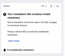
(2) (minor) The contrast between active/inactive errors is rather low - #222222 #72777d. The arrows are small and what works perfectly in terms of contrast for VE options in the toolbar is not that clearly visible for the issue card navigation arrows.

(3) #ffcc33A8; - Is it an invalid value?

//Issues without focus:
box-shadow: -17px 0 0 -4px #ffffff, -20px 0 0 -4px #ffcc33A8;

@Pginer-WMF , please review the following before marking this ticket Resolved.

Thanks for the review, @Etonkovidova.
I think the result is good for the purpose of the ticket. We need some adjustments on how the different cards appear and move (T212436) and some minor styling adjustments, but follow-up tickets can be created for these.