Page MenuHomePhabricator

Update link colors in Vector 2022 for improved UX (and consistency)
Closed, ResolvedPublic3 Estimated Story Points

Assigned To
Authored By
Huji
Jan 15 2019, 1:02 AM
Referenced Files
F35512295: Screen Shot 2022-09-07 at 12.07.09 PM.png
Sep 7 2022, 4:08 PM
F35491721: Screen Shot 2022-08-26 at 11.19.15 AM.png
Aug 26 2022, 3:21 PM
F35491720: Screen Shot 2022-08-26 at 11.20.19 AM.png
Aug 26 2022, 3:21 PM
F35475069: Screen Shot 2022-08-18 at 1.11.56 PM.png
Aug 18 2022, 5:16 PM
F35475067: image.png
Aug 18 2022, 5:16 PM
F35475065: image.png
Aug 18 2022, 5:16 PM
F35212407: image.png
Jun 6 2022, 5:59 PM
Tokens
"Dislike" token, awarded by Asartea."Like" token, awarded by Quiddity."Like" token, awarded by Ladsgroup."Yellow Medal" token, awarded by Jdforrester-WMF."Orange Medal" token, awarded by Krinkle."Like" token, awarded by alexhollender_WMF.

Description

Problem statement

The World Wide Web Consortium (W3C) have Web Content Accessibility Guidelines. These guidelines define a minimum contrast level for links: "For usability and accessibility, links should be underlined by default. Otherwise, link text must have at least 3:1 contrast with surrounding body text, and must present a non-color indicator (typically underline) on mouse hover and keyboard focus" (link to guideline). Since we do not underline links by default, our link color choice must meet the 3:1 contrast requirement. In order to check the contrast of our links with our body text we can use the contrast checker provided by WebAIM. Our body text color is #202122.

Current colors

Color Contrast with body text #202122 Test result Link to test results
Blue links (#0645ad) 1.89:1 Fail results
Visited links (#0b0080) 1.01:1 Fail results

Proposed colors

Color Contrast with body text #202122 Test result Link to test results
Blue links (#3366cc) 3:1 Pass results
Visited links (#795cb2) 3.06:1 Pass results
current colors proposed colors
image.png (382×1 px, 116 KB)
image.png (382×1 px, 117 KB)

Additionally, the proposed blue link color is already part of the Wikimedia Design Style Guide, and is used on our mobile websites as well as in various project logos, so we would be gaining consistency.

NOTE: The proposed changes outlined here will affect Vector 2022 only (it will not affect legacy Vector)

Community feedback

We recently requested feedback from the community regarding these changes (link to request for feedback). Out of 104 responses: 78 people support the change (75%), and 26 people opposed the change (25%) — link to feedback.

The main concern with the proposed colors is that they have less contrast with the white background color (#ffffff), and are therefore harder to read. However their contrast with the white background color still passes the Web Content Accessibility Guidelines (with a AA score). In summary, this is a difficult challenge: the colors must be dark enough to sufficiently contrast with white, but light enough to sufficiently contrast with black. The proposed colors satisfy both of these criteria.

Acceptance criteria

Our goal is to provide WCAG 2.2 level AA compliant colors*

  • Update the link color to #36c
  • Update the :visited link color to #795cb2
  • Note, that it doesn't make sense to provide just a limited number of our color palette colors with AAA compliance as it's no added value to affected users. We therefore aim for enabling additional software for those needs, example is Windows High Color Contrast Mode.

Resources to align

See also

Sign off steps

  • Make sure a Phabricator ticket exists for providing a generic solution for Minerva and Vector to share CSS variables (more context at T213778#8107991)

Related Objects

Event Timeline

There are a very large number of changes, so older changes are hidden. Show Older Changes

Please review on beta cluster and then move to sign off or needs more work.

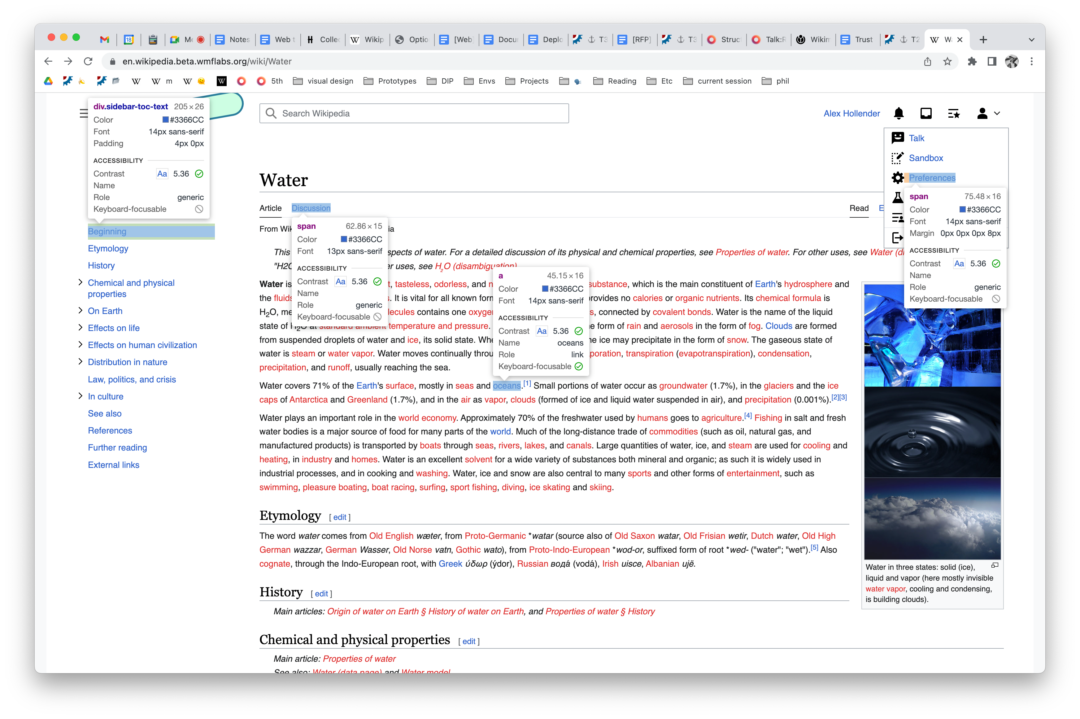
looks good...as far as i can tell everything is the correct blue

image.png (2×3 px, 3 MB)

image.png (2×3 px, 828 KB)

Screen Shot 2022-08-18 at 1.11.56 PM.png (2×3 px, 2 MB)

@Jdlrobson - When can we expect this in production?

I believe this is still correct:

We're targetting this being live on all the wikis on 25th August.

hence it is being announced in Monday's Tech News as "Changes later this week". :-)

External links’ colors changed in legacy Vector as well, both visited and unvisited (internal links’ didn’t):

Screenshot 2022-08-24 at 11-42-26 A kis herceg – Wikidézet.png (190×832 px, 28 KB)

(https://hu.wikiquote.org/wiki/A_kis_herceg, group1 wiki).

Please change them back.

ovasileva raised the priority of this task from Medium to High.EditedAug 24 2022, 10:03 AM

@Tacsipacsi - thanks for the report. @Volker_E - I can confirm that on legacy Vector I'm seeing the old blue links, and old visited link color, but the new colors for external links and unvisited links.

ovasileva raised the priority of this task from High to Unbreak Now!.Aug 24 2022, 10:05 AM

I can confirm that the external link color has changed from #3366BB to #3366CC and visited external link color has changed from #663366 to #795CB2 in legacy Vector. Active has also changed from #bb6633 to #faa700

Change 826303 had a related patch set uploaded (by Jdlrobson; author: Jdlrobson):

[mediawiki/skins/Vector@master] Vector legacy no longer imports variables from Vector modern

https://gerrit.wikimedia.org/r/826303

Change 826303 merged by jenkins-bot:

[mediawiki/skins/Vector@master] Vector legacy no longer imports variables from Vector modern

https://gerrit.wikimedia.org/r/826303

Change 826250 had a related patch set uploaded (by Hashar; author: Jdlrobson):

[mediawiki/skins/Vector@wmf/1.39.0-wmf.26] Vector legacy no longer imports variables from Vector modern

https://gerrit.wikimedia.org/r/826250

Change 826250 merged by jenkins-bot:

[mediawiki/skins/Vector@wmf/1.39.0-wmf.26] Vector legacy no longer imports variables from Vector modern

https://gerrit.wikimedia.org/r/826250

ovasileva lowered the priority of this task from Unbreak Now! to High.Aug 24 2022, 4:41 PM

Mentioned in SAL (#wikimedia-operations) [2022-08-24T16:51:30Z] <ladsgroup@deploy1002> Synchronized php-1.39.0-wmf.26/skins/Vector/resources/mediawiki.less.legacy/mediawiki.skin.variables.less: Backport: [[gerrit:826250|Vector legacy no longer imports variables from Vector modern (T213778)]] (duration: 02m 52s)

@Jdlrobson Amir has deployed the change. Can you confirm the colors are all appropriate now and if so remove the train blocker? Thanks ;)

Volker_E reassigned this task from Sarai-WMDE to ovasileva.
Volker_E added a subscriber: Sarai-WMDE.

Unfortunately, the new link colors (especially for a:visited) in Vector 2022 are much to light on my screen; the readability is seriously impaired. Please provide a way to choose darker colors! The coding of a link color seems hard to override without using "!important", and without adversely affecting other link colors.

here is what I'm seeing in production:

Legacy vector
link type color expected?
default #0645ad
default, visited #0b0080
external #3366bb
external, visited #663366
red #ba0000
red, visited #a55858

(expected values above based on this documentation)

Vector 2022
link type color expected?
default #3366cc
default, visited #795cb2
external #3366bb
external, visited #795cb2
red #dd3333
red, visited #a55858

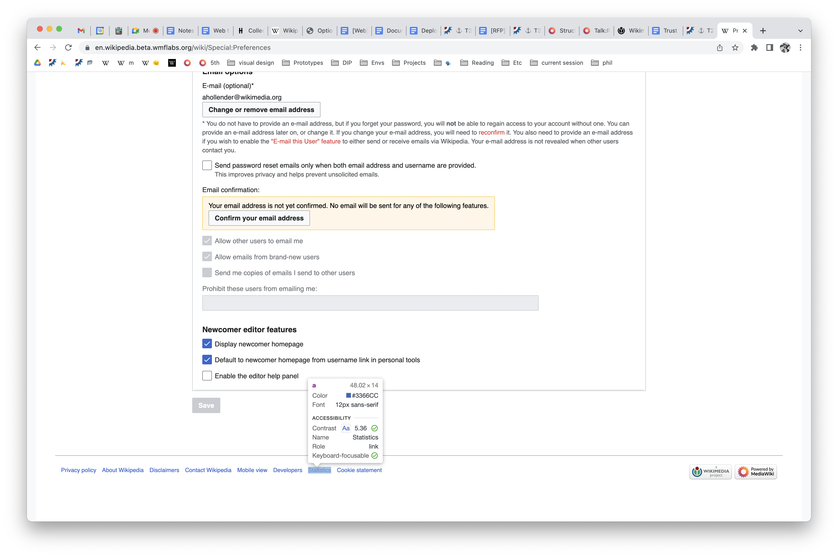
on MediaWiki I'm seeing the tabs taking on visited link colors which I don't believe is intended/expected:

Screen Shot 2022-08-26 at 11.20.19 AM.png (692×860 px, 105 KB)
Screen Shot 2022-08-26 at 11.19.15 AM.png (1×2 px, 745 KB)

For completeness, it looks like that's a regression caused by T308344 (so unrelated to this change). Seems like we can move this to sign off now?

@Jdlrobson @ovasileva @Volker_E additional questions related to link styling:

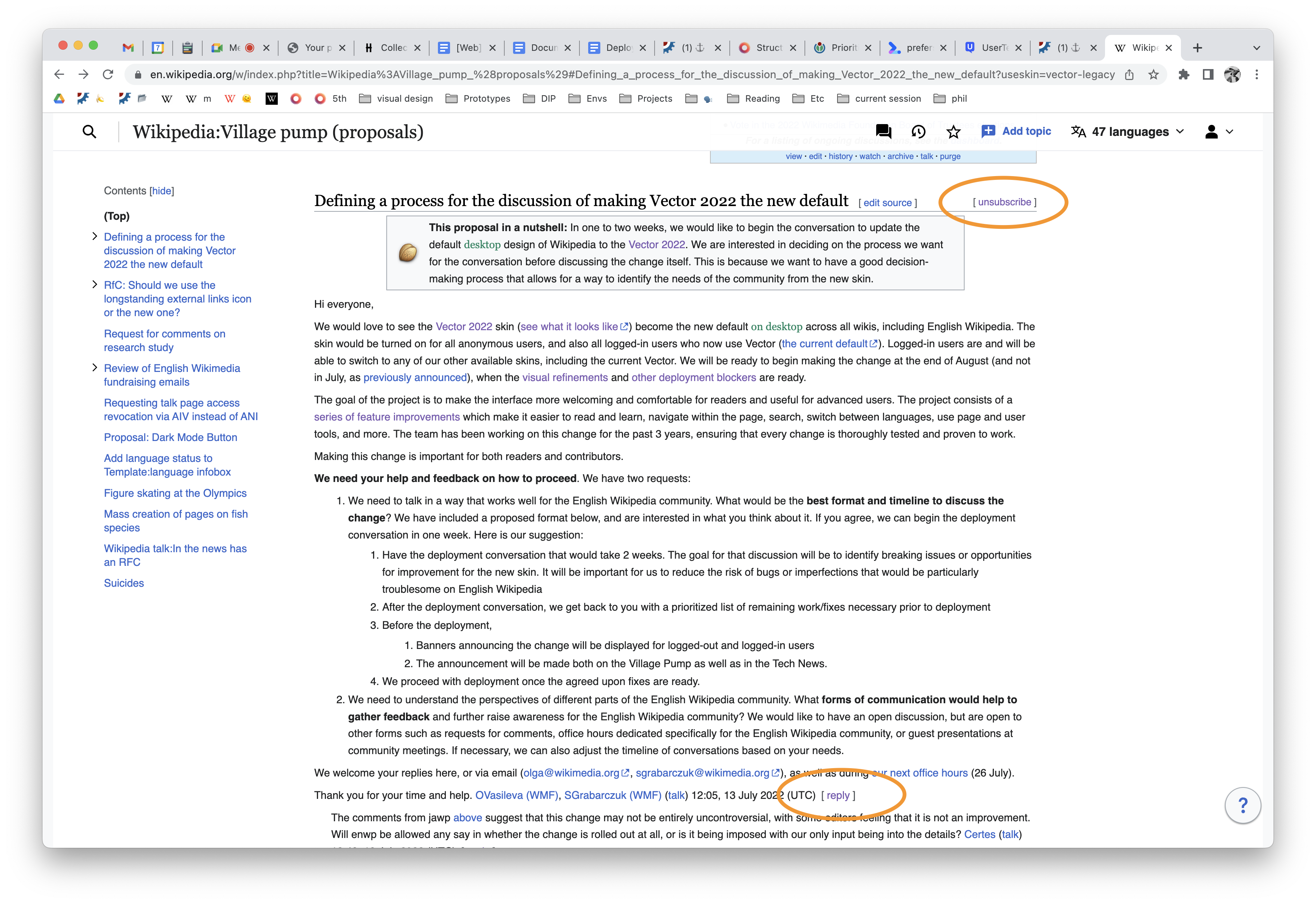
  • I just noticed that the visited link styling is also getting applied to the [ reply ] buttons on Talk pages. As far as I can tell this was previously happening (in Legacy Vector) but was less noticeable because the visited link styling was so similar to the normal link styling. It might not matter much for [ reply ] because the Editing team is switching that to a button, however it makes me wonder if there are other link/buttons out there that are also getting visited link styling, but shouldn't be? This is more or less the same issue we're addressing in T316574: [regression] [Visual refinements] Toolbar tabs should not get :visited styling
  • @stevenwalling has pointed out that all many links on Watchlist and Contributions pages have visited link styling (because any page that appears there is a page you've visited). This raises the question of whether it makes sense to use visited link styling on these pages or not. There might be other places, such as the User menu and/or Main menu, where visited link styling is more distracting than helpful as well. (link to discussion)
  • @stevenwalling has pointed out that all links on Watchlist and Contributions pages have visited link styling (because any page that appears there is a page you've visited). This raises the question of whether it makes sense to use visited link styling on these pages or not. There might be other places, such as the User menu and/or Main menu, where visited link styling is more distracting than helpful as well. (link to discussion)

@stevenwalling wrote that the majority of links on watchlists and own contributions pages is visited, not all links and not all users’ contributions pages. And even this is not necessarily true, it depends on one’s watchlist usage—I, for example, usually visit changes to my watched articles from watchlist emails, so neither the article link nor the diff link on Special:Watchlist gets visited (the diff link in the email is a different URL), causing the majority of the links on my watchlist to be blue, not purple, and purple links highlighting mostly articles I recently edited (as after editing, I get the canonical URL).

Generally, I think overriding the color of visited links on a per-page basis is more confusing than helpful (why is this link marked as visited on this page but not on that one?). Maybe the visited link style could be changed to be more similar to the unvisited style (but still different enough from normal text color and background color, of course)?

Tacsipacsi is correct. I also pointed out in the discussion what they say about per-page inconsistency also being potentially confusing. I personally find it useless/annoying to have the purple visited style on my watchlist and contributions page but others could feel differently. I leave it up to the team to decide how to approach it—the largest audience here is readers, who generally can’t customize the style for themselves as easily as an editor/logged in user, so I think optimizing for them and giving editors tools to customize to their preferred needs is probably fine.

I prefer consistency as well. I think the visited link colour on the watchlist/main menu/contributions wouldn't be that annoying if the purple colour is closer to meeting the WGAC AAA standard (or even meets it, but there is only one colour that meets both accessibiilty requirements).
I suggested the two colours that fit with the criteria ((#3344dd for blue, and #804180 for purple)). If the blue is a given, #6550A5 may be a prettier option for the purple. It almost meets the AAA standard on a white background and comfortably meets the AA standard on a lightgrey background, which is common across the site. Happy to test if it still poses me trouble if somebody could explain how.

I hadn't realised that the black isn't 'pure black'. Now that I've ran the numbers, I see there is no colour that meets the AAA standards with background and the link standards. The purple can be made ever so slightly darker while still meeting the link standard, but that won't resolve the accessibility issue on white/light grey text. The best solution is probably not meeting either standard, but coming close to both.

Proposed colours on light-grey background

Color Contrast background (AAA) Contrast link Link to test results
Blue links (#3366cc) 5.09:1 ❌ Fail Pass results
Visited links (#795cb2) 4.99:1 ❌ Fail Pass results

Proposed colours if WCAG AAA to white background is met

Color Contrast background (AAA) Contrast link Link to test results
Blue links (#3344dd) Pass 2.31:1 ❌ Fail results
Visited links (#804180) Pass 2.29:1 ❌ Fail results

Proposed compromise colours

Color Contrast background (AAA) Contrast link Link to test results
Visited links (#725DB1) 5.08:1 ❌ Fail Pass results
Blue links (#2F5EBC) 6.09:1 ❌ Fail 2.64:1 ❌ Fail results
Visited links (#6953AC) 6.11:1 ❌ Fail 2.63:1 ❌ Fail results

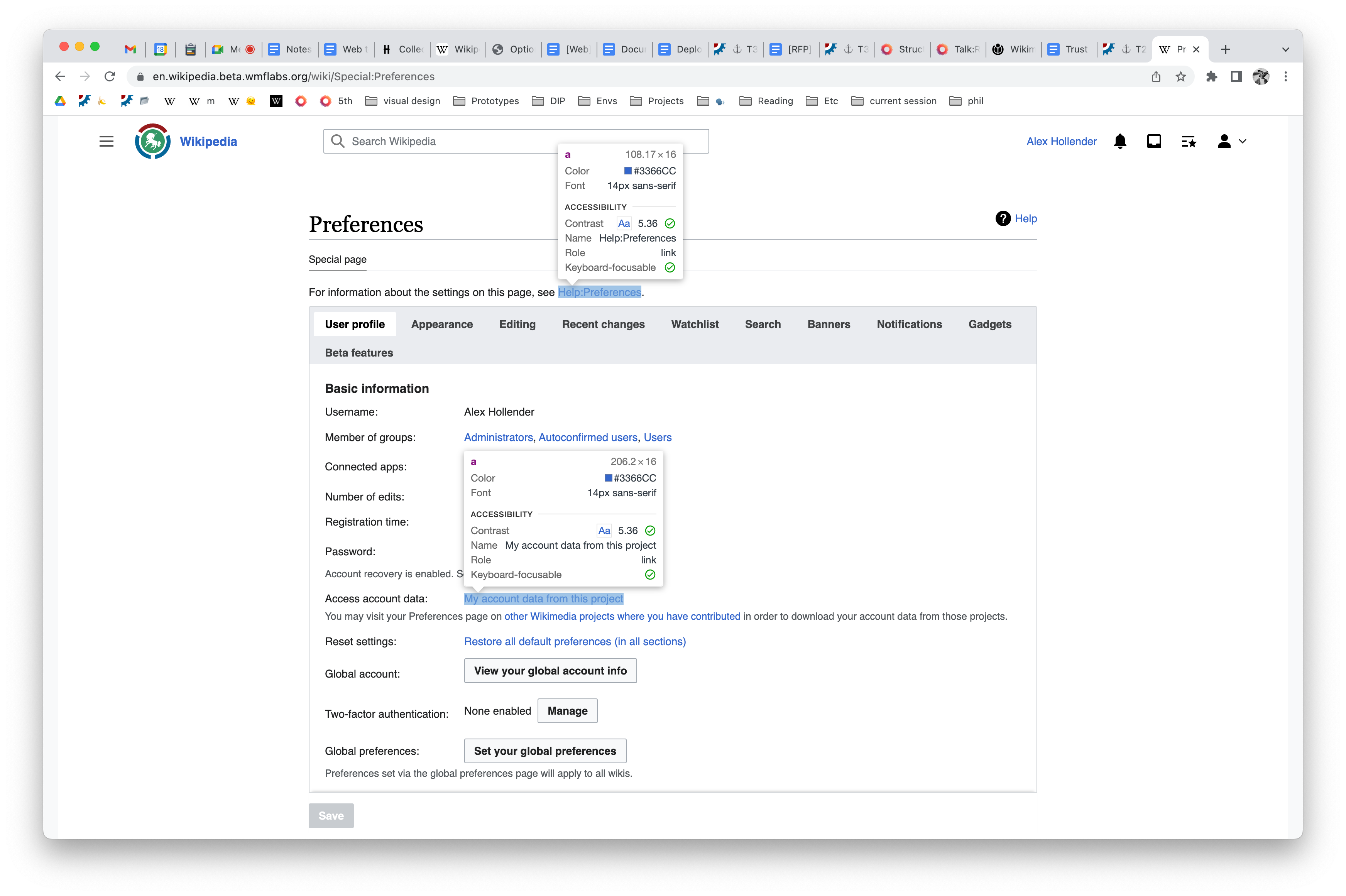
@ppelberg @nayoub @Esanders: it seems that on Talk pages, in both Legacy Vector and Vector 2022, the [ reply ] and [ unsubscribe ] links/buttons are able to get :visited styling. I never noticed this until recently, when we made the :visited styling more distinct from the normal link styling. I wonder whether or not it makes sense for these links/buttons to be able to get :visited styling (my initial thought is that it doesn't make sense)? What do you all think? And if you agree that it doesn't make sense, should we prioritize changing this? I believe this will no longer be an issue with the updated Talk pages, since they use buttons instead of links for Reply and Unsubscribe, though I don't know how soon that will be rolled out everywhere.

Screen Shot 2022-09-07 at 12.07.09 PM.png (2×3 px, 1 MB)

(Technical note: it’s because they use href="", so all the ‘links’ reference the current page.)

I prefer consistency as well. I think the visited link colour on the watchlist/main menu/contributions wouldn't be that annoying if the purple colour is closer to meeting the WGAC AAA standard (or even meets it, but there is only one colour that meets both accessibiilty requirements).
I suggested the two colours that fit with the criteria ((#3344dd for blue, and #804180 for purple)). If the blue is a given, #6550A5 may be a prettier option for the purple. It almost meets the AAA standard on a white background and comfortably meets the AA standard on a lightgrey background, which is common across the site. Happy to test if it still poses me trouble if somebody could explain how.

We're aiming to achieve full WCAG AA support in our (new) product developments. It doesn't make sense to have a limited amount of interface elements AAA compliant, it doesn't provide affected humans added value when they could only interact/read half of our interface. On the other hand the contrast requirements for AAA would negatively impact color options and make our interface inharmonious and imbalanced.
Therefore we're unblocking additional software solutions catering to these needs (like Windows High Contrast Mode) without requiring AAA for WikimediaUI's color palette.

Change 622763 abandoned by VolkerE:

[mediawiki/skins/Vector@master] [modern][styles] Use default Design Style Guide link color choice

Reason:

Superseded by I8a309eedd70b9a82f

https://gerrit.wikimedia.org/r/622763

Has underlining been considered? The new colours still pose two accessibility problems

  1. It's too light for about 10% of people. Many people who indicate it's too light indicate an accessibility issue (difficult to read) rather than aesthetics.
  2. For people that are colour blind, the contrast between visited links and unvisited links may not be clear (see for instance Iritscen's feedback).

Contrast can be improved by a better choice of colours for #1 (grey/greyish purple at 4.5:1 looks fainter than bright pink at 4.5:1), but this does not resolve the second issue and there is a trade-off between aesthetics and contrast. To solve both issues, you need underlining. I've been trying out a subtle underlining, and that looks reasonably good in prose.

We're supporting to always underline links in user preferences underneath “Appearance” as MediaWiki feature.

Apologies for not being clear. Has underlining been considered as a default to allow the use of darker colours, and resolve the two accessibility problems above? I hope you agree with me that these do pose a problem, and that 4.5:1 contrast (or 5:1) is not a guarantee for sufficient contrast (as WebIAM says: "For many of us, some of these combinations are not very readable. That is why 4.5:1 is the minimum required by WCAG.." )

The standard underlining is intrusive given the density of links on Wikipedia, so we would have to go for something more subtle, as the example above in my css.

We're supporting to always underline links in user preferences underneath “Appearance” as MediaWiki feature.

Link colors affect all readers, logged-in or logged-out. User preferences are for logged-in users only. Unless and until you make this particular preference available for logged-out readers, this is not a solution.

@ppelberg @nayoub @Esanders: it seems that on Talk pages, in both Legacy Vector and Vector 2022, the [ reply ] and [ unsubscribe ] links/buttons are able to get :visited styling. I never noticed this until recently, when we made the :visited styling more distinct from the normal link styling. I wonder whether or not it makes sense for these links/buttons to be able to get :visited styling (my initial thought is that it doesn't make sense)? What do you all think? And if you agree that it doesn't make sense, should we prioritize changing this? I believe this will no longer be an issue with the updated Talk pages, since they use buttons instead of links for Reply and Unsubscribe, though I don't know how soon that will be rolled out everywhere.

Thanks, filed as T319019

Underlining all links by default is not a good usability choice for Wikipedia, and there is a reason why most sites with a high density of links (like Google search results pages) have moved away from underlining by default for all users. There is solid evidence that when there is a high density of links, underlining negatively impacts readability.

I very much agree that normal underlining (same colour, normal width, directly under words) would not work for Wikipedia. The study linked gives two reasons why readability is negatively impacted by that type of underlining

  1. The underlining interferes with letter like q, p, j. This can be solved by giving the underlining a grey colour, and moving it down, for instance with something like "a:visited { text-decoration: none; padding-bottom: 1px; border-bottom: 1px solid #DCDCDC ;}"
  2. The underlining makes the links stand out. The same is however true with the new colours, that are chosen explicitly to stand out better against the prose with a 3:1 contrast. This problem is unavoidable if we also want to make sure people can properly recognise links. Why not make it stand out in a way that does not pose a problem for 5-10% of people based on the respondents? Making the line thin further helps readability compared to standard line width.

And yes, in line with other places like Google, we can safely omit underlining for links where it's obvious they are links (watchlist, contributions, menus). These are the places where the new link colours cause the largest problems for me, and it's not even necessary to use the faint colours there.

Google uses #681DA8 for its visited links, and #1a0dab for its unvisited links. Neither colour comes close to the 3:1 criterion. Britannica also uses a blue colour that meets the AAA standard against the background (#14599D), and fails the 3:1 criterion. I'm not sure the 3:1 criterion was made for link-heavy websites.

JFYI: the study’s point on avoiding descender elements of q/p/j is outdated by now, all modern browsers already do that for underlined links.

I've reanalysed the feedback, to quantify the accessibility problem, classifying it in 4 categories (new, no objection to new, old, neither). I classified 135 responses, but have skipped some of those where there was a language barrier / machine translation didn't help me. The question was slightly steering the respondents to support. I think that is the correct way to deal with accessibility problems, as we're trying to solve a problem for a minority of editors, but that should be taken into account now that it has become clear the new colours also pose an accessibility problem.

Preference
New 53%
No objection to new 13%
Old 19%
Neither 16%

Not all of those who object to the new colours indicate they have accessibility problems. Many people don't give an explanation or mention prettiness. The respondents note two accessibility problems with the new colours, their contrast with the white background, and their contrast with each other. Some people supported the change, but also noted that it was less easy to read for themselves.

Accessibility problems new colours
Contrast between colours 7%
Contrast with white background 16%

Attached the raw data. I've done this somewhat quickly, so I wouldn't be surprised if there are a few misclassifications. I've taken a broad definition of accessibility, which includes those with only minor problems. If I only categorise those with a clear accessibility concern, the total group of people with problems halves to 11%.

During the office hours, I heard that you're in contact with a charity for people with visibility problems :). Thanks for taking this problem seriously, and I hope they will be able to provide us with a more accessible set of colours. Would it be an idea to contact WebAIM direclty?

Another aspect that I wonder if worth considering if how much we want to look forward to updates to the WCAG in the proposed changes to colour contrast accessibility calculations proposed in future in a new "APCA algorithm (Advanced Perceptual Contrast Algorithm)". It seems far off implementation, but worthwhile noting some of the inadequacies in the current calculation that it is intended to address.